Category: Design
Catch Yee Monkey x
This week has been a matter of smoothing the road whilst riding the battle bus: Lots of things happening, too much juggling and not enough time for writing – something had to give. But we’re definitely on the acceleration towards the end.
Well – sort of end – there’ll still be the decorating to finish, and given my ability to blow the budget, it’ll all be down to me to climbing ladders and wielding paint brushes. Not that I really mind – I like the sense of ownership…and at least when the colours polymorph it’s not a double whammy of paying for new paint and decorators to put right. But I’ve reached the stage I just want it finished…to see everything back in the rooms..pictures on the walls..the spaces given their kiss of life.
Upstairs we have a whole room jammed to the ceiling with bulging boxes and bits. It’s going to be interesting to see what makes it back – what one needs (we’ve managed with very little for the last six months ) versus what one wants (I’ve missed cookery books, wedding photos and vases) versus essentials: a running tap, a sink, a dishwasher…a fridge door that opens all the way..an oven! How have we managed without a kitchen for 6 months??
Today the tap is going in – the oven is in the house rather than in the shed. The lovely French cabinet is also in – but I think photos can wait till all the handles are on. Hehe.


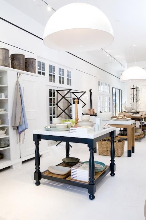
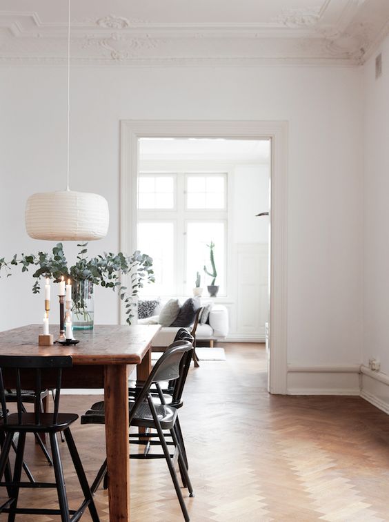
(All pics Pinterest)
At the moment I’m just removing all the lacquer from the brass with nail varnish remover and elbow grease so they can all age disgracefully and develop their own patina. One’s own patina…A life’s essential don’t you think?
Laters, Kate x
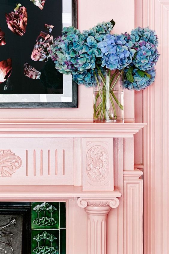
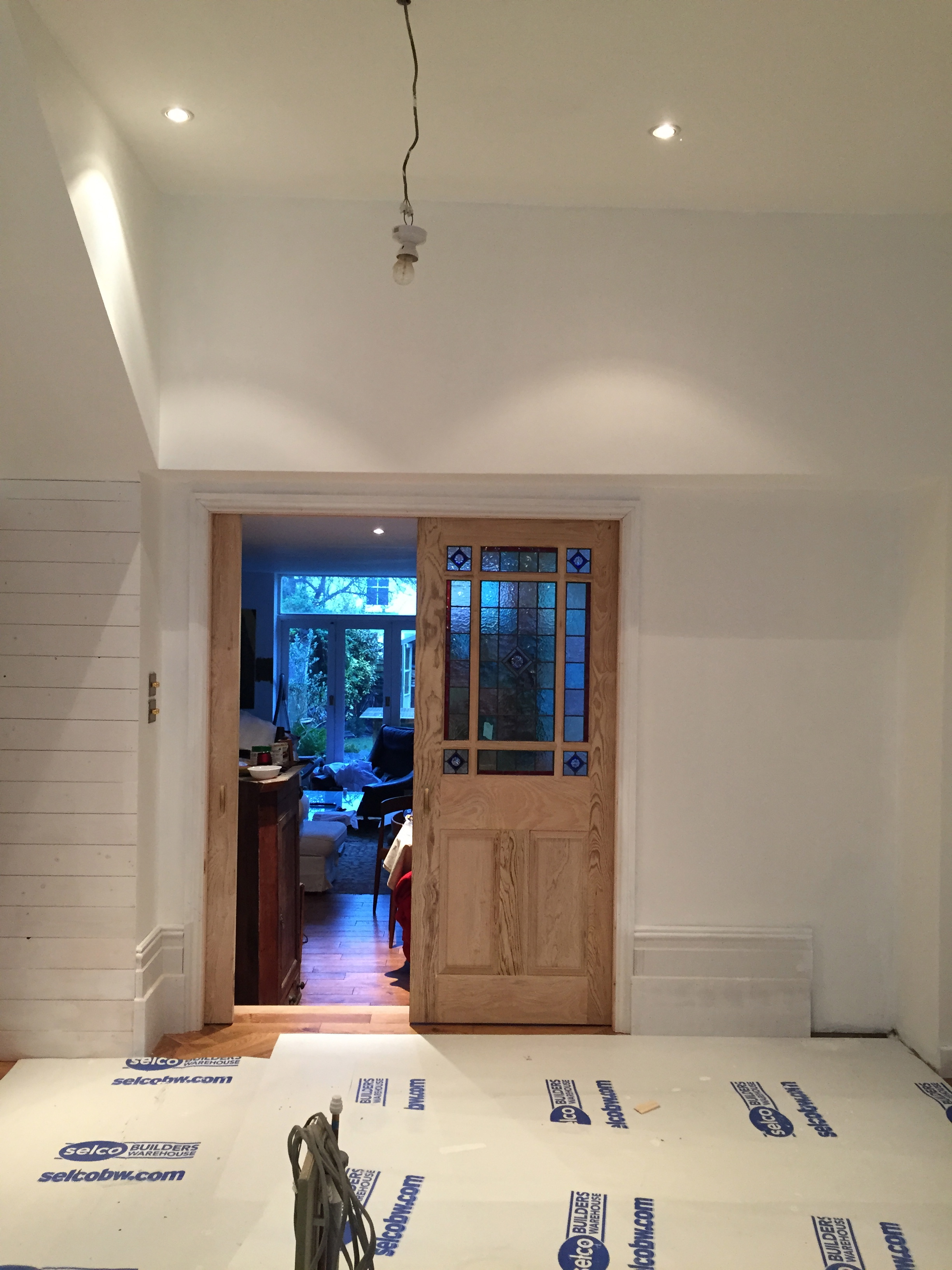
A Progress Report: Blue Notes..
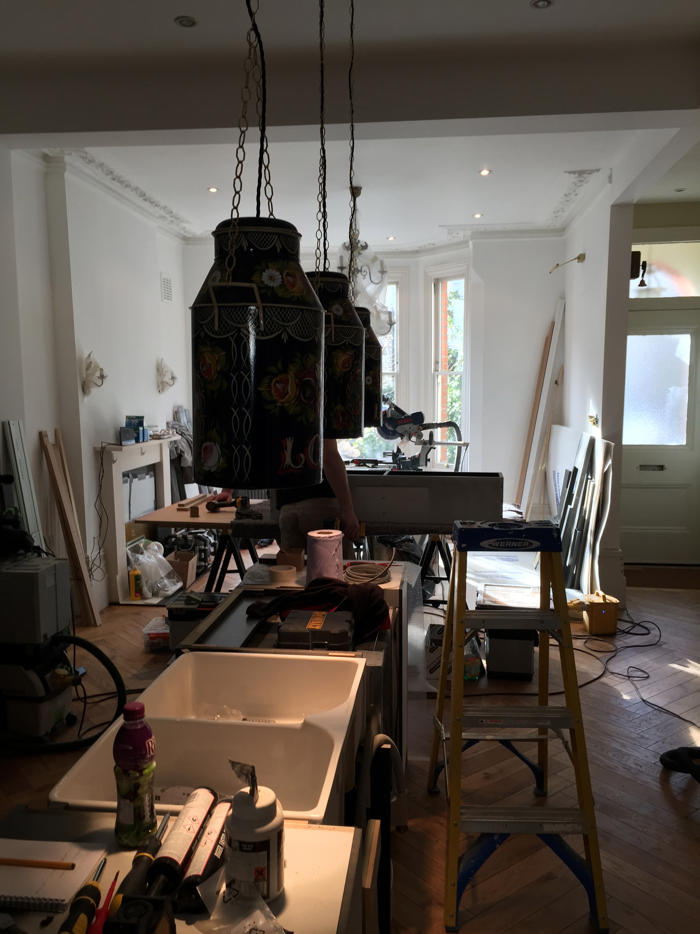
Things are changing daily..the lights: wall lights/pendants/milk churns are all up (I think they deserve a separate post..)

But here’s a sneak peak: This pic was taken last week..much has changed since then..but more later..
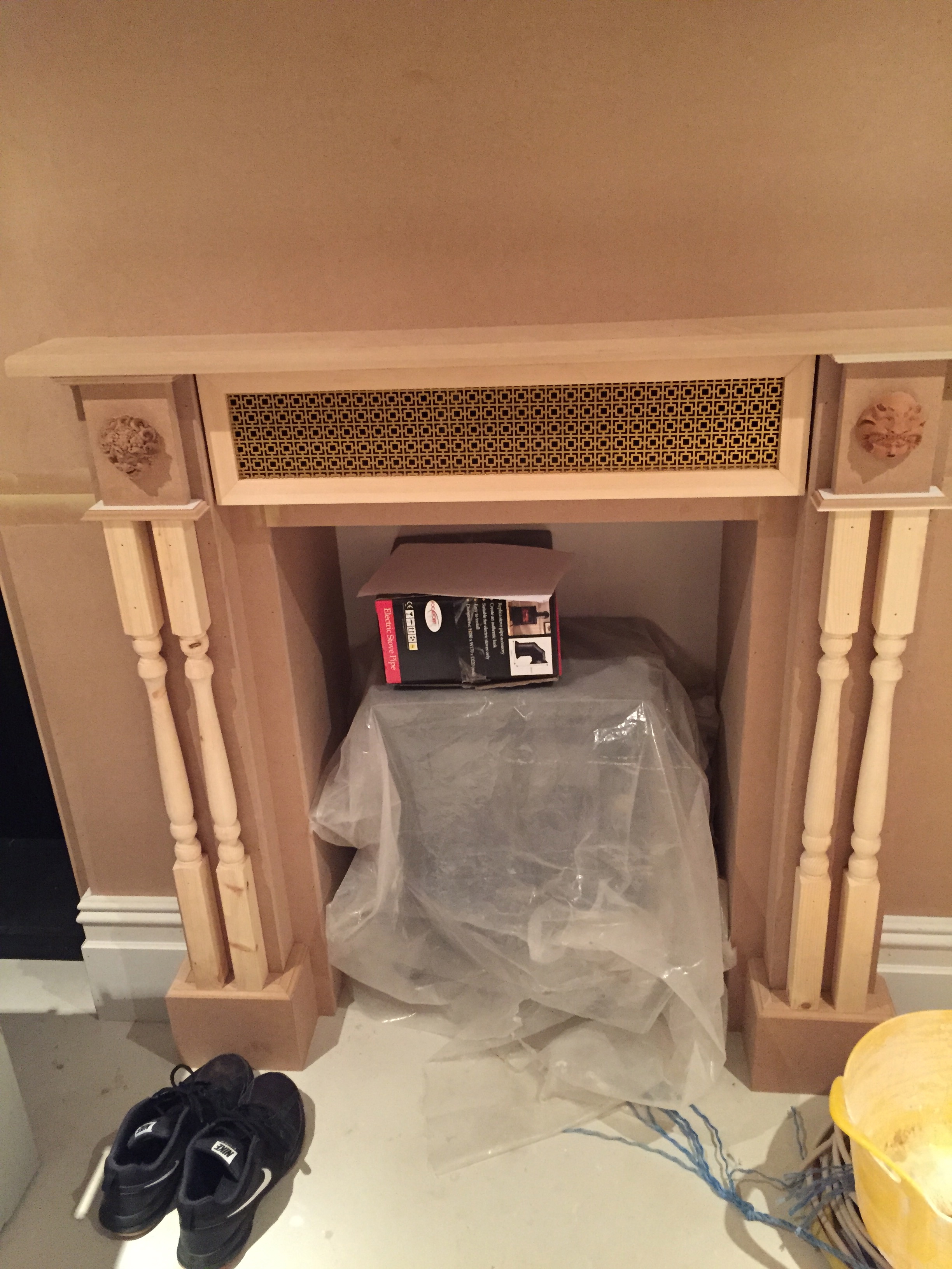
Down below in the underworld is where decisions are still taking place: The DVD-storage-provider-fireplace now has it’s hinged camouflage grill in place, completing the look..I LOVE it.
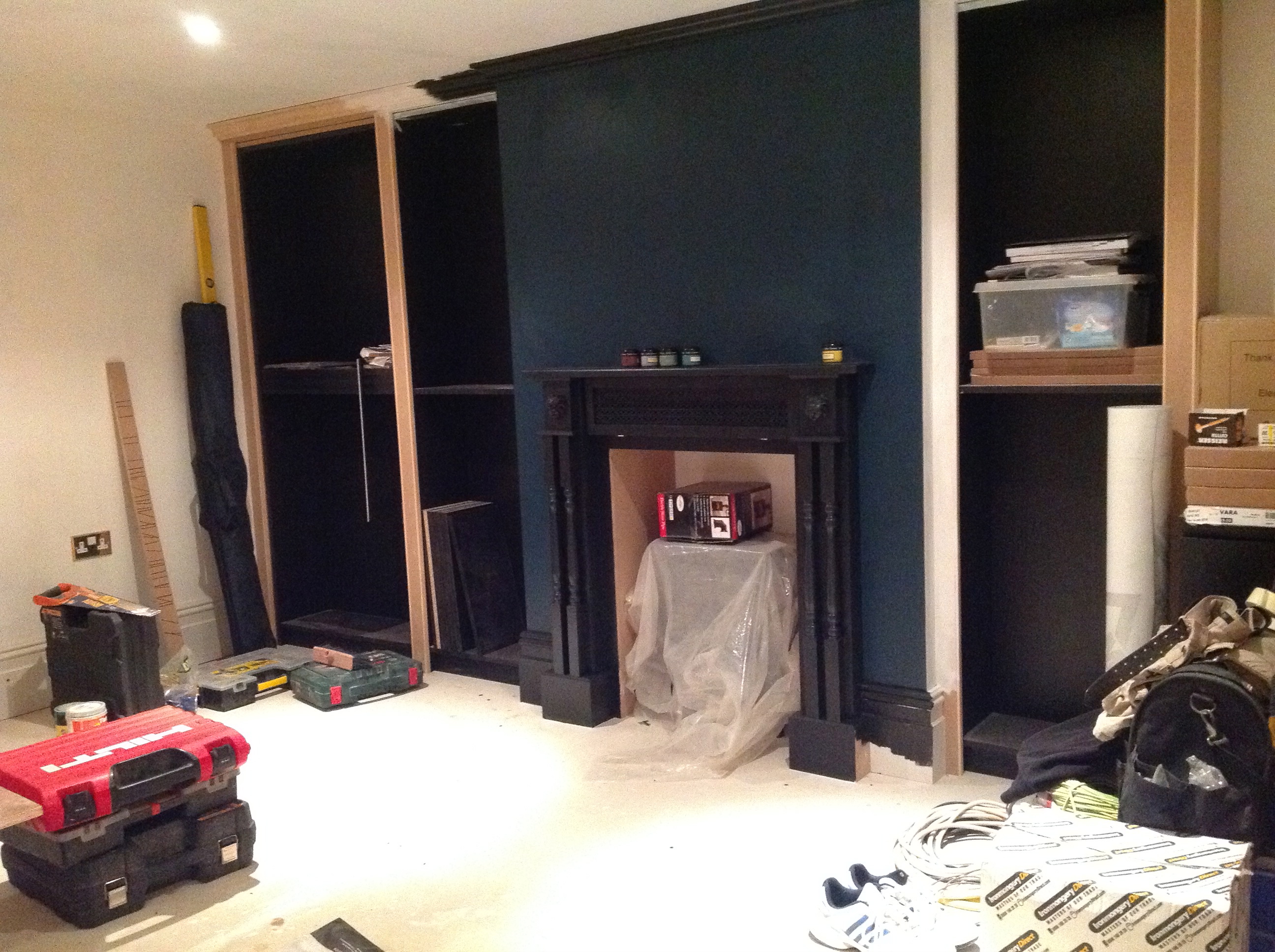
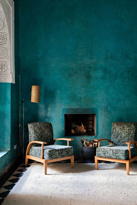
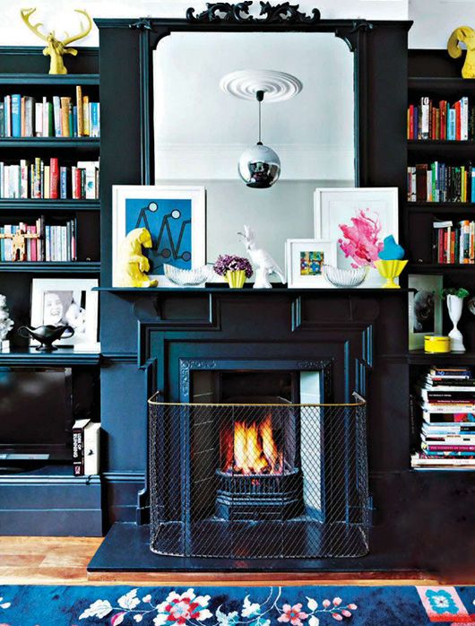
The TV needs to be mounted so the wall needed to be painted…and so the polymorphing paint trials started again. Sigh. The aim was for dark blue with grey undertones to link in with a big rug coming in. A blue shouldn’t be a hard colour to find, I thought – classic, straight forward..simple. The sample on the wall looked great – dark, velvety, petroly even – perfect!…except when I painted it on the fireplace wall…it was green. OH.NO.NOT.AGAIN (Yet look at the picture…blue…) but honest to God it was a dark, Victorian green…and looked OK..just not…right – too harsh – too green (I think colours are harder to nail when it’s a room with no natural light, but I am starting to wonder if colour blindness can be brought on by renovations and old age..) Arggghhhhhhhh!
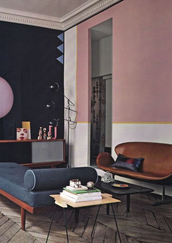
So it was back to inspiration pics..


Back to the rug..

Back to the DIY shop…with the decision that if paint could change, then the exploitation of it should be a controlled decision. I went determined for a smokey blue that could almost be grey, but could be mistaken for a bruised lavender. And I went avoiding all the ‘branded’ paint with their promises of perfection, approaching the much cheaper Valspar range with their choice of 2000 colours…knowing to only trust my eye.

The result is a joy: A summer thunderstorm, the mist on a mountain..the light at dusk.

And look how the bare mdf looks in the pics…like the perfect just plastered putty pink! It’s the next colour to track down..that and a complementing grey..
Wish me luck.
Laters, Kate x
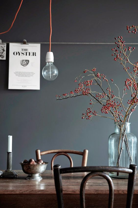
Succulent Sorbet..

There’s ways and means of going light..thinking contrasts, warmth and the unexpected.


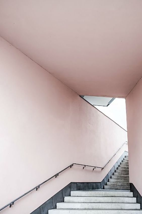
Set off against the grey = pure lush..
Hmmmmmmmmmm…
Laters, Kate x
The Underworld x

As the kitchen has been progressing, so has the cellar..the bookcases are finished and the faux fireplace/black-box-storage-facility now has fancy detailing..
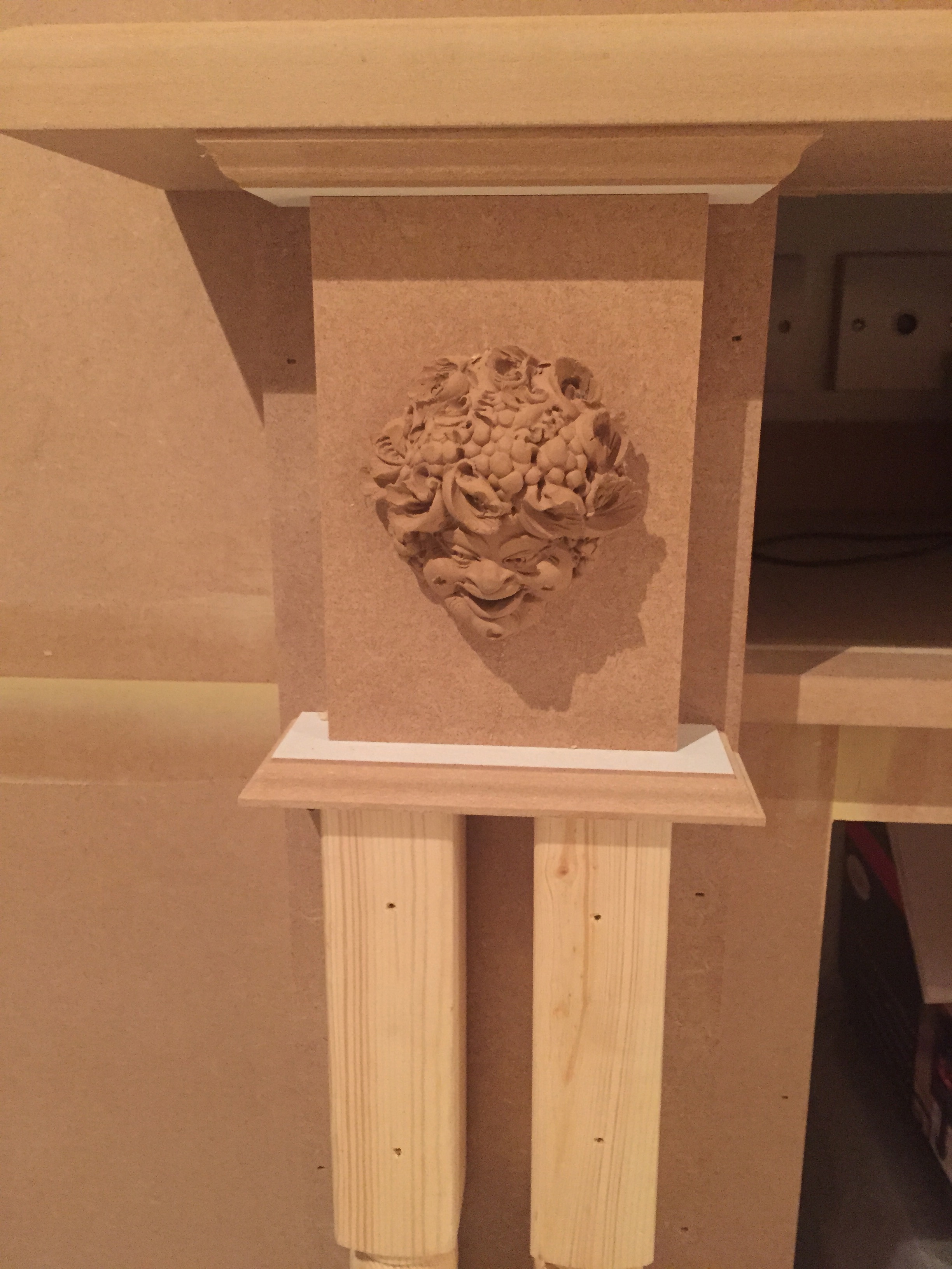
(We bought these terracotta plaques nearly fifteen years ago on a very memorable trip to Sicily involving climbing volcanos, exploding boats and great friends)
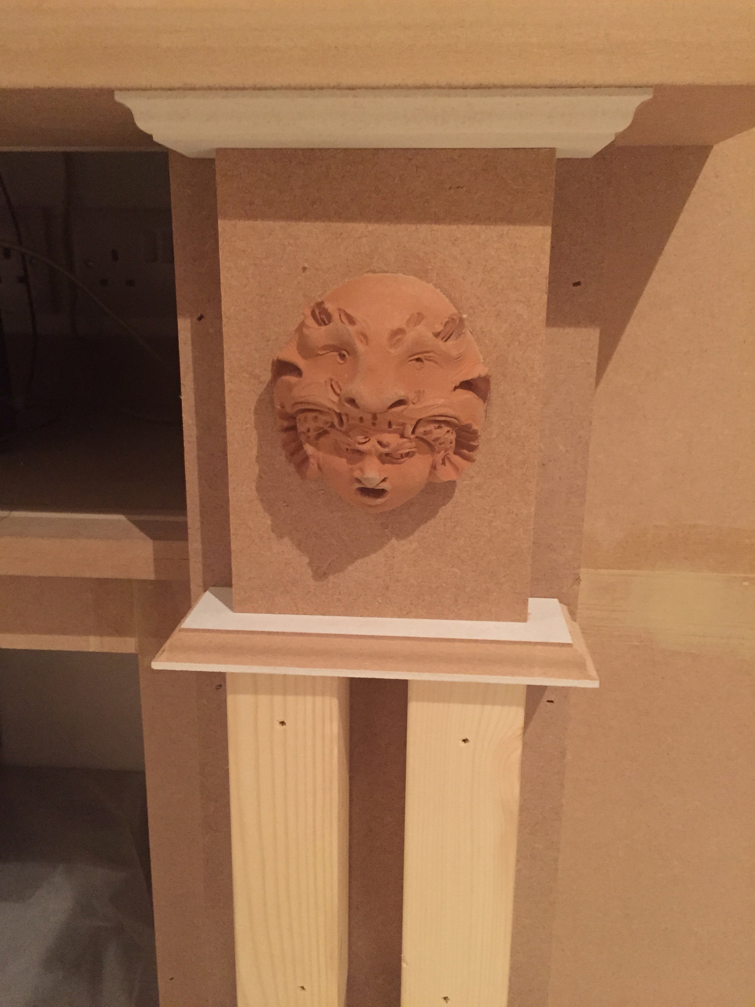
They’ve been waiting all this time for the perfect place to shine…and now they will forever make me smile.
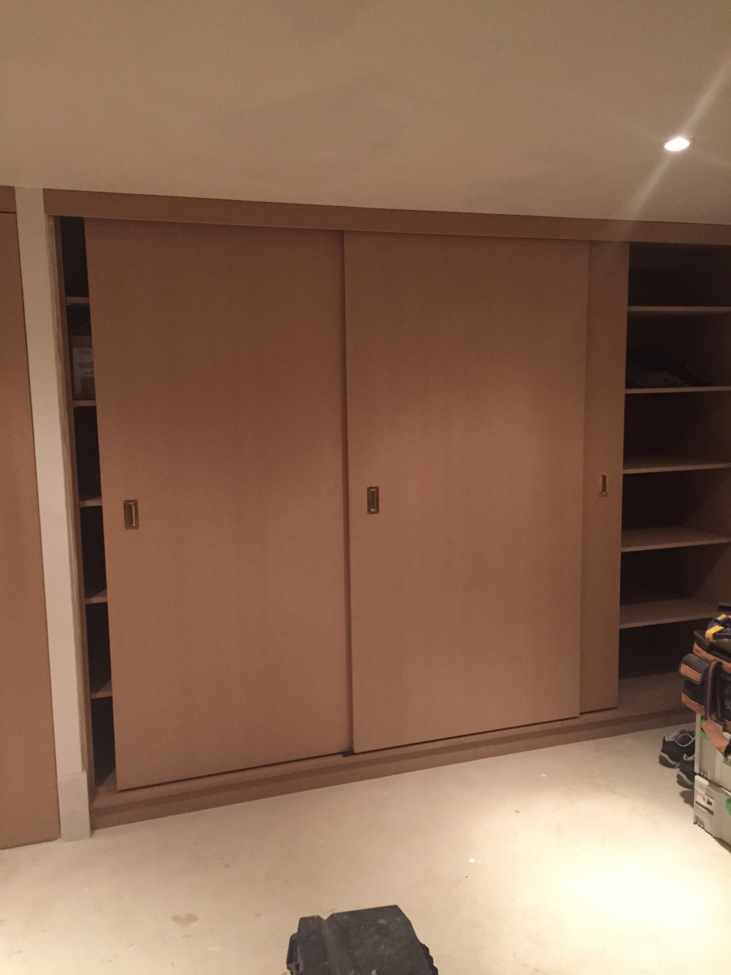
The carpentry on all the storage cupboards is also complete.
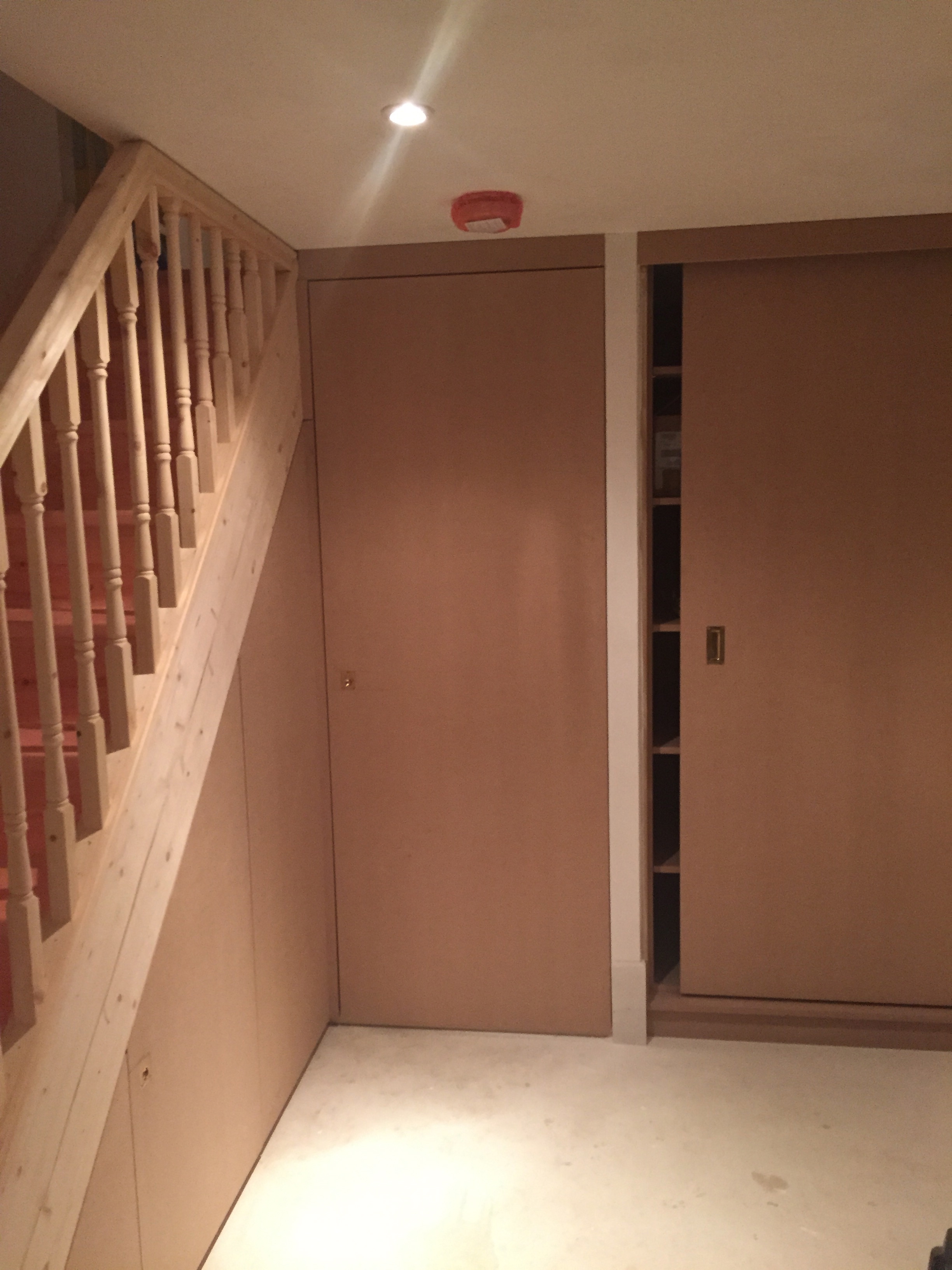
And the stairs are done – it just all needs a lick of paint now…and will be the next room to be decorated. Time to re-cap on the inspiration shots..and start buying paint samples.


Not long…
Laters, Kate x
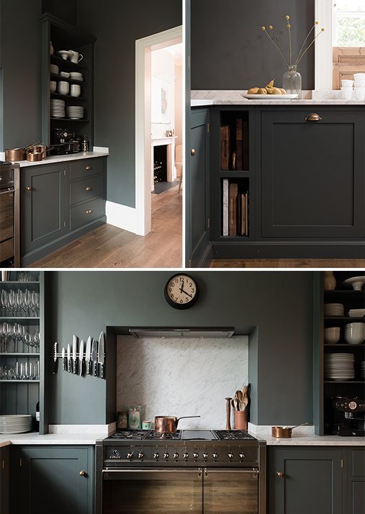
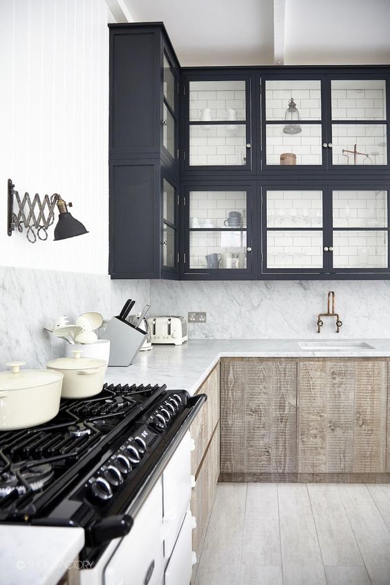
The Kitchen’s Arrived!

And all hail the Gods of colour…it’s a lovely dark….GREY! Not a hint of brown in sight…

Phew. Phew. Phew.

And it looks pretty dramatic against the white…

Now it’s the simple matter of getting it all fitted…

Plus some of the other little extras I’ve been waiting for. New coat hooks?!
Laters, Kate x
Happy birthday..

It’s Finery’s first birthday – it seems hardly believable they’ve been around for such a short time.

It’s such a great label that fills a gap in the market you never thought was there. Until they started.


On the one side it’s reflective, mild mannered and be-spectacled.

On the other, clever, en pointe, different.

This is a label that joins all the dots.

And does the best trousers. Stalk them.
Laters, Kate x
The Hall x

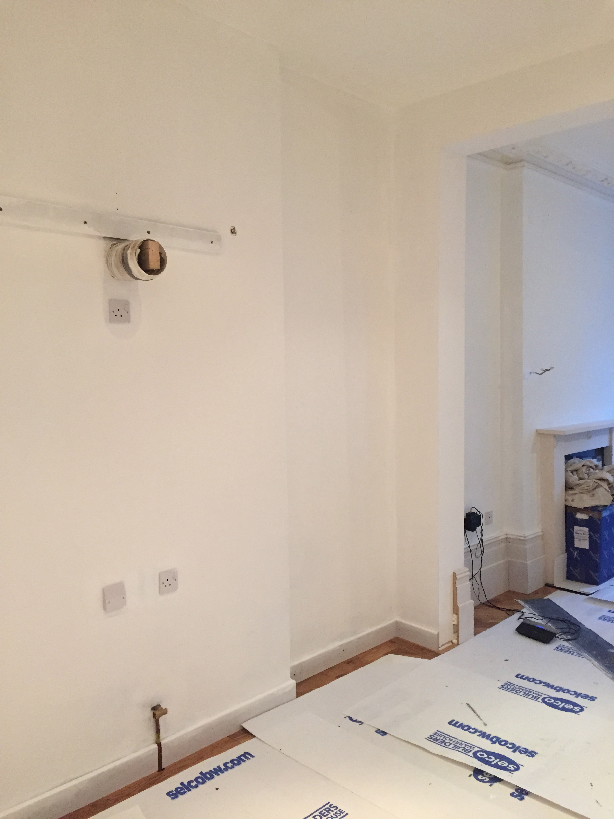
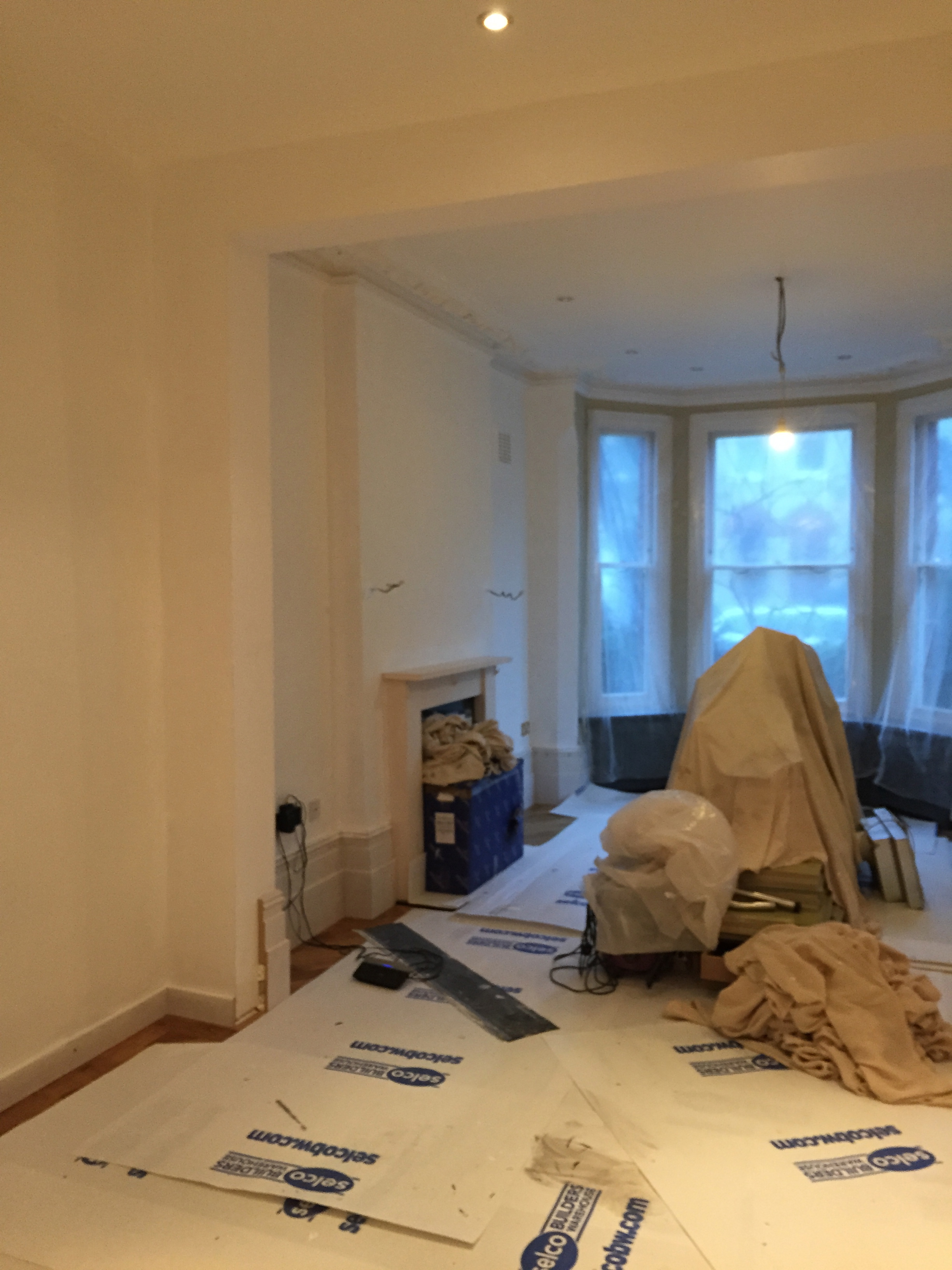
The kitchen still hasn’t arrived – some hold up at the spray painters. I wait for it with baited breath because I’m desperate to know the colour as it will have such an impact on what happens next both in the hall and in the sitting room.

I have the empty pot sitting on the fireplace as a colour guide..and it looks a greeny grey.

And the colour samples on the wall…which look grey.
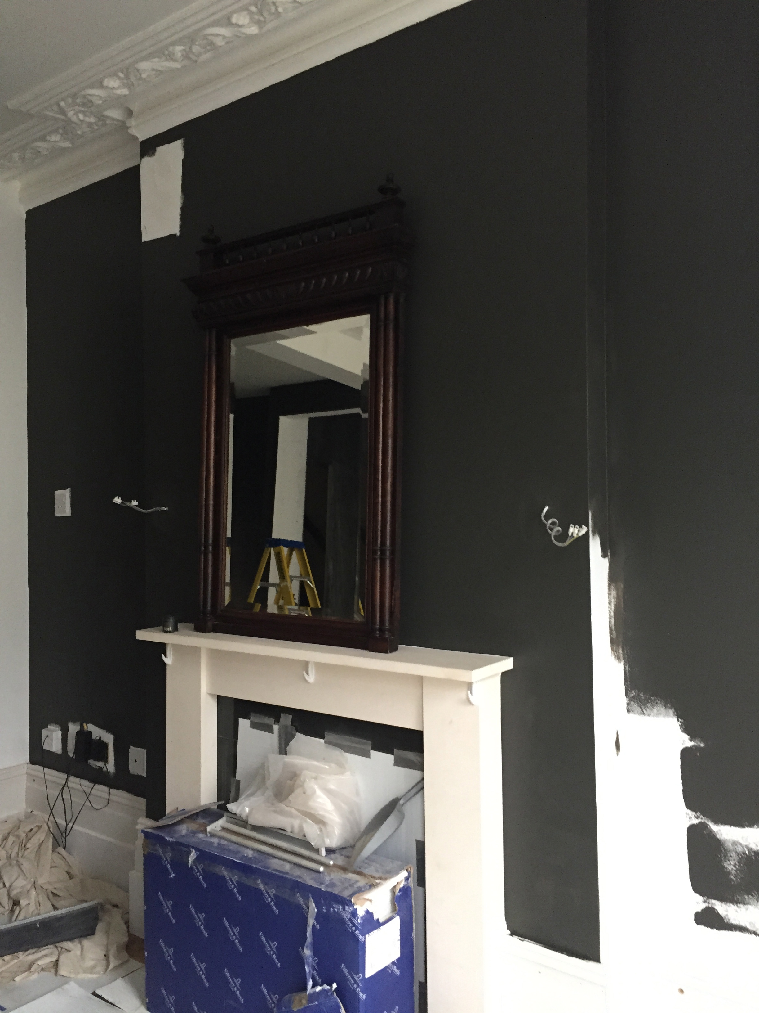
But I swear when it was painted it was a seventies brown.
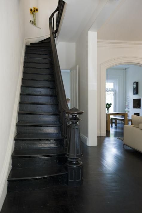
The stairs up to the first floor are already painted this colour (not a picture of them – too covered in dust (another ceiling went this week..the last one) (over our temporary kitchen mind you!)…but does it stay? I’ve also noticed that all the staircases that tick the box have no runners….not an option for us. And if a staircase is dark, the walls are white. Not great with kids. And what runner works on a dark staircase?

There’s always the option to go lighter..

I was going to use a kilim runner as a stair carpet down to the cellar/underworld. Maybe I’ll move that idea and use it in the entrance hall instead..add a bit of much wanted colour and texture..


I think I’m going to run with it (hoho)..and see what happens…
Nothing ventured, nothing gained…
Laters, Kate x
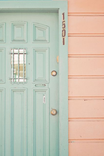
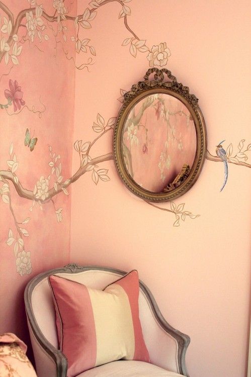
Procrastinating aloud..
No more this. Begone..
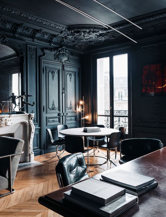
Or this. All dark thoughts to be obliterated (or possibly left to the cellar underworld to (hopefully) fulfil..we’ll see..)
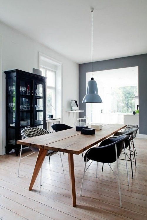
Welcoming this.

And this.

Clean, calm, tranquil. Spilt tea, homework, functional, practical..

And this.
No. Not this. (Must learn..)

This. Which could be approximately the colour the units will be (despite having painted the whole room – I still have no idea what colour it is – officially it’s called Umbra grey)..But it’s what it’ll look like in photos..the actual colour is more earthy? (How could I have chosen such a non-colour??)..

This picture has made the cut because of it’s contrasting pale colour – I think I’ll need one..(will it be a green, grey or cream?? Depends on the colour of the units…)

Contrast colours..
Subtle contrast colours.
Not sure I’m very good at subtle.
Laters, Kate x
Disaster..

So here’s the thing: This weekend I finally started to paint the kitchen..

I pulled out the big drums and polyrhythms and went with what my heart said..dark. On the sample it looked grey – in my tin – grey. On the wall – brown. In pictures – black. My mother (who saw it) is still convinced it was green. To be honest..once it was on, it just looked promisingly awful. Not at all what I had imagined.

If you’re an uber cool couple with no children..then it certainly makes a statement. Sadly our space is less flickering candlelight more spilt tea and homework. I even unwrapped the mirror to see if stuff on the walls made a difference – and like the skidmarks of a bad crash, that’s when I discovered the next tragedy – the mirror had woodworm…great with a brand new oak parquet floor..

I know I’m not the only one to be suffering colour sample polymorphing..the truth is – the only way to know if you really like a colour is to paint a whole wall..or if you’re mad like me, a whole room. Sigh. And then be prepared to stand back and admit you’ve made a mistake: I like to believe I have adventurous taste but to have kept this just to prove a point would’ve made it the worst fake since…well, Madonna. So whilst I lament that it’s the wrong story…and it breaks my heart – the salient fact is it’s only paint and we all make mistakes: Nobody has died. It’s just my very own, very sad bad….that will be paid for in blood and sweat..
There was no time to faff with new samples – it needed to be finished by this morning (Monday) as the kitchen was due to arrive back for fitting. The only option was to go big and go white..
Have you ever painted over black before?
I gave up at one o’clock this morning..
The whole design now needs a new re-think…and I’m suspecting that only way to make this work is to embrace everything Scandi.
Never thought I’d write that..
Laters, Kate x
Rosie x

There’s something rumbling in the air: Apparently Isabel Marant opted out of sharing her pre-season pictures with anyone until as late as possible. She said it was less to do with the threat of copying than over exposure – ‘There’s just too much stuff’. A notion that is starting to infiltrate and seep through the runway shows at New York fashion week…It’s becoming too obvious, too controlled..and the designers – crowned icons of creativity – are starting to rebel and explore other avenues to present their collections. It’s about time.

Rosie Assoulin presented her collection at the Meatpacking District (I like her thinking) with her usual chutzpah and personal style.

She sees a hemline and moves it up further… a gather becomes a statement.

A simple stripe is now a conversation of pattern and geometrical possibilities.

Exposure is about dreams, not exploitation.


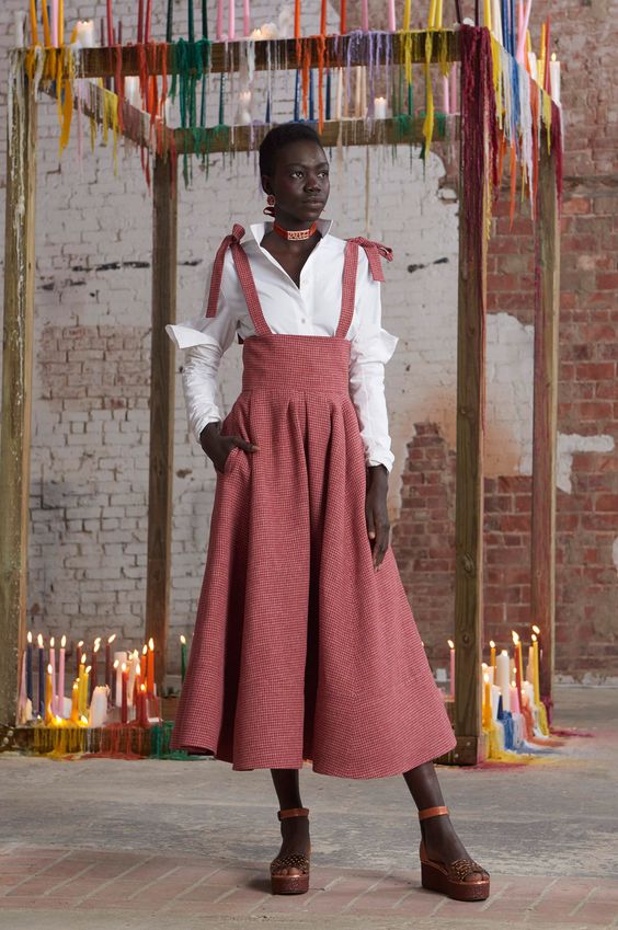


Extravagance, strength and femininity all simply and elegantly pulled together with beautiful tailoring.

(All pics Vogue and Pinterest)
Now a stalwart of fashion week, she’s still a breath of fresh air.
And I love her candles.
Laters, Kate x
