Tagged: choosing colours
A Progress Report: Blue Notes..
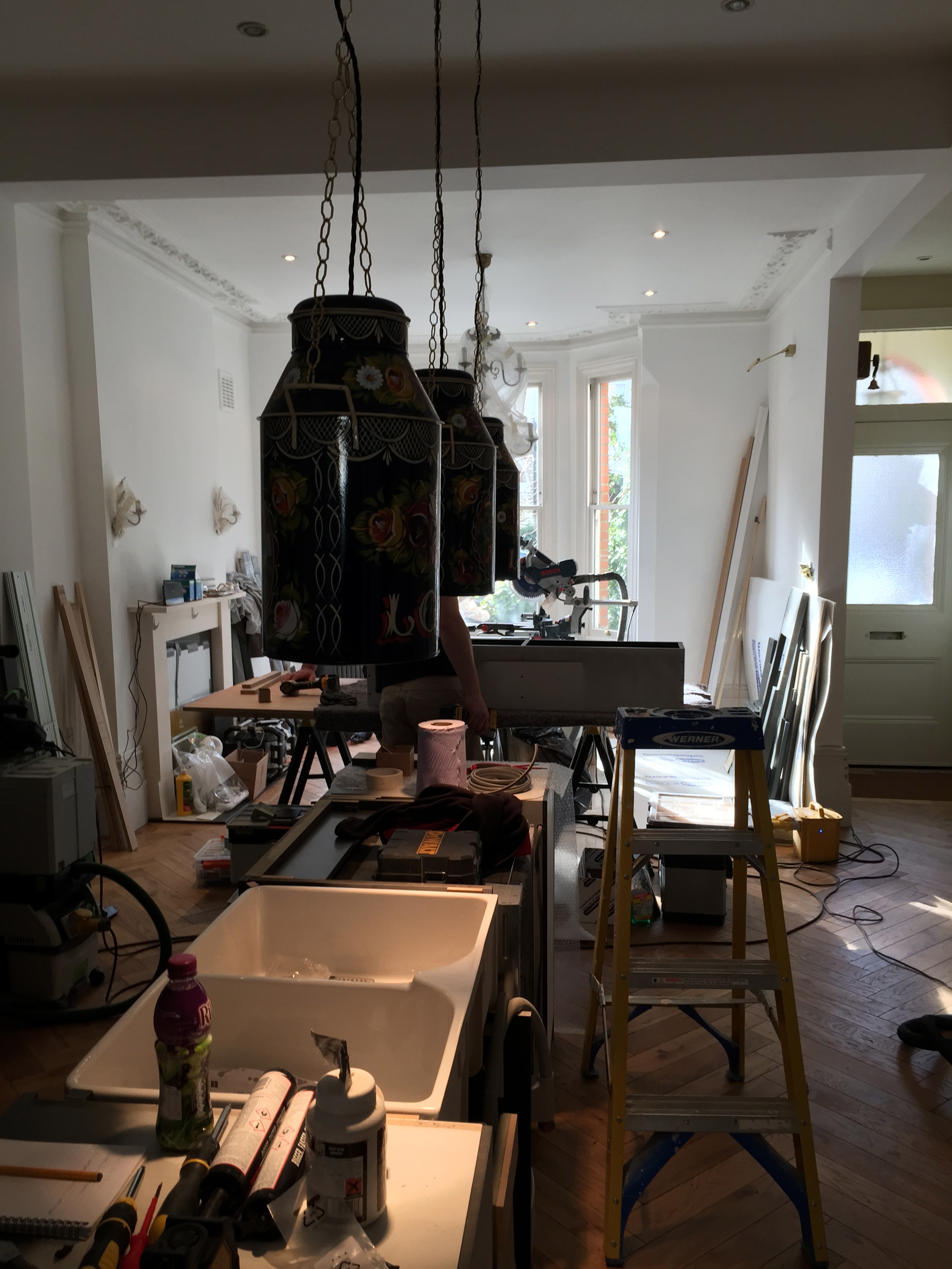
Things are changing daily..the lights: wall lights/pendants/milk churns are all up (I think they deserve a separate post..)

But here’s a sneak peak: This pic was taken last week..much has changed since then..but more later..
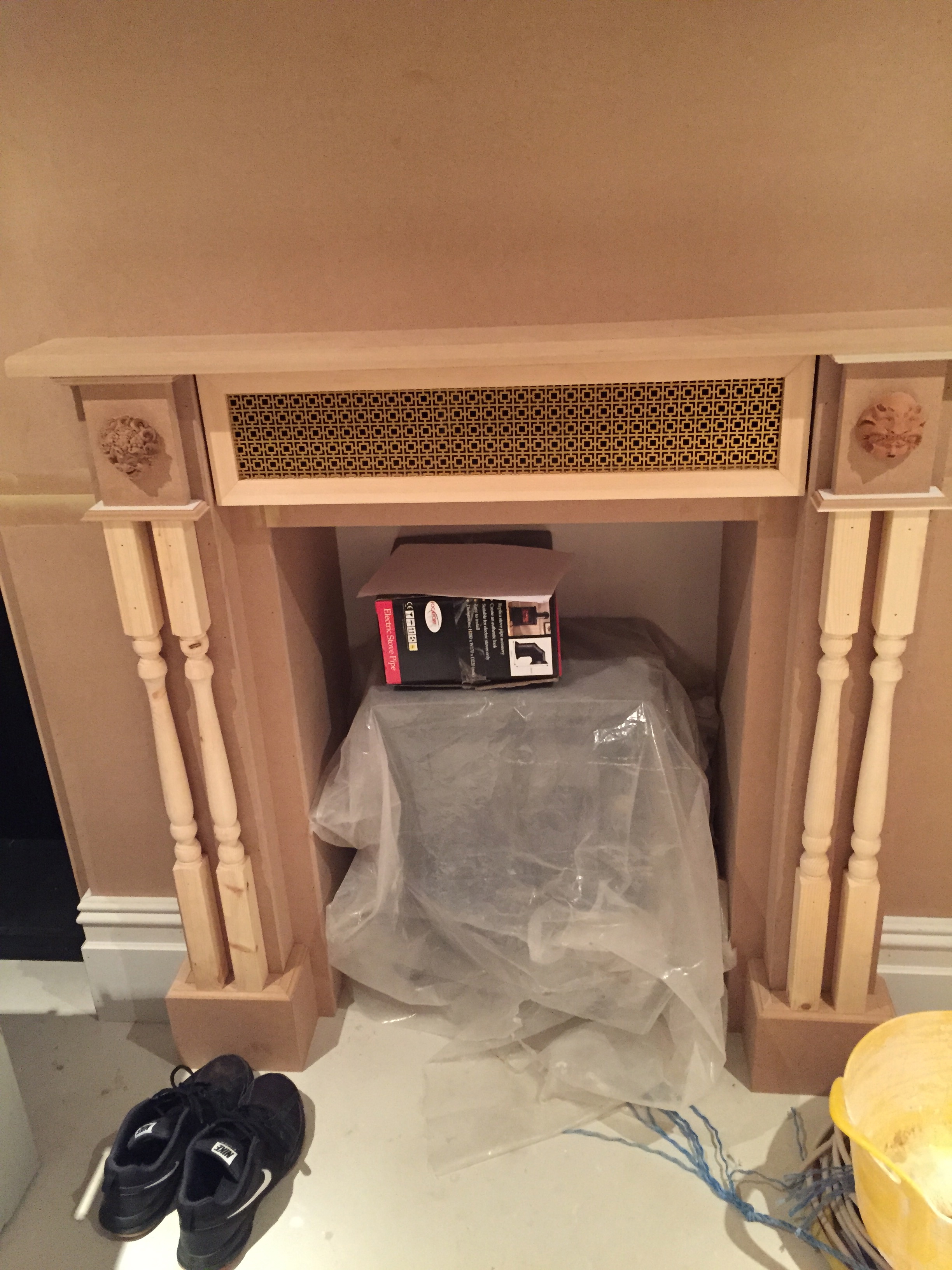
Down below in the underworld is where decisions are still taking place: The DVD-storage-provider-fireplace now has it’s hinged camouflage grill in place, completing the look..I LOVE it.
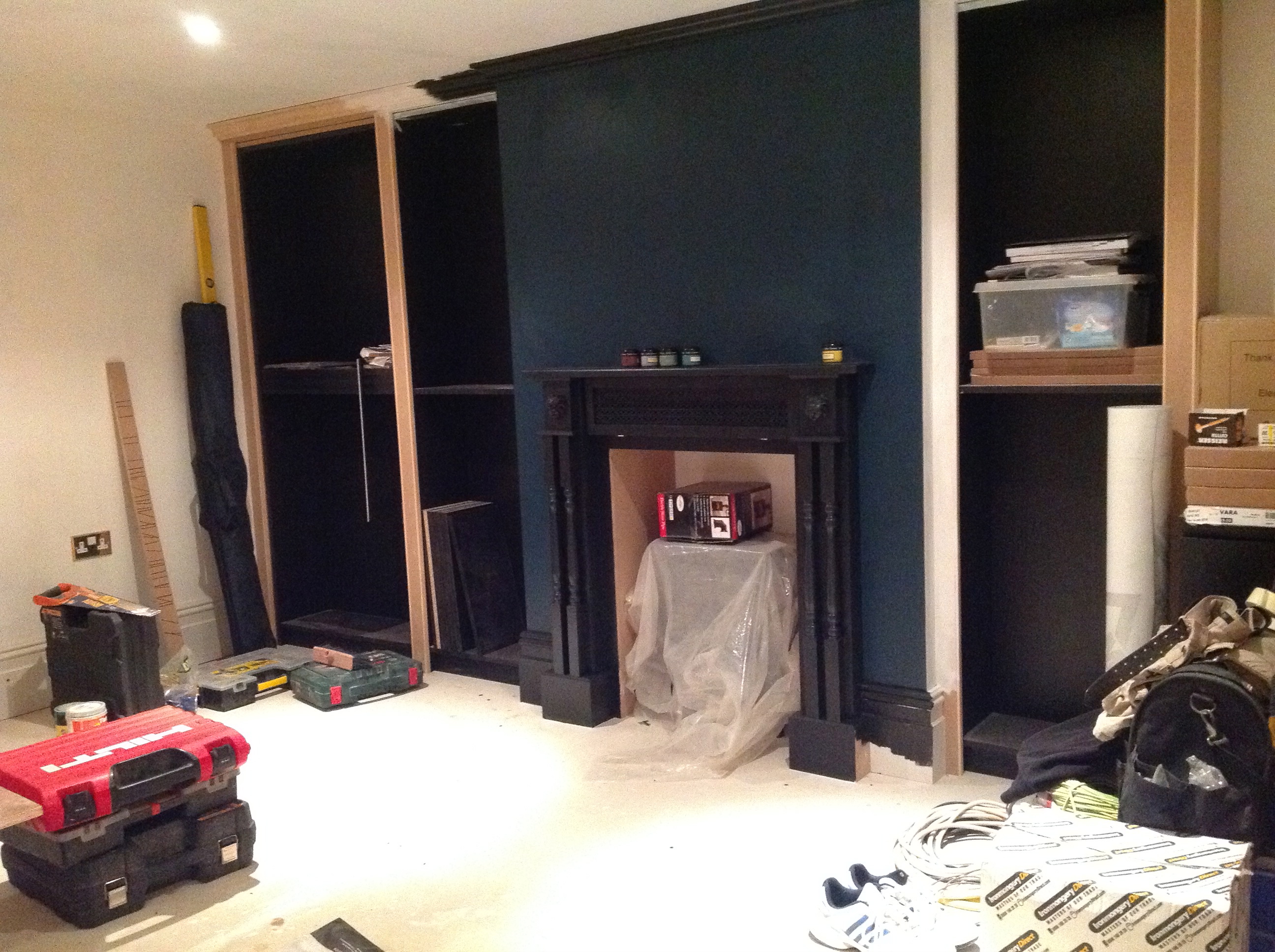
The TV needs to be mounted so the wall needed to be painted…and so the polymorphing paint trials started again. Sigh. The aim was for dark blue with grey undertones to link in with a big rug coming in. A blue shouldn’t be a hard colour to find, I thought – classic, straight forward..simple. The sample on the wall looked great – dark, velvety, petroly even – perfect!…except when I painted it on the fireplace wall…it was green. OH.NO.NOT.AGAIN (Yet look at the picture…blue…) but honest to God it was a dark, Victorian green…and looked OK..just not…right – too harsh – too green (I think colours are harder to nail when it’s a room with no natural light, but I am starting to wonder if colour blindness can be brought on by renovations and old age..) Arggghhhhhhhh!
So it was back to inspiration pics..


Back to the rug..

Back to the DIY shop…with the decision that if paint could change, then the exploitation of it should be a controlled decision. I went determined for a smokey blue that could almost be grey, but could be mistaken for a bruised lavender. And I went avoiding all the ‘branded’ paint with their promises of perfection, approaching the much cheaper Valspar range with their choice of 2000 colours…knowing to only trust my eye.

The result is a joy: A summer thunderstorm, the mist on a mountain..the light at dusk.

And look how the bare mdf looks in the pics…like the perfect just plastered putty pink! It’s the next colour to track down..that and a complementing grey..
Wish me luck.
Laters, Kate x
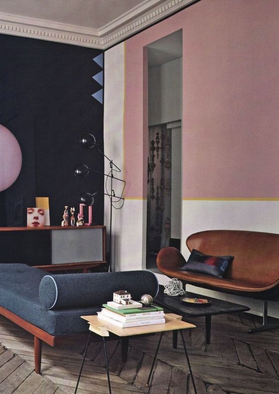
Turning to the Dark side..
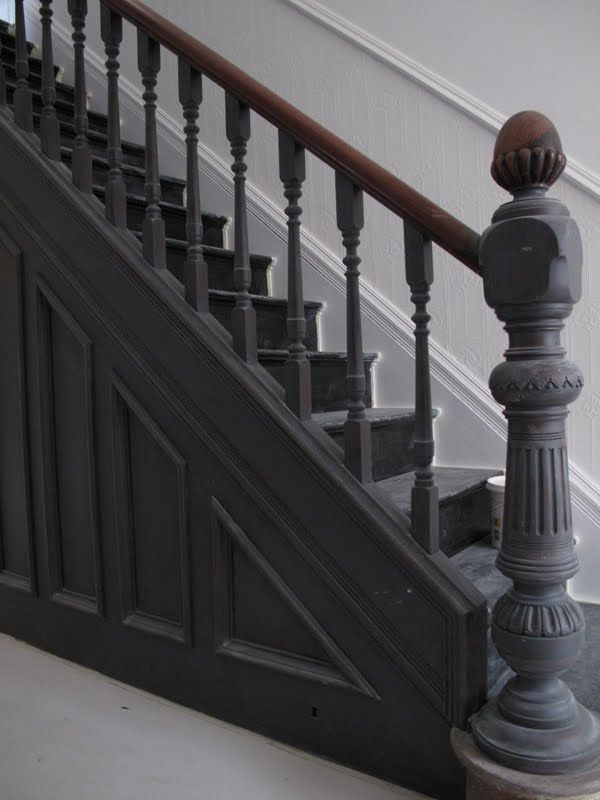
Now to decide on the colourways for the hall. This isn’t my hall, just a picture for inspiration, but I know I want the woodwork to be dark, virtually black, except how far do you go? The newel post in this picture is epic, but I can’t help feel they missed a trick not painting everything that dramatic thundercloud grey up to and including the dado. Does that mean below the dado has to be dark as well? The radiator cabinet? It’s a dilemma..
Although having it dark certainly makes wallpaper pop.

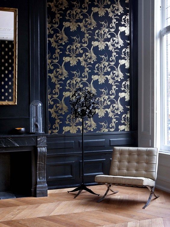
And wallpaper is a cert. William Morris if I have my way, but not this one, though the black wood looks magnificent against it.

A dark top half which directs the eye beautifully to the bamboo paper at the back. But it’s not what I want.

Dark all the way..tempting, except it’s leading into a dark room..

This is the closest picture to reality…and it’s got to be black all the way, up to and including the dado.
Decision made. Now to choose the wallpaper..
Laters, Kate x
