Category: Design
Tracy Reese x
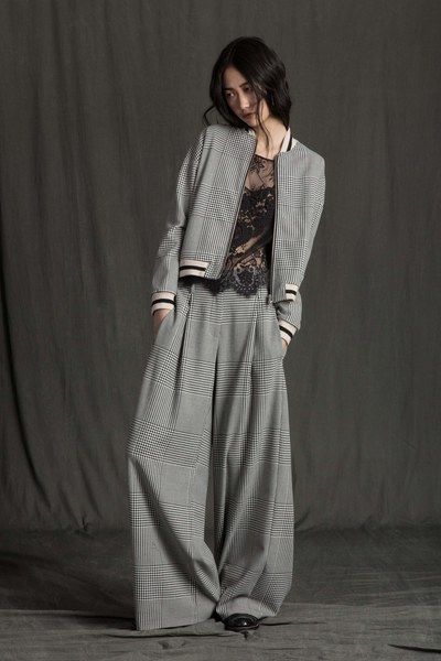
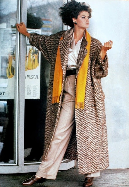
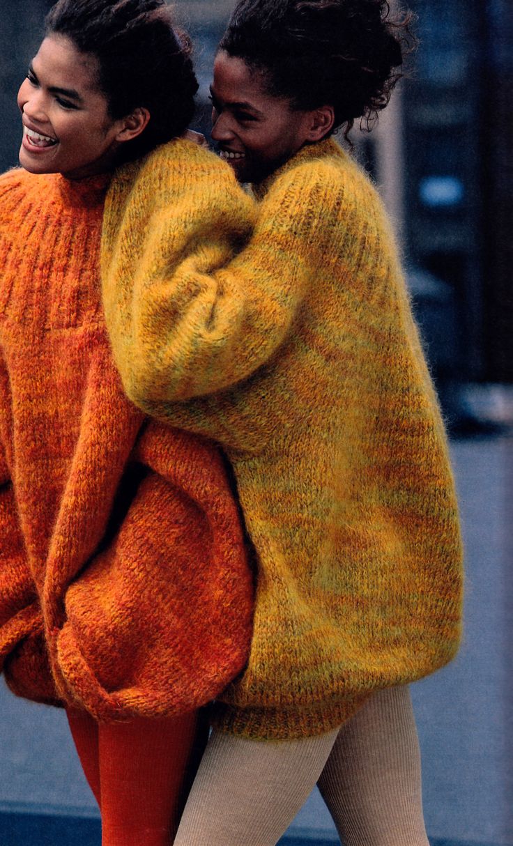
Tracy Reese is an older soul with youthful eyes who has the magic to make retro content spring to life.


She’s not a label I know – after spotting her 2016 Fall collection I went to her website to learn more expecting a continuation of this subdued, edgy elegance – and was greeted with bright, hot pink and a style more reminiscent of a catalogue shop: The site needs a makeover, because this is a rich, deep vein she’s uncovered.
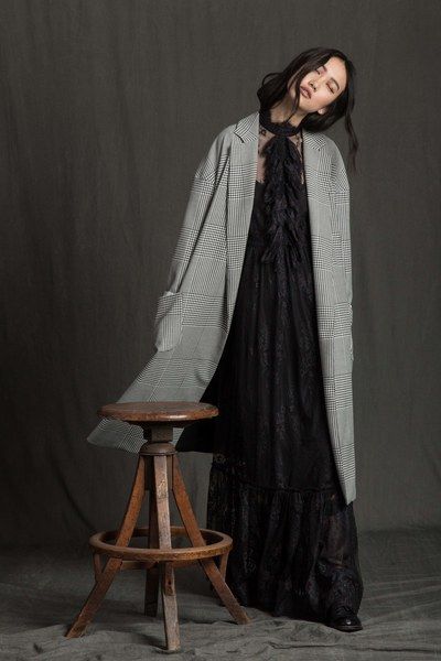

She makes large shapes and floaty lines look feminine and easy.
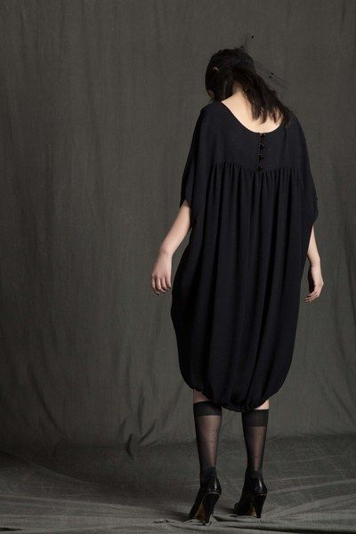
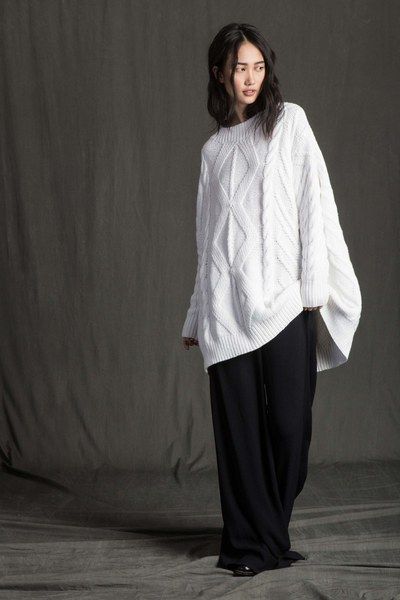
All beautifully composed and perfectly remembered.


And I want more.
Laters, Kate x
House update..
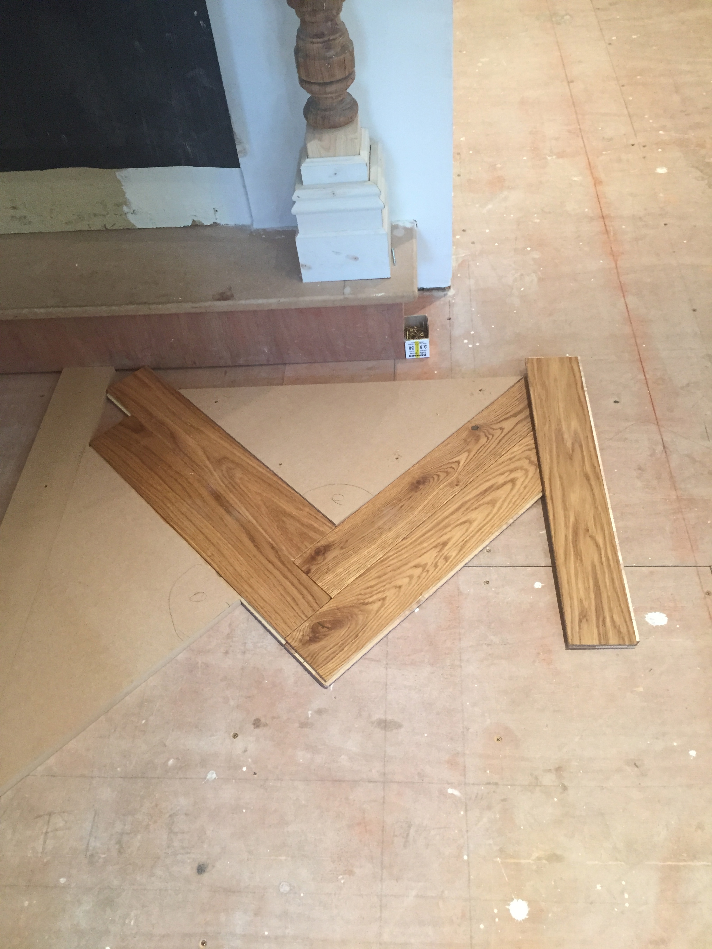
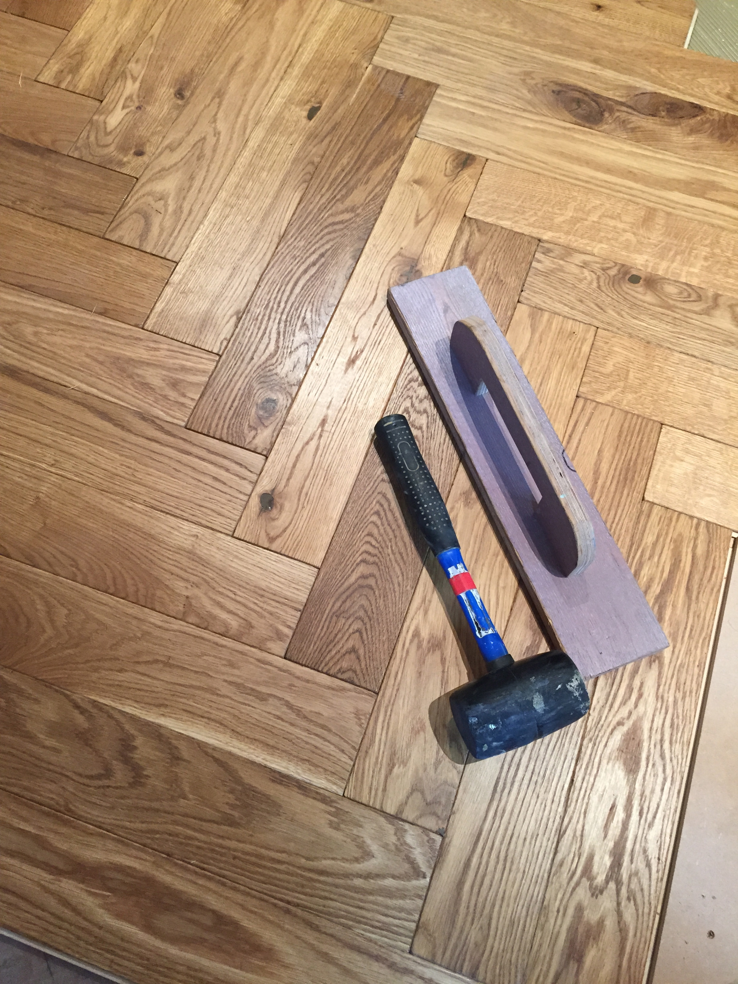
It’s becoming like Christmas here with something new every day…another major part of the build – the floor – is going down…

It’s ticking all the boxes…the choice had again been a step away from the norm as I’d asked them for as many knots/character/colour variations as possible..basically a posh design that feels rustic.
The transformation is taking a bit of getting used to – after staring at it (for what was probably hours) I gingerly tried to balance my way round the unfinished edge to get to the stairs. ‘It’s a floor!’ The builders said, ‘Walk on it!’
Except I can’t!..
(Don’t think it will stop the kids though…)
Laters, Kate x
It’s all black and white..

The good news is I’m off this morning to pick up our platform ladder from my sister…which means the serious renovation decoration is about to start.


The bad news is it’s all going to get done by paintbrush wielding me.

The good news is I like to get my hands dirty: No pain, no gain.


(All pictures Pinterest)
The bad news is…it tends to be more than just my hands..
Laters, Kate x
Backsplash Recap..
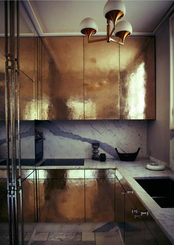
From hero to zero: After the joy of last week, all that’s now left of the kitchen is an empty room with a few pipes in the floor as it’s all been shipped to the spray painters. I committed to the final colour yesterday…nerve wracking! Particularly when you’ve had your heart set on one shade since the start…and then you’re told it’s not possible. Thank God I’m a great believer in fate..but it hasn’t stopped my heart from pounding.

But more decisions await: There was this post on splashbacks a while back and the final look still needs to be pinned down. Loving all things metallic at the moment so I’m thinking why not?


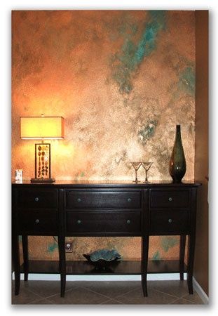

So much to choose from!
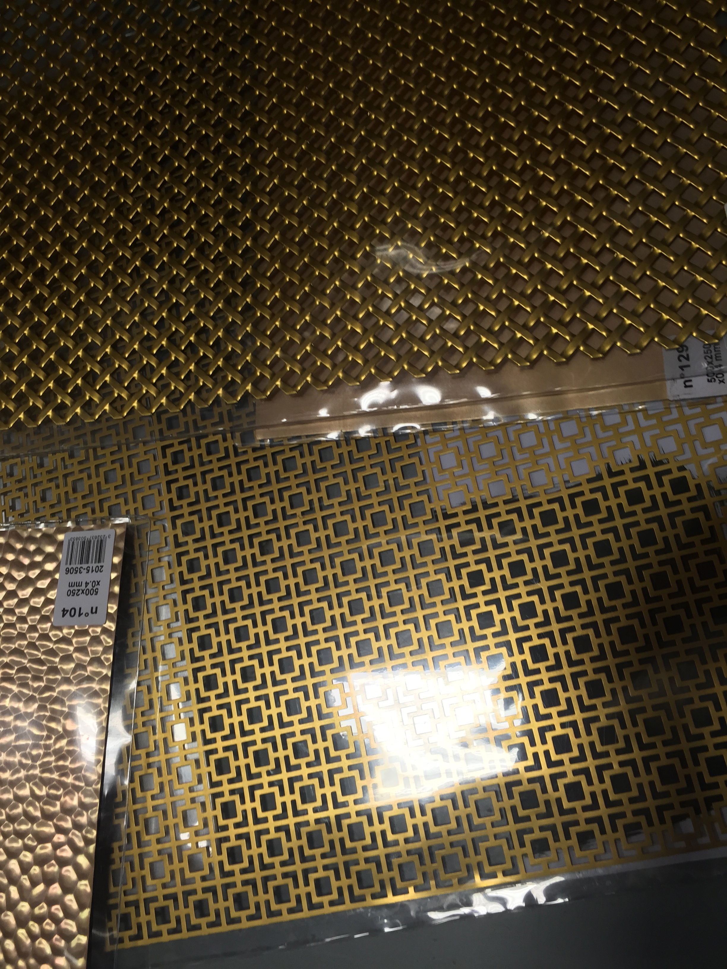
But budget does come into it..so I took myself off to bog standard B and Q to see what I could find that could be man-handled into something different…and was surprisingly successful. There’s this woven brass sheet, reminiscent of French Bergere sofas and chairs..
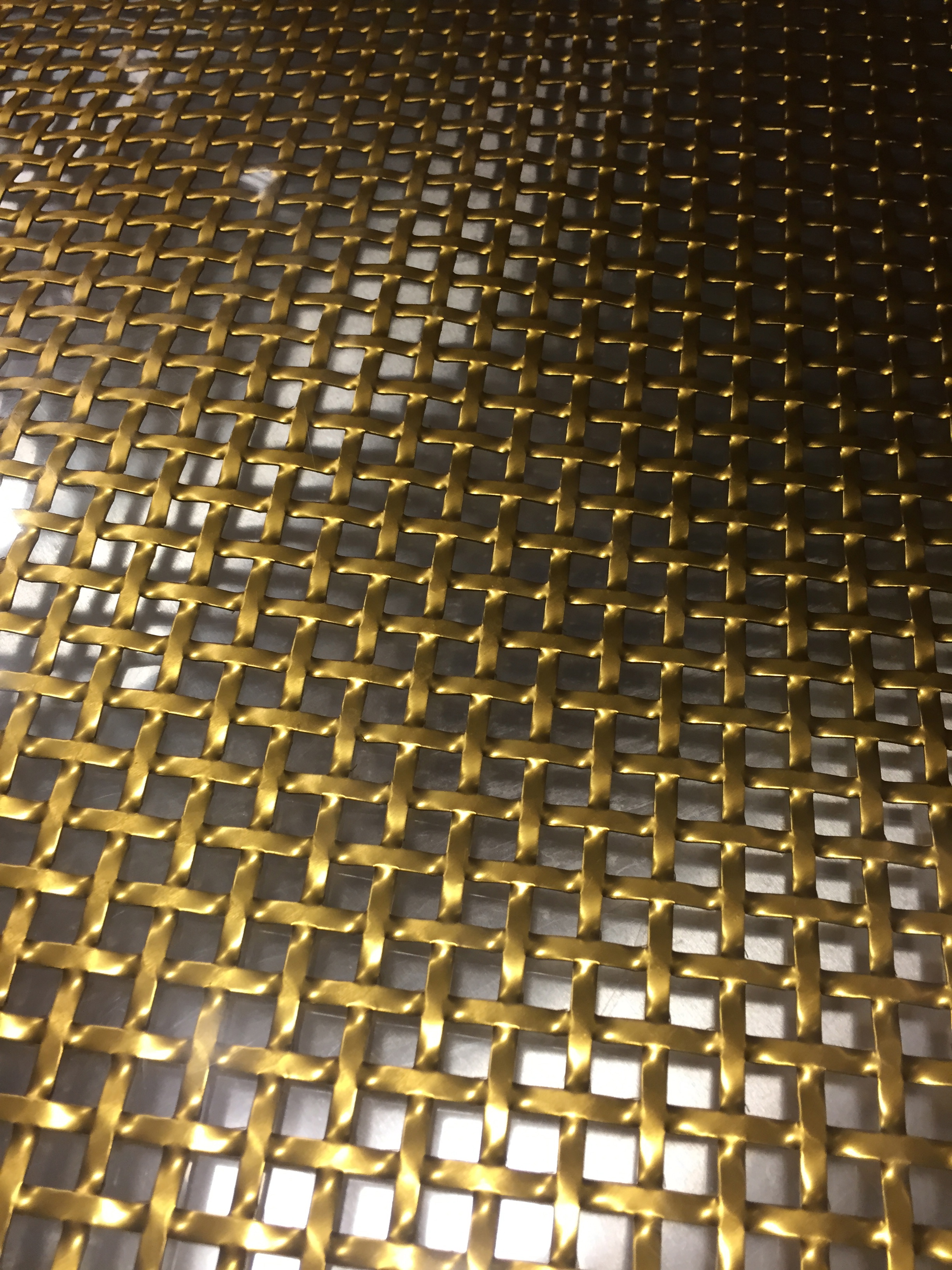
Laid over a stainless steel sheet it would compliment and pull in the stainless steel from the fridge/freezer..

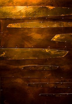
Then there was this design..if the design itself had been bigger I would’ve snaffled it up there and then..

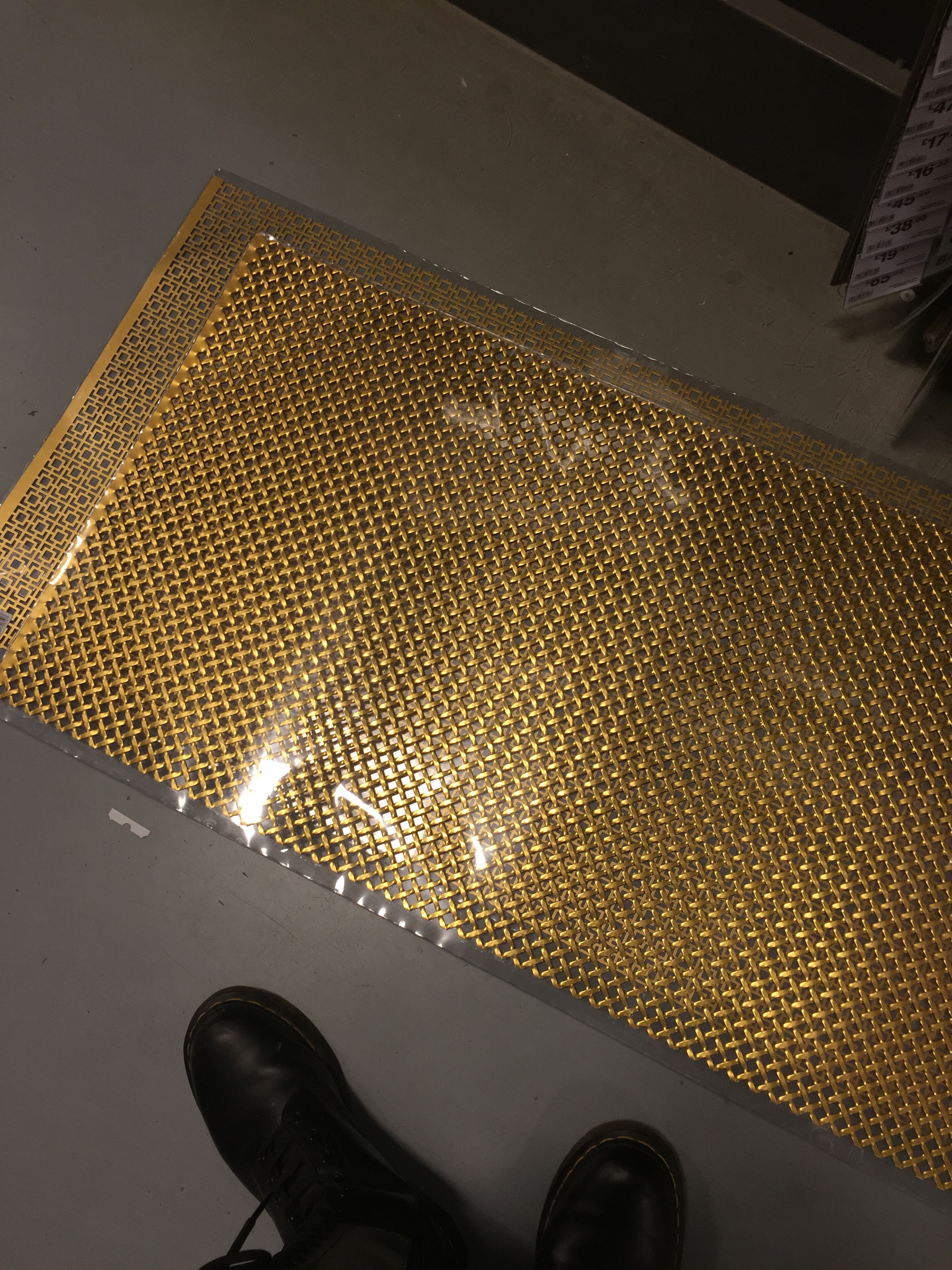
And then they had this..hammered copper rather than brass..again, not sure as it was only in the smaller size..and all the accents are brass..would pink work??
(All pics Pinterest)
I was sensible..there’s no rush – yet. So I walked away and will let it all cogitate and stew down…
Laters, Kate x
The Underworld x
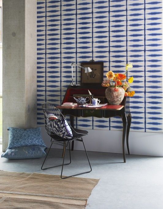
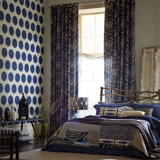
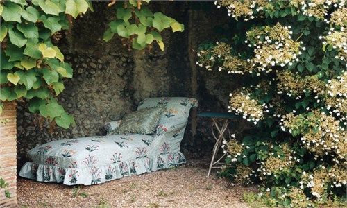
The hunt for the perfect wallpaper goes on. One group of designs that would’ve be way off the radar a few years ago but are ticking the boxes now are the tie-dye patterns.

There’s something about the way they repeat that looks so natural and realistic..as if they’re not repeating at all. Which, let’s face it, has to be a good thing…
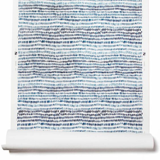
Or maybe it’s the memories of a happy summer’s day in the garden.
.

(All pics Pinterest)
They’re probably more suited to a bathroom or bedroom than a cellar…but there’s just something about them..
Laters, Kate x
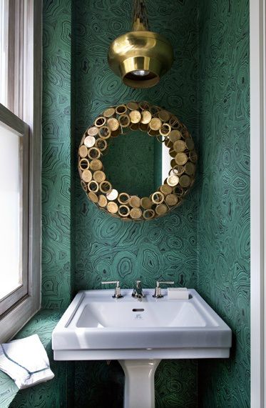
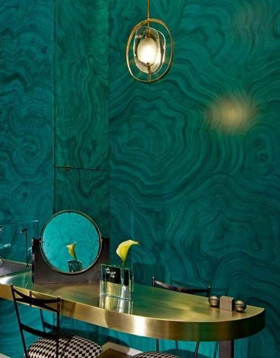
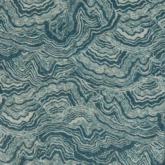
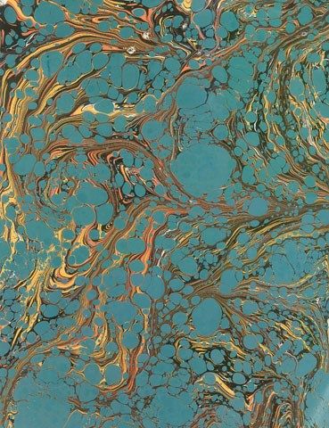
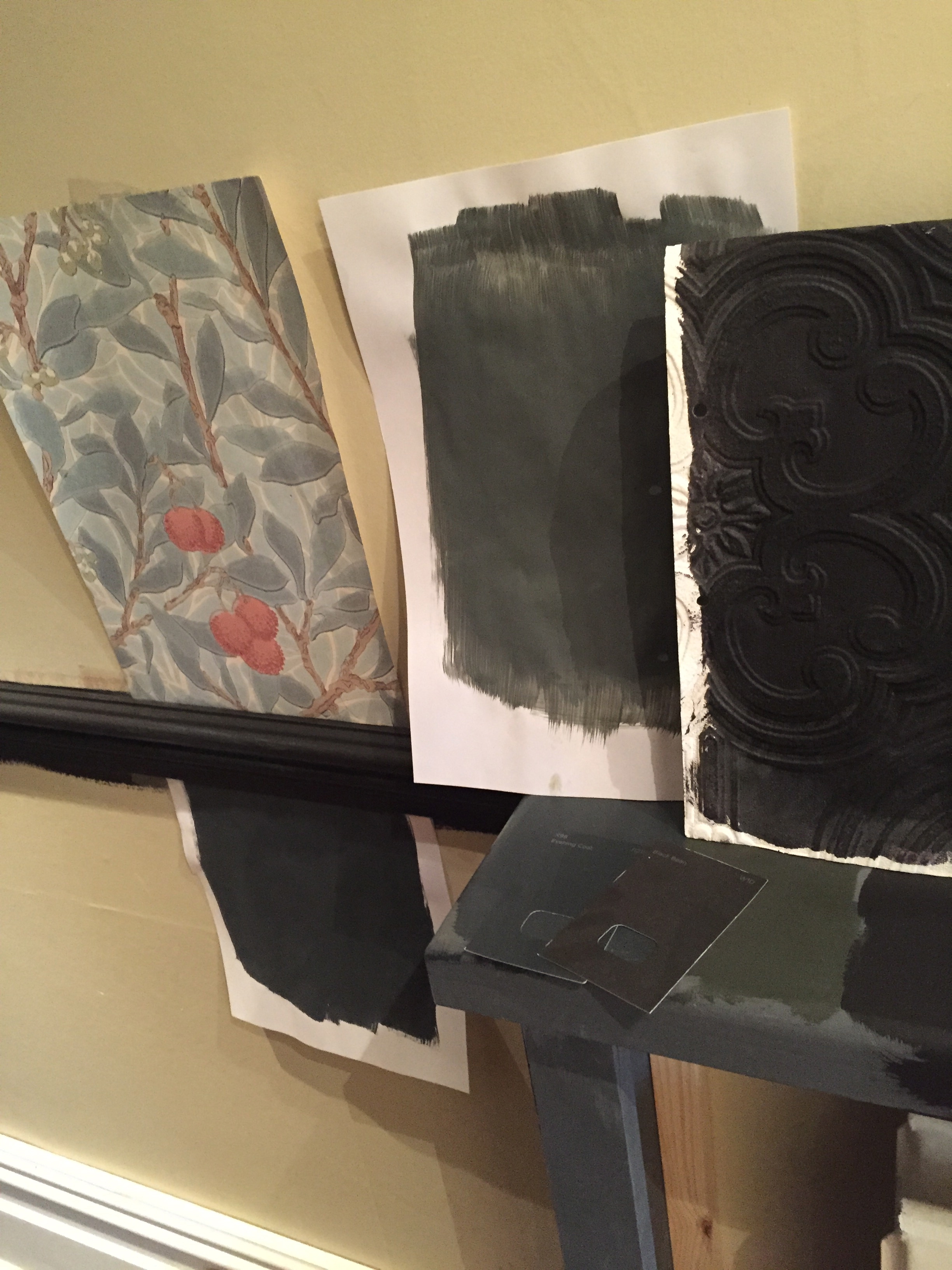
Marbled Marvels..

It’s that time of year: sick children…one coughing her way through the night which is the natural equivalent of chinese water torture, the other with a weeping ear and suspected perforated eardrum. Winter – don’t you love it? At least there’s beautiful wallpaper to keep the blues at bay. The final choice for the cellar (can I really keep calling it that? (but cinema room sounds so pretentious..)(such a first world dilemma)) has yet to be made: There’s three choices and this post represents the first group…a marbled/malachite paper with the hint of unusual mixed with traditional, timeless beauty..


I’m going to trawl the internet to see what I can find that’s UK based…but first we’re off to the quacks…
Laters, Kate x
An Update: House etc..
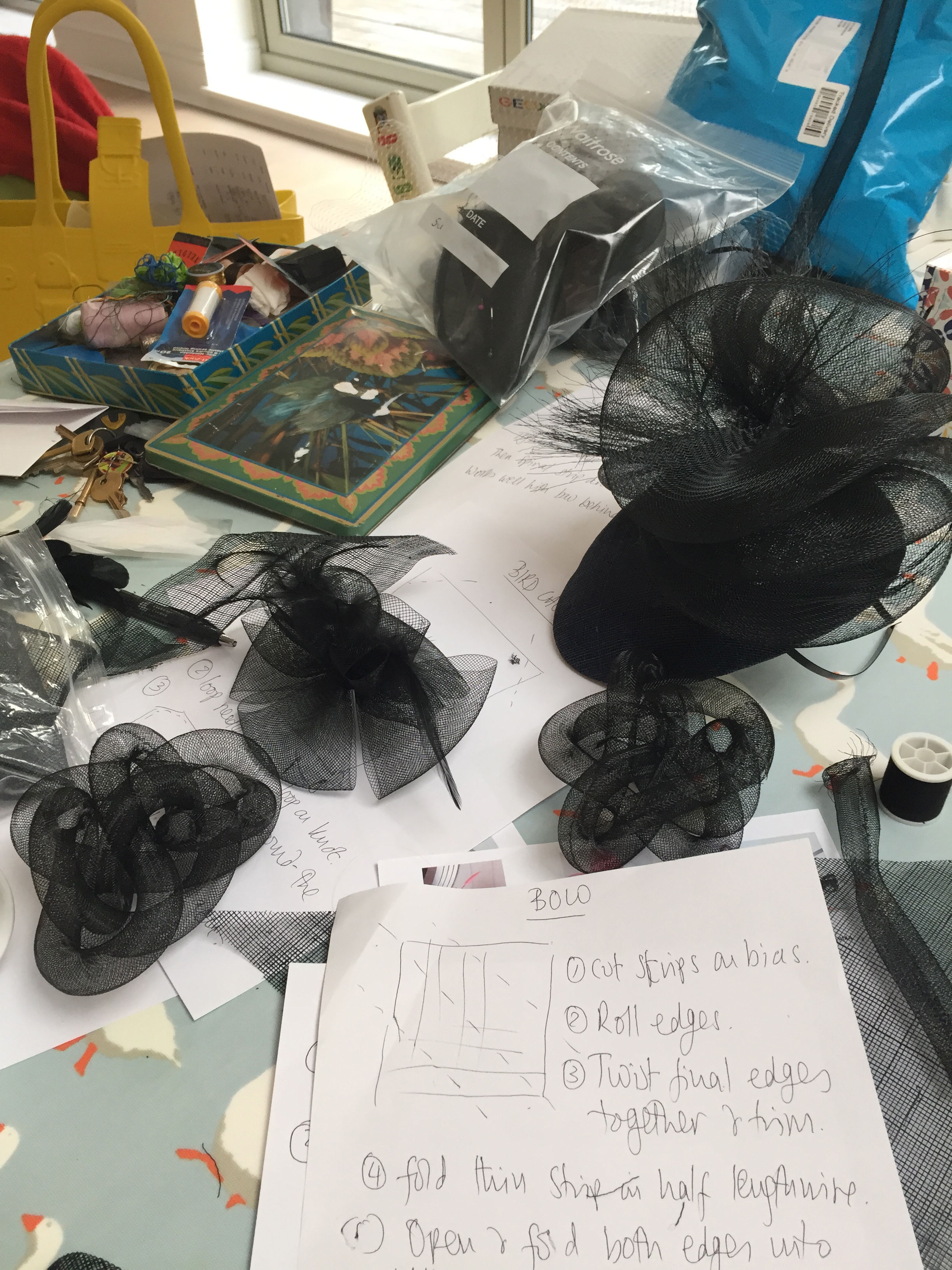
Yesterdays fascinator experiment went well..I was thinking of you Julie (hattitude) as we marshalled in the sinamay into shape! Could’ve done with your skill!!
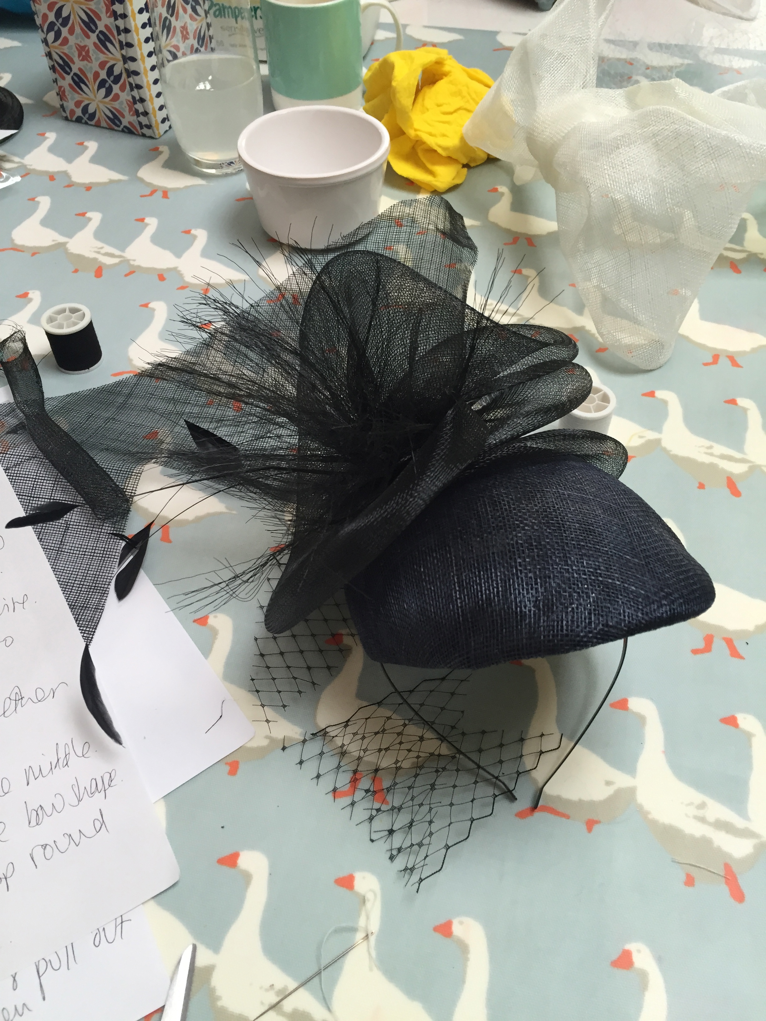
No real finished ones to reveal yet..(the first official creative coffee is on Wednesday) but I think we’re a bit more prepared..

(It’s great stuff just to let loose and play with..I recommend it.)
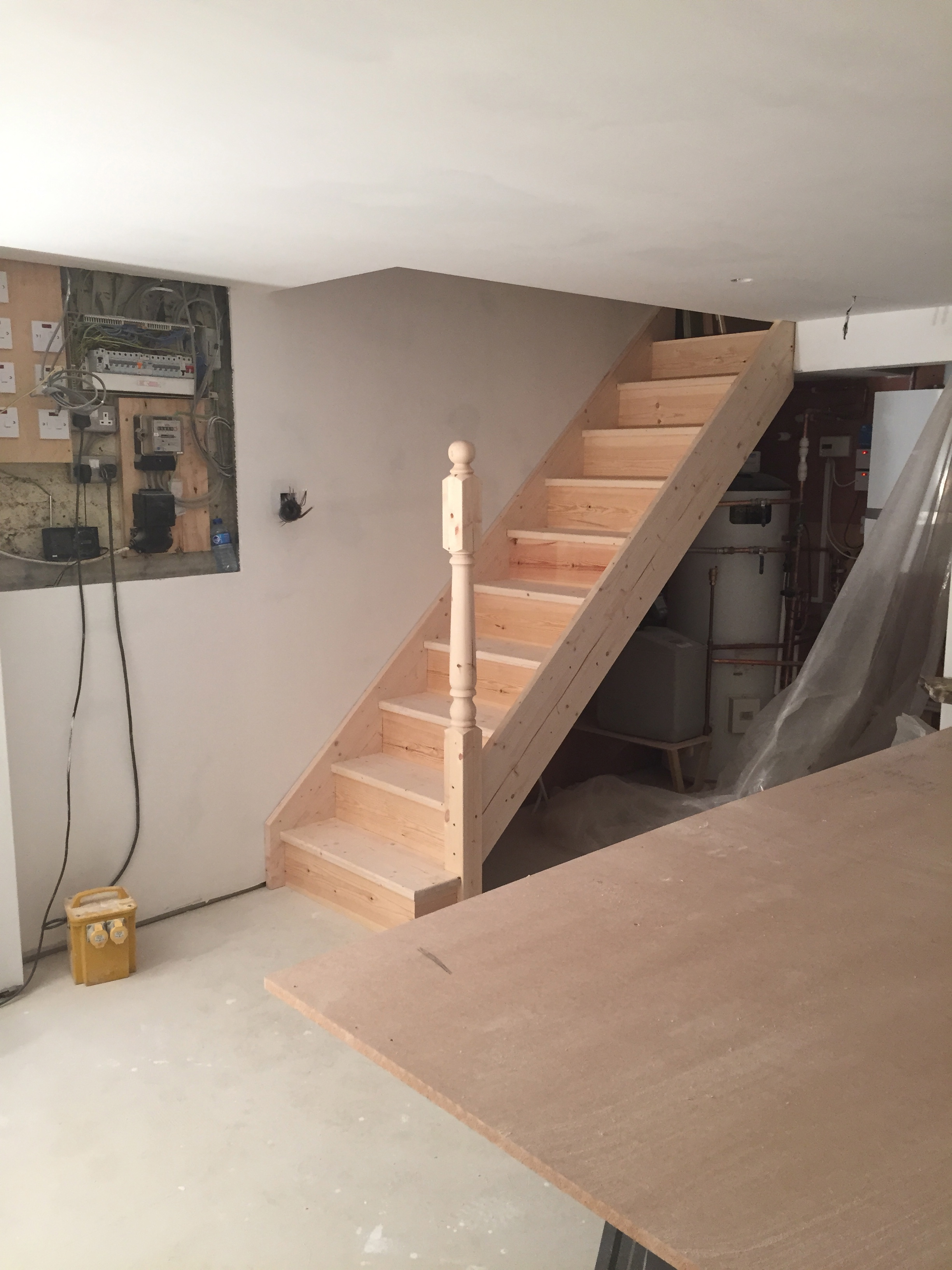
On the house front, there’s no longer a broken neck risk checking out the cellar…we now have stairs!..

Upstairs…could that actually be a sink in the kitchen??!

To the unknowing eye, this all just looks like mismatched piles of wood..

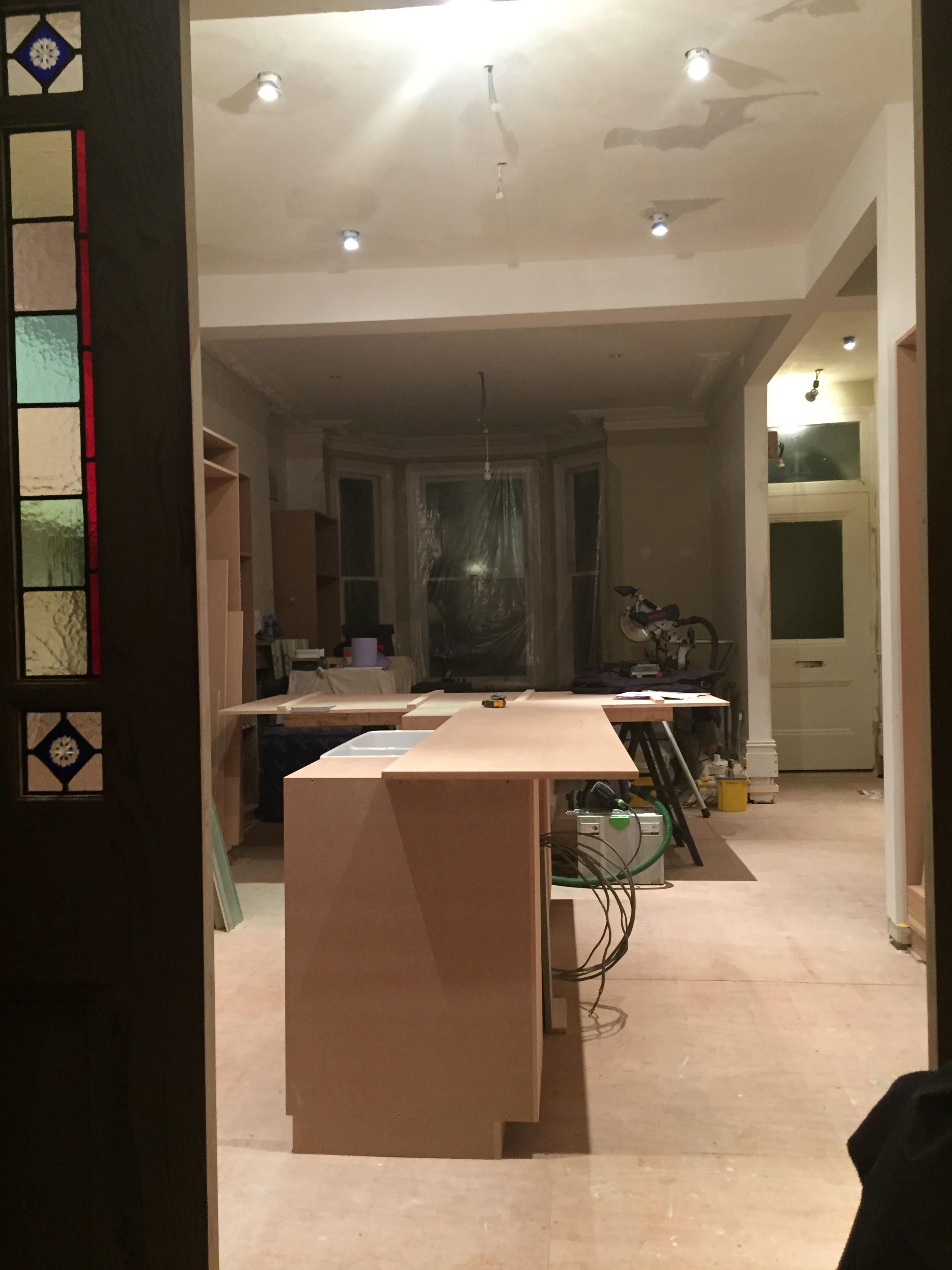
To me, it’s the light at the end of the tunnel..(even knowing, once it’s made it’s coming out (sob!) to be painted (and so the floor can go down))..but this is pure progress. We may even have a working bin soon – the excitement, the luxury!
Laters, Kate x
Raw Talent x

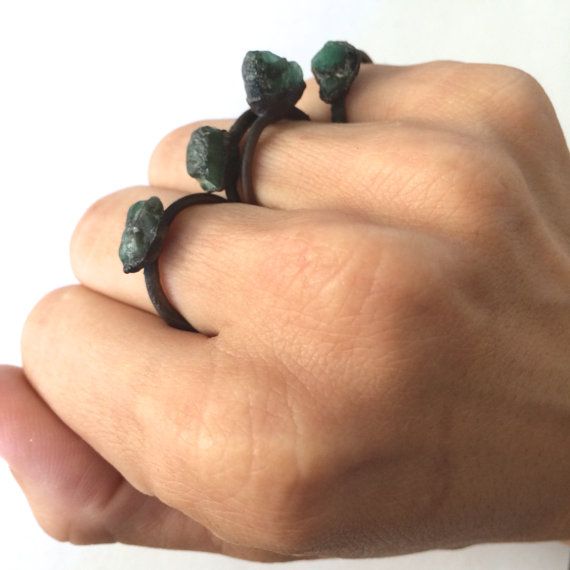
Jessica Kramer is my new arthouse-slash-fully-fledged-rockstar (of the jewellery kind) and the maker/owner of Hawkhouse. She’s been a wanderer and traveller, soaking up the sights and sounds of six of the seven continents of the world before love made her drop anchor or as she says ‘Wild woman falls in love with island boy and signs up for Etsy’. Her story and all it’s wonder is ingrained in her pieces.


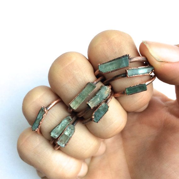
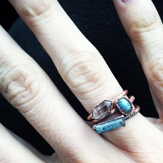

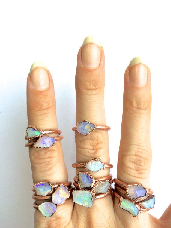

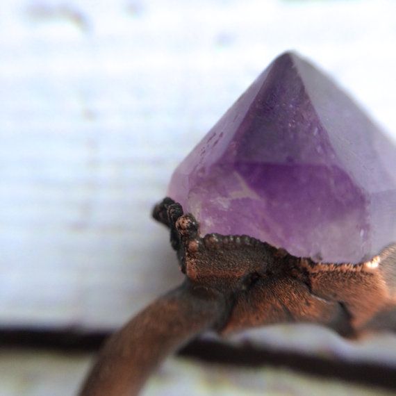
Her works are frank and forthright without the slightest glint of superficiality, just pure natural beauty shining through.
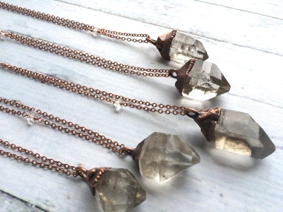
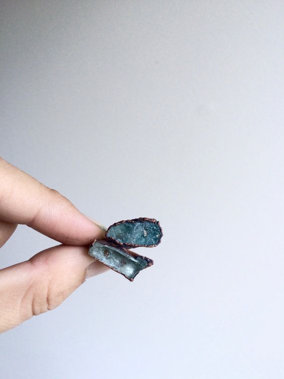
There’s a visceral feeling of groundedness (is that a word??) straight talking and sincerity.
(All pictures Hawkhouse and Pinterest)
Designer prices? No – everything, even the uncut emeralds above are around the £40 plus shipping; This is outside the brain boil of mainstream madness, brand and oneupmanship, here it’s honesty and integrity that take centre stage and run straight through the middle of every single piece.
Just simply inherently cool.
Laters, Kate x
Bees Knees x

In my virtual world, this is what I look like today.


Exif_JPEG


(All pictures Pinterest)
Proving that old is always new….which gives me endless hope!
Laters, Kate x
The Hall x

Time to decide which wallpaper makes the cut for the hall which is a bit like going into Willie Wonka’s chocolate factory and just choosing one ickle bickle flavour. How do you pick?
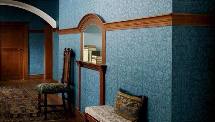
It will be William Morris because he is my interior design hero and God. But that hardly narrows the field down.
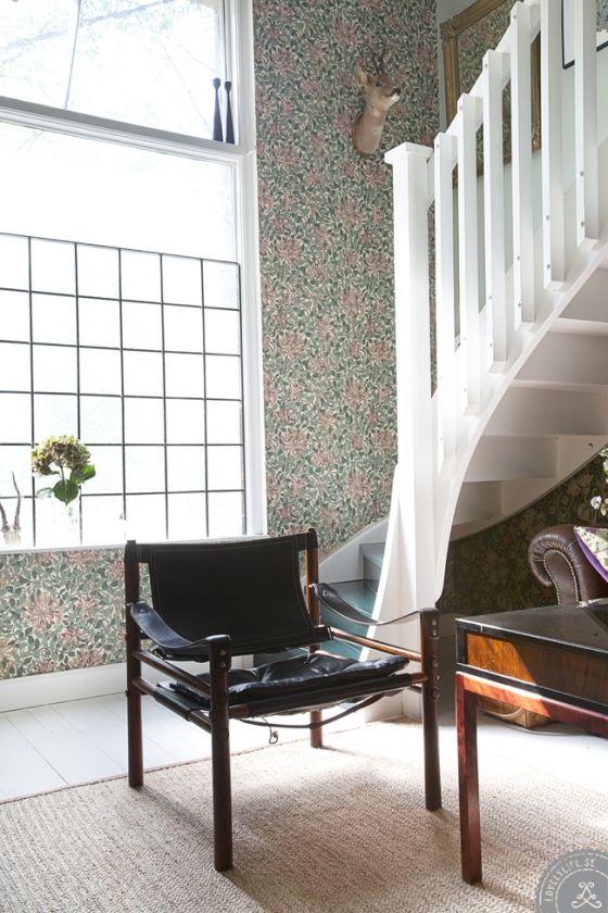
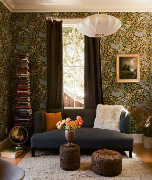
I’ve discarded some of the darker patterns, just because I’m going darker…on the dado and skirting boards..and in the kitchen..and sitting room..and cinema room..hey ho – just call my home a cave..

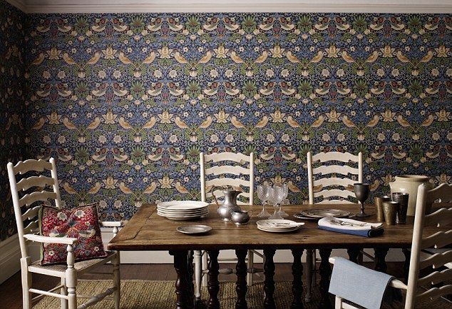

I’m thinking this one – Arbutus – could be it…There’s something about the 3D effect of the leaves and their blue/grey colour..
Decisions, decisions…
Laters, Kate x
