Tagged: wallpaper
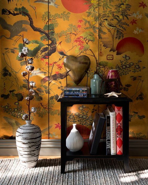
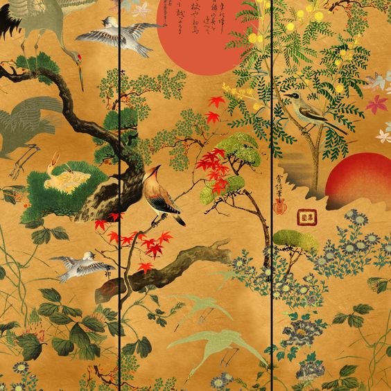
Mind The Gap x
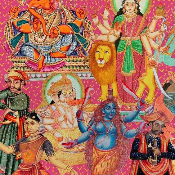
I was talking to a friend the other day about wallpaper for a downstairs toilet – always such an interesting room because it’s hidden away and small, meaning the imagination is free to fly – as are the purse strings; always a Brucie bonus. My first thought was for some classic Cole & Son; strong, contemporary that sing quality. But then I thought – how nice it would be to find something different that nobody else has – and remembered ‘Mind The Gap.’


(All pics Pinterest and Mind The Gap)
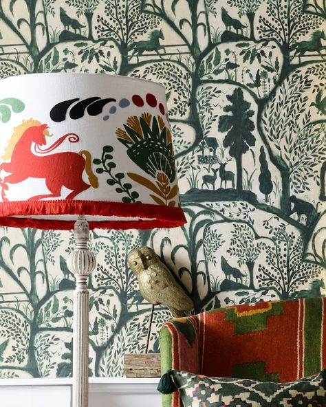
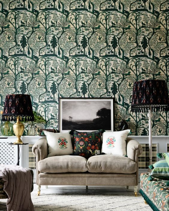
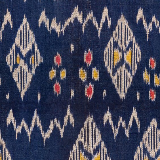
Bold, dramatic and timeless – but what more would you expect from a company based in Transylvania?
Laters, Kate x
Trends x
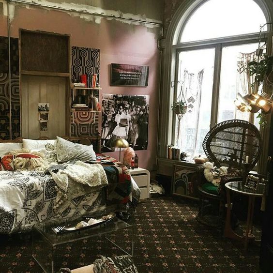
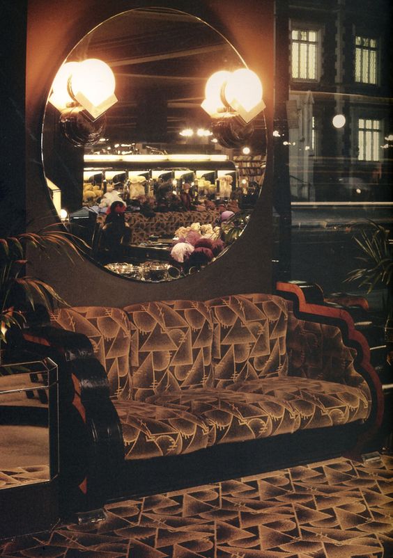
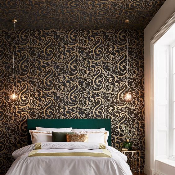
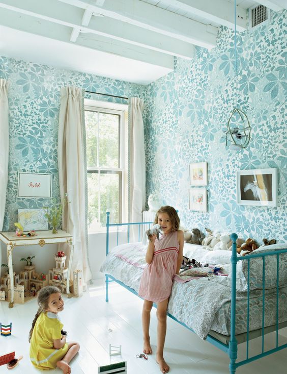
Has anyone else watched Good Trouble on BBC iplayer? Easy binge watching, like an ever replacing tube of paprika Pringles. One of the main stories is following the trial of a black man shot by police. Prophetic when you think it was made in 2018. But not so when you think how many times a shooting of a black man by police has happened. But it’s the interiors that have stolen my heart. Set in an old movie theatre in the City of Angels – both elements a pleasant spin on the habitual backdrops of New York – the vibe is high ceilings, large spaces, gorgeous flaking period features, with the implication that taste is always more important than high spend, except this would obviously cost for those not in the know, except of course these people know, except they don’t, because it’s all so artful and effortless for them. There’s one particular room – other than the library, the kitchen and the pool – to die for. And that’s Malika’s bedroom – on the wall by the bed is black and gold geometric retro wallpaper, inspired by Art Deco, mixed with the swinging sixties and oozing the era of Biba and Barbara Hulanicki – and it’s singing a sweet song of ‘my time is coming again…’


In fact, Barbara Hulanicki has been designing in her signature style for Graham and Brown wallpaper.


(All pics Pinterest)
Black and gold, geometric patterns circa Biba. It will be a thing.
Laters, Kate x
Simples x

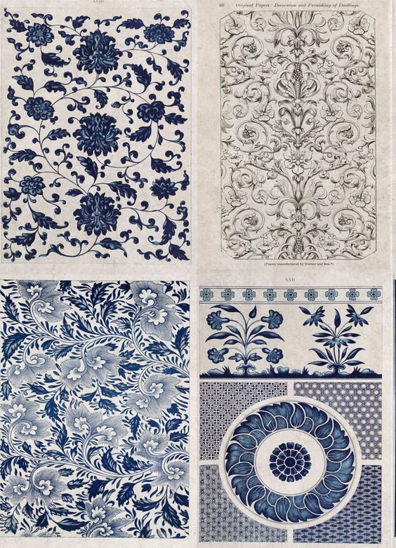
Pigeon holes, dividers, stereotypes all designed for easy short hand and sometimes lazy labels, because look further and who knows what you’ll find; this simply, but strikingly effective wallpaper comes from a heritage brand set up to promote what some would consider old fashioned chintz.

Mrs Henry Parish is considered to be one of the last of America’s grande dame decorators. Founded in 2000, Sister Parish is a homage brand whose aim is to bring back the prints and papers that Mrs Parish loved.


(All pics Sister Parish and Pinterest)
It’s timeless elegance on a hot day, blue skies, green grass, the distant sounds from a pool, and always a cool, gentle breeze.
Laters, Kate x
Paper World x

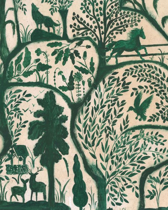
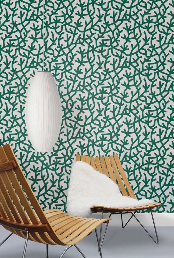
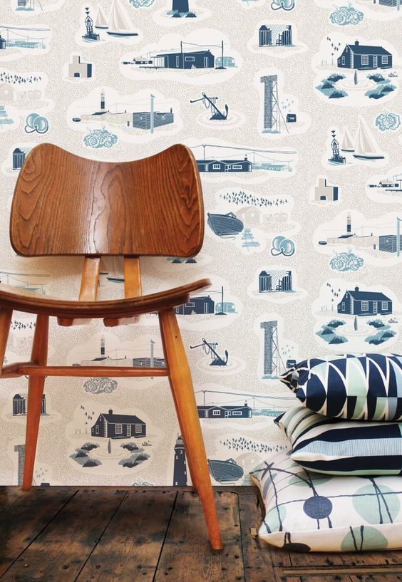
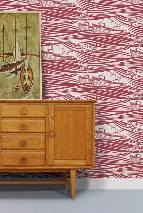
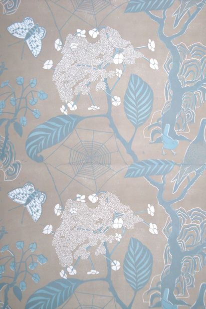
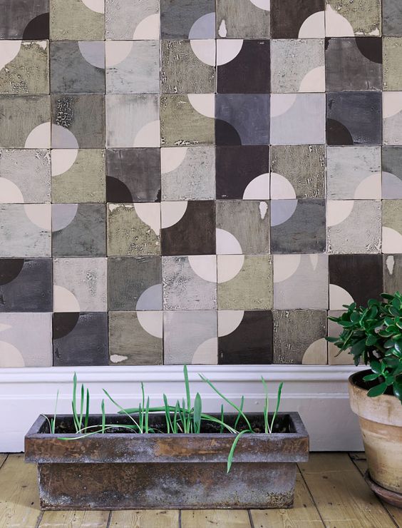
A little slice of heaven: I’ve found the most brilliant, thrilling, wallpaper site: Mind the gap. Like the jewels on a crown, or dew drops on a spider’s web, it’s a cornucopia of treasures..and from the most unusual source: Romania. All ideas of ever starting a wallpaper company have been banished, because if I did, this would be it..
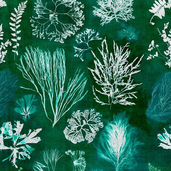


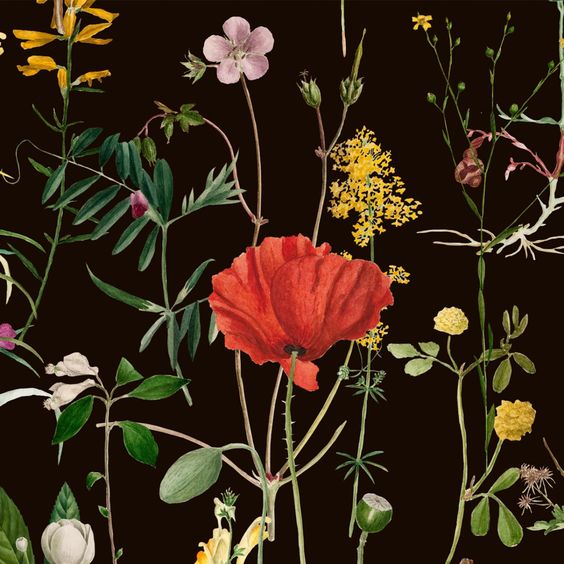

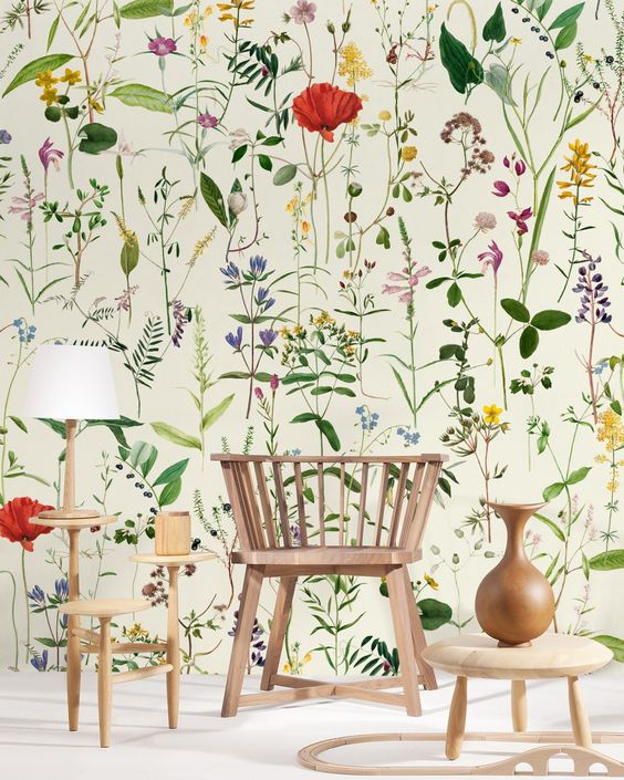


(All pics Mind the Gap and Pinterest)
Price wise it’s £150 for three rolls, which means it’s a consistent splash…but not selling off organs silly.
Not that that would necessarily stop me….
Laters, Kate x
Minimoderns x

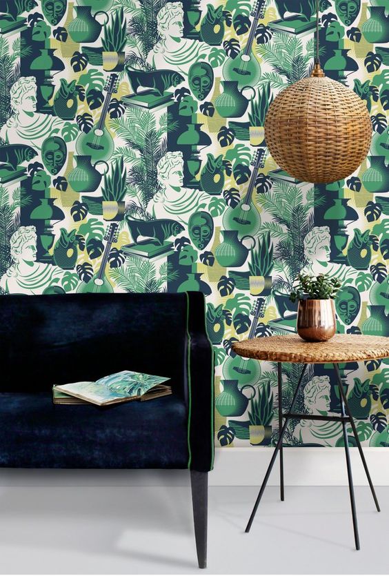
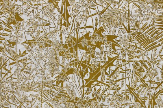
The driving force of Minimoderns is pattern with a story: The founders, Keith Stephenson and Mark Hampshire view what they produce as applied pattern across a range of products, including some incredible wallpapers. It adds a pleasant change, a certain flavour. A different slant.

Their design influences range from mid-century British textiles to vintage toys, literature and even childhood memories.

(Love this for a boys room)

It’s the detail..
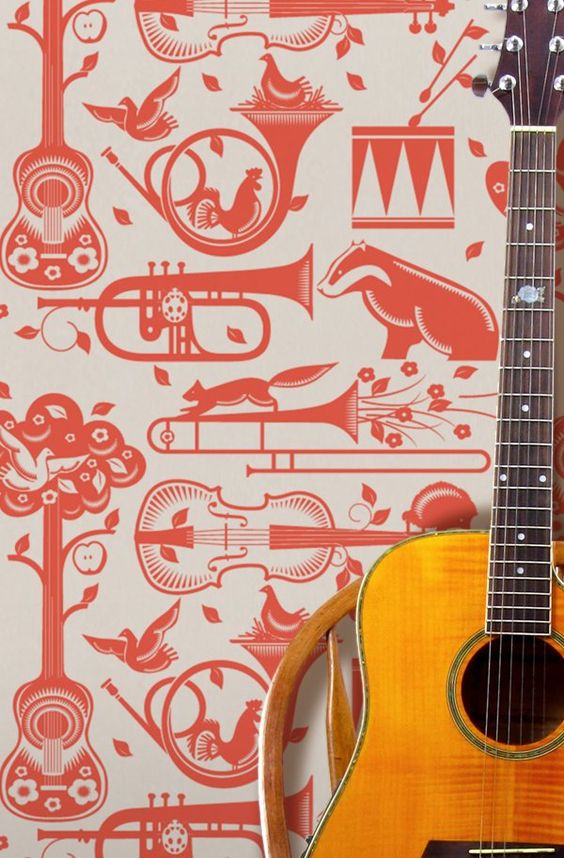
Wallpaper, trombone and badger are three words I never expected to use in a sentence.
If you want retro nostalgia with design integrity and are not afraid of making a statement, look no further.
Laters, Kate x
Revelation x
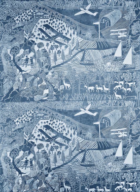
There are many things that science can still not explain so maybe I have died and gone to heaven, such is my delight at discovering the designer and maker of this wallpaper and her treasure trove of work.

Marthe Armitage graduated from Chelsea School of Art after World War 11. Faced with the problem of juggling young children, she started designing and lino-cutting her own wallpapers. After sketching the design she uses the hand-cut lino blacks and a century-old offset lithographic printing press that she has owned for over 40 years to created custom-printed rolls of wallpaper.

Not only does she create an object of desire but a lifestyle, a passion and a calling.

Maybe she’ll adopt me?
(Link here, all pics Pinterest)
Before my idol was William Morris, but it’s the seductive meanderings of Marthe’s work that pull at the heart strings and make eyes glow.
When my boat comes in, this is the wallpaper that will adorn my walls.
Laters. Kate x
Pure Moss x

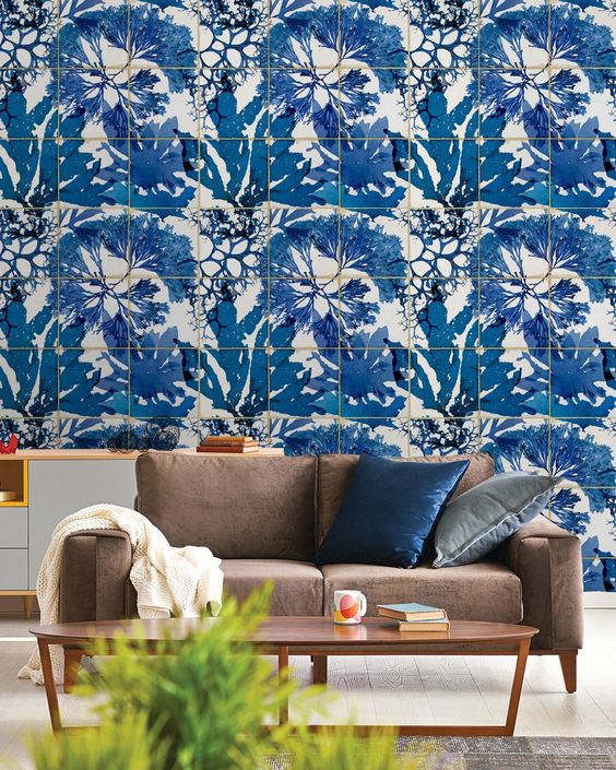
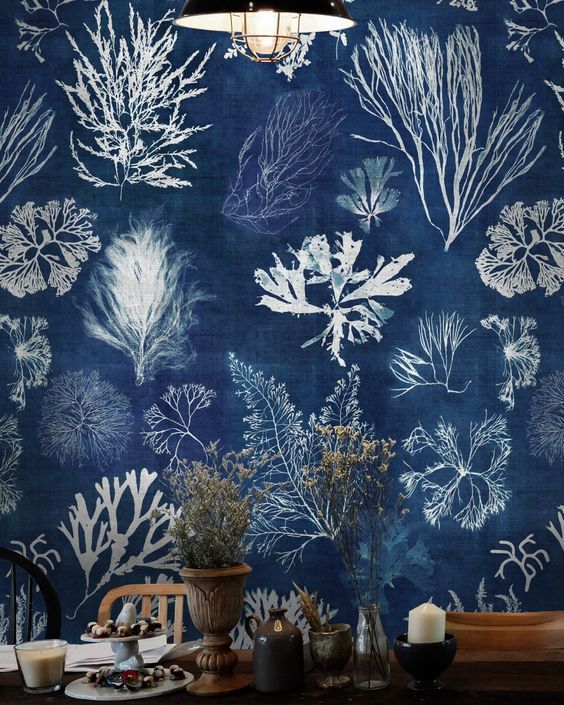
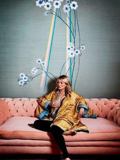
‘Picture a summer night when it goes silvery-blue from the light of the moon’ Is how Kate Moss describes the inspiration behind the wallpaper for her bathroom.

Based on silver-tinted anemones symbolising luck in Greek mythology and interspersed with shards of solar radiance, the wallpaper is the creative result of a collaboration between Moss and De Gournay, the bespoke wallpaper house.
(All pics Architectural Digest)
The hall is now proudly adorned with the daybreak version. ‘I like the feeling of when the sun is just coming up at a festival and you have that glowy light.’ It’s all pale pastels and bright, in your face neons.
A match made in heaven.
Laters, Kate x
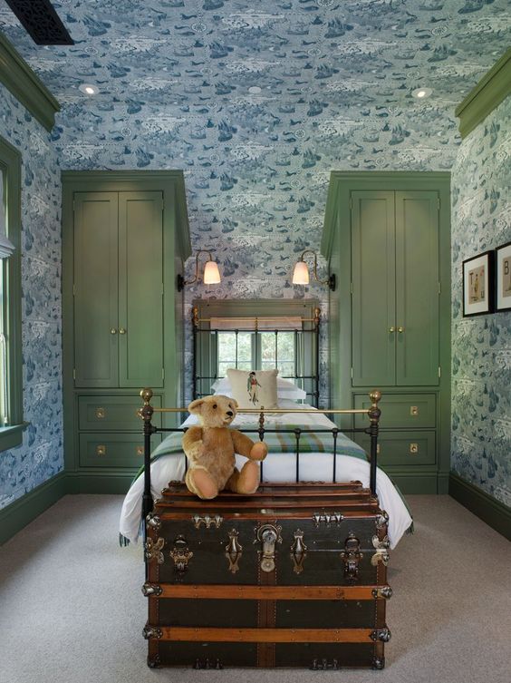
7 Hammersmith Terrace

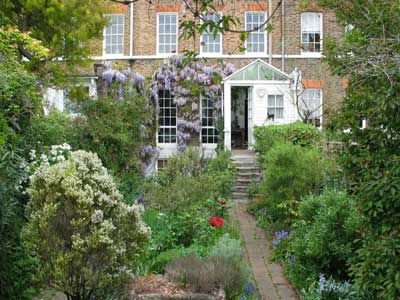
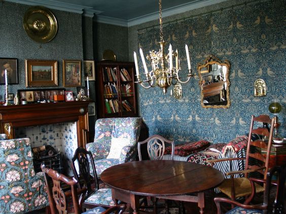
There’s a new place ripe to visit: No. 7 Hammersmith Terrace, once the home of printer Emery Walker has just been re-opened to the pubic and proudly boasts the most complete and authentic Arts & Crafts interiors in the UK. Delights include hand blocked Morris & Co Wallpaper, a veritable smorgasbord of textiles and authentic Philip Webb furniture. Deep sigh..few houses in the world have original Morris & Co wallpaper on every floor in nearly every room…but this one does.

Walker was a key member of many of the organisations that embraced the ideals of the Arts and Crafts Movement and as such was a close friend and mentor to William Morris.

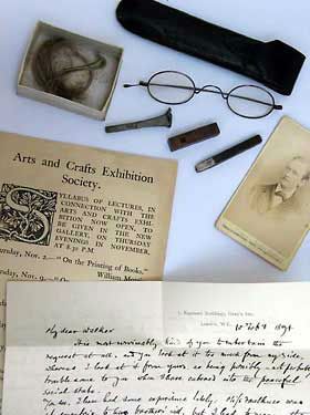
His house has just undergone an eighteen month renovation – during the process all sorts of delicious discoveries were made like letters from Rudyard Kipling used as book marks and spectacles belonging to Morris with cuttings of his hair in a desk drawer. It is a living and breathing time capsule.


Could be my new favourite place in London…
Laters, Kate x
Smallest Room Part 2

The wallpaper we made over the holidays?

Despite just using the basics: Lining paper, leftover emulsion paint and cut up sponges – has worked a treat.

(Even though it meant embracing chaos)


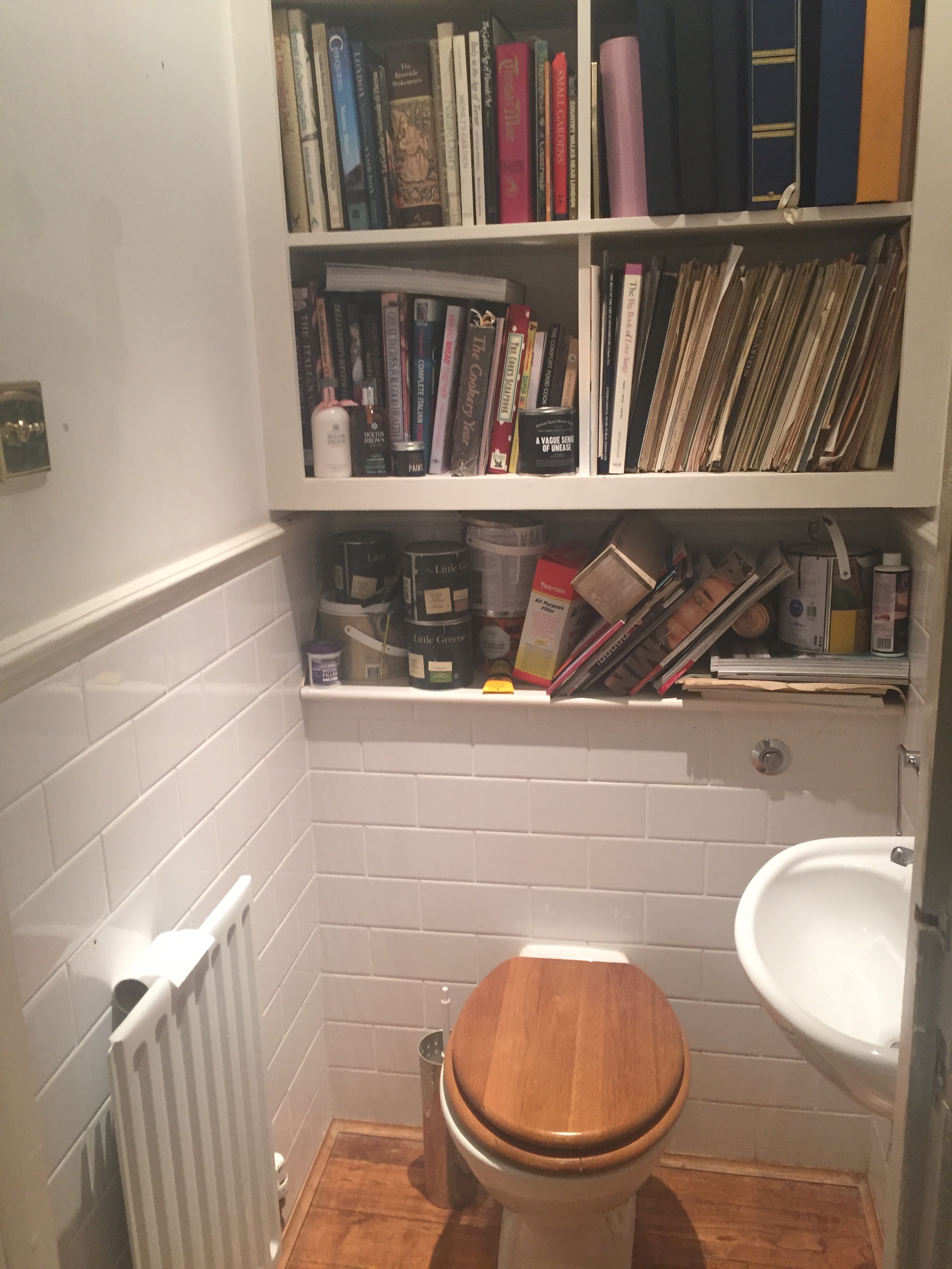
This was the before state of the downstairs toilet. A mini dumping ground of DIY and general clutter.

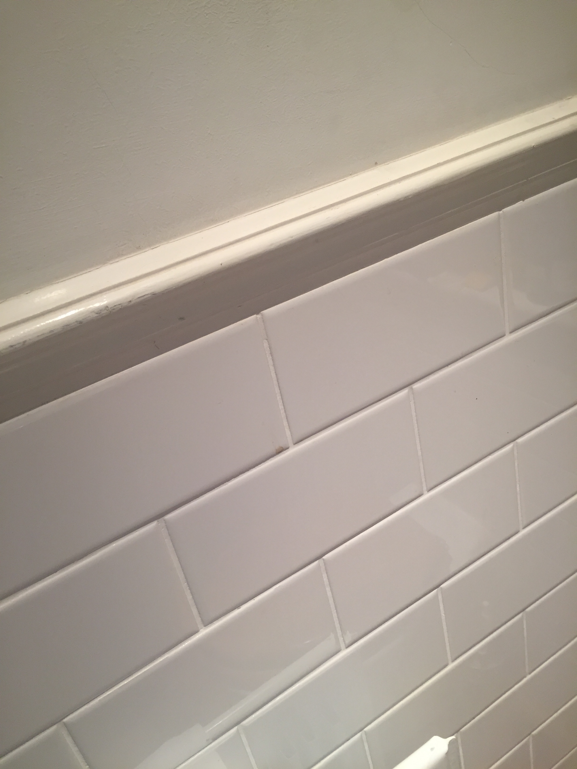
First step was a deep clean of the tiles. Vinegar, though powerful on the nostrils did the job. A little bit of re-grouting was needed – and then I was going to dye the grout a dark grey, but I was concerned the new grout was of a different consistency – less chalky, more rubbery so would they dye the same colour? It was an easier decision to not risk it. Besides the new pristine white of the tiles was impressive. Finally, paint – white on the ceiling and the Little Greene Paint Company’s French Grey Dark on the woodwork which is a soft, pinky grey that seems to blend with any thing. A continual stream of Radio 4 plays on the ipad helped the process along..
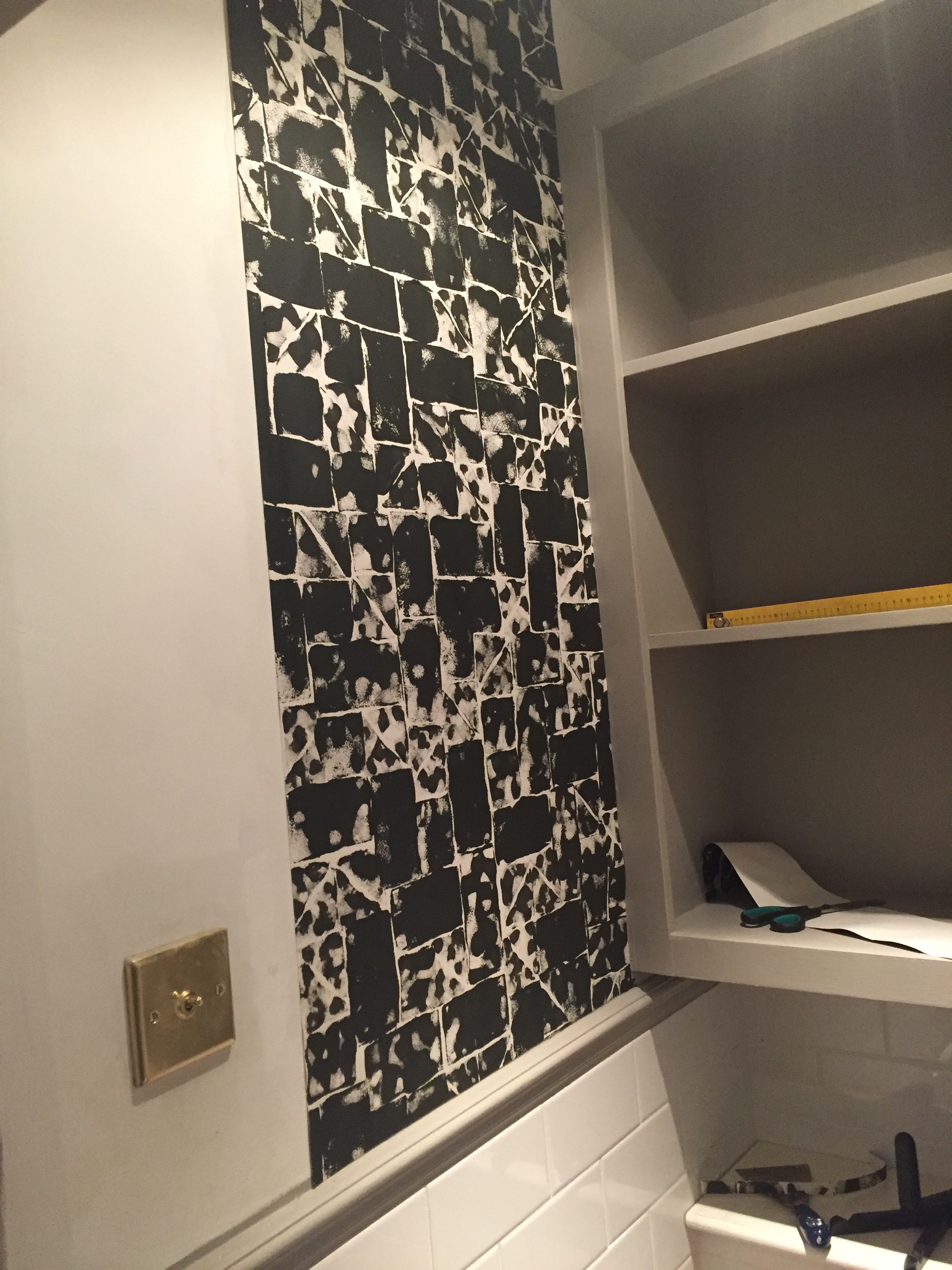
The wallpaper went up easily: The lining paper was one of the thickest available and was aided by both pasting the wall and paper, and leaving the paper for a few minutes to fully soak up the wallpaper paste.
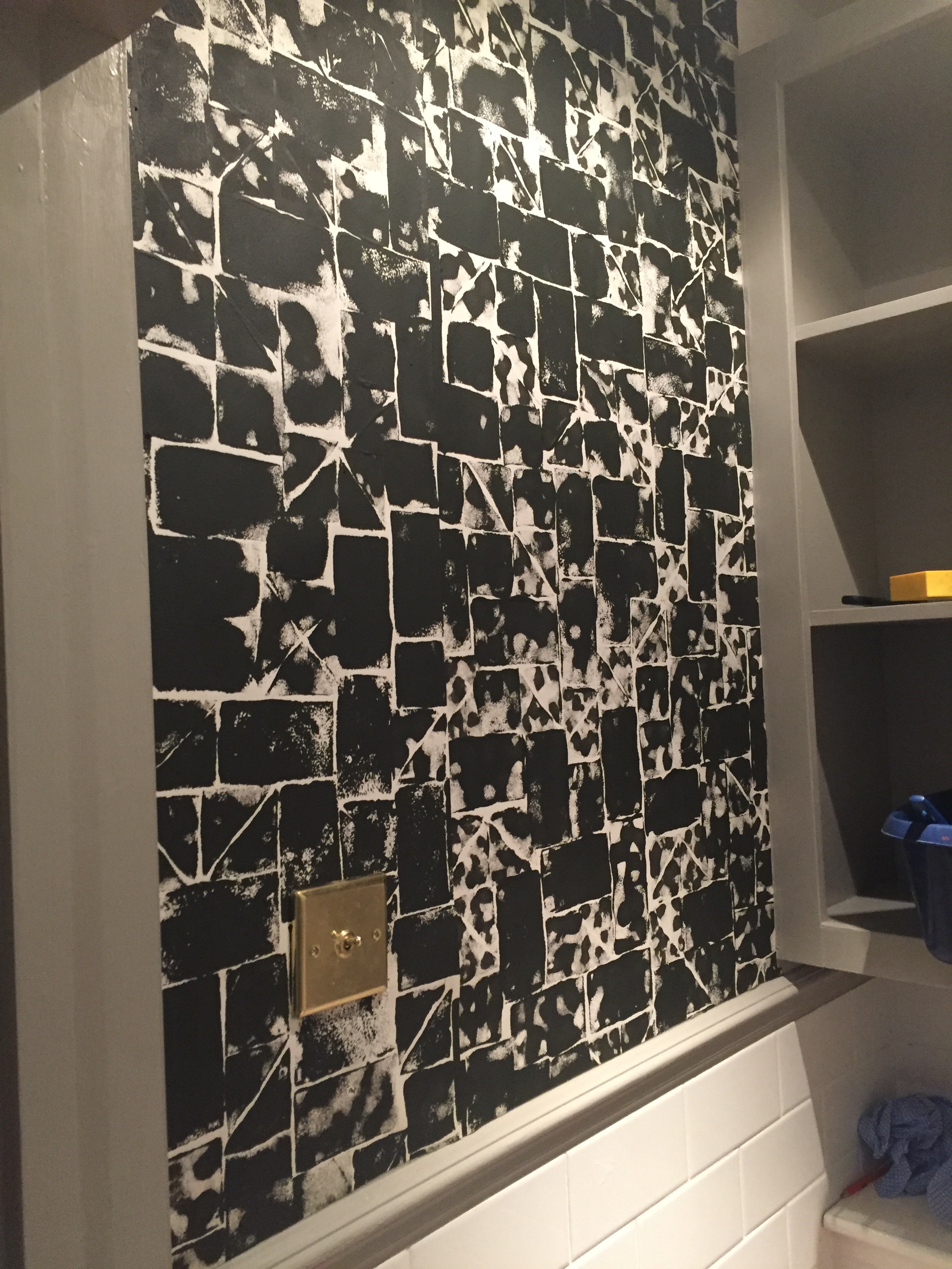
The randomness of the print meant there was no problem on the join – second piece went up where it went up. Bliss.

The finished job.
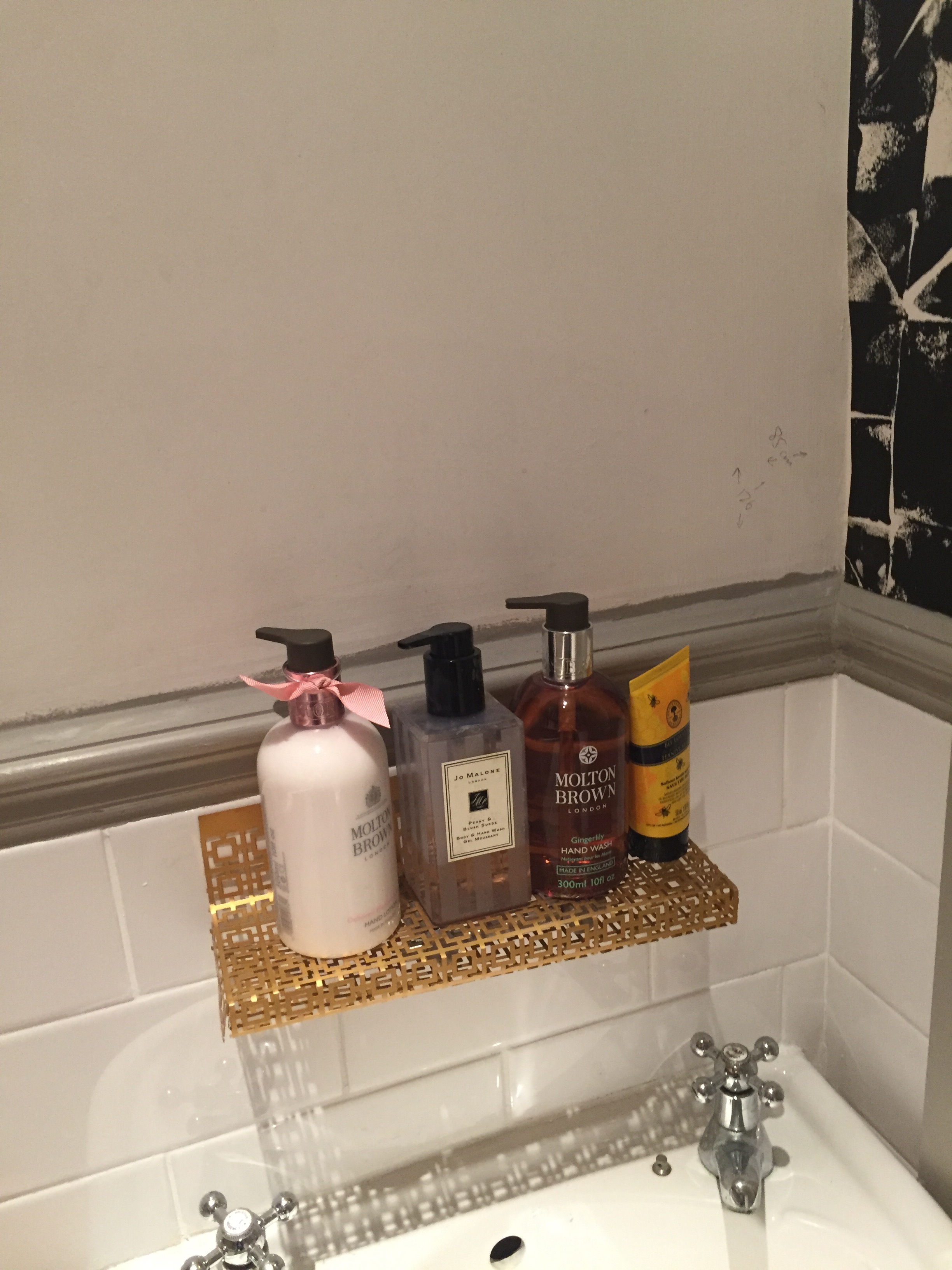
Except there’s always one thing left to do…a fitted mirror over the sink. Sigh.
Better get ordering.
Laters, Kate x
The Smallest Room x
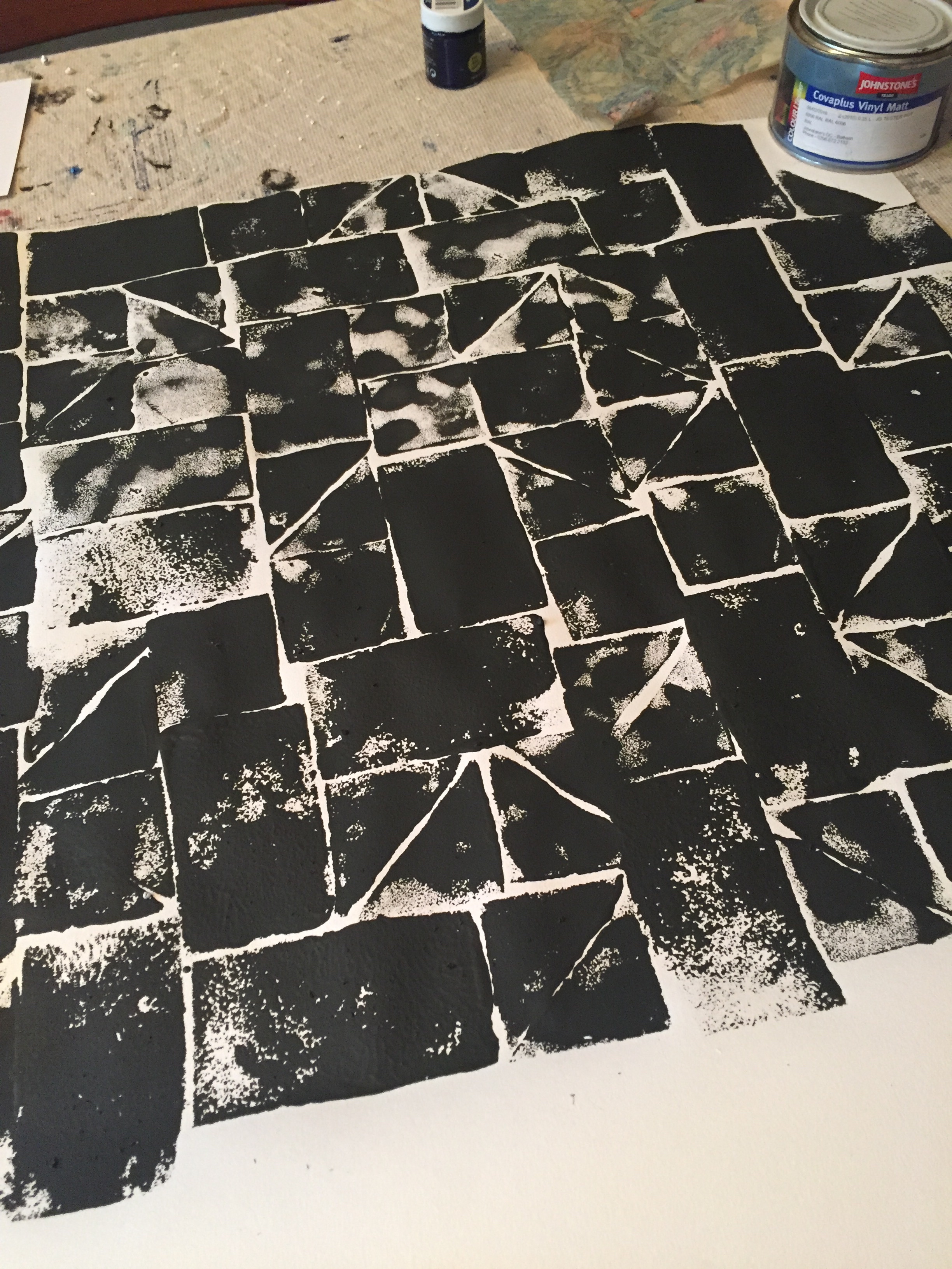
We’ve been printing.
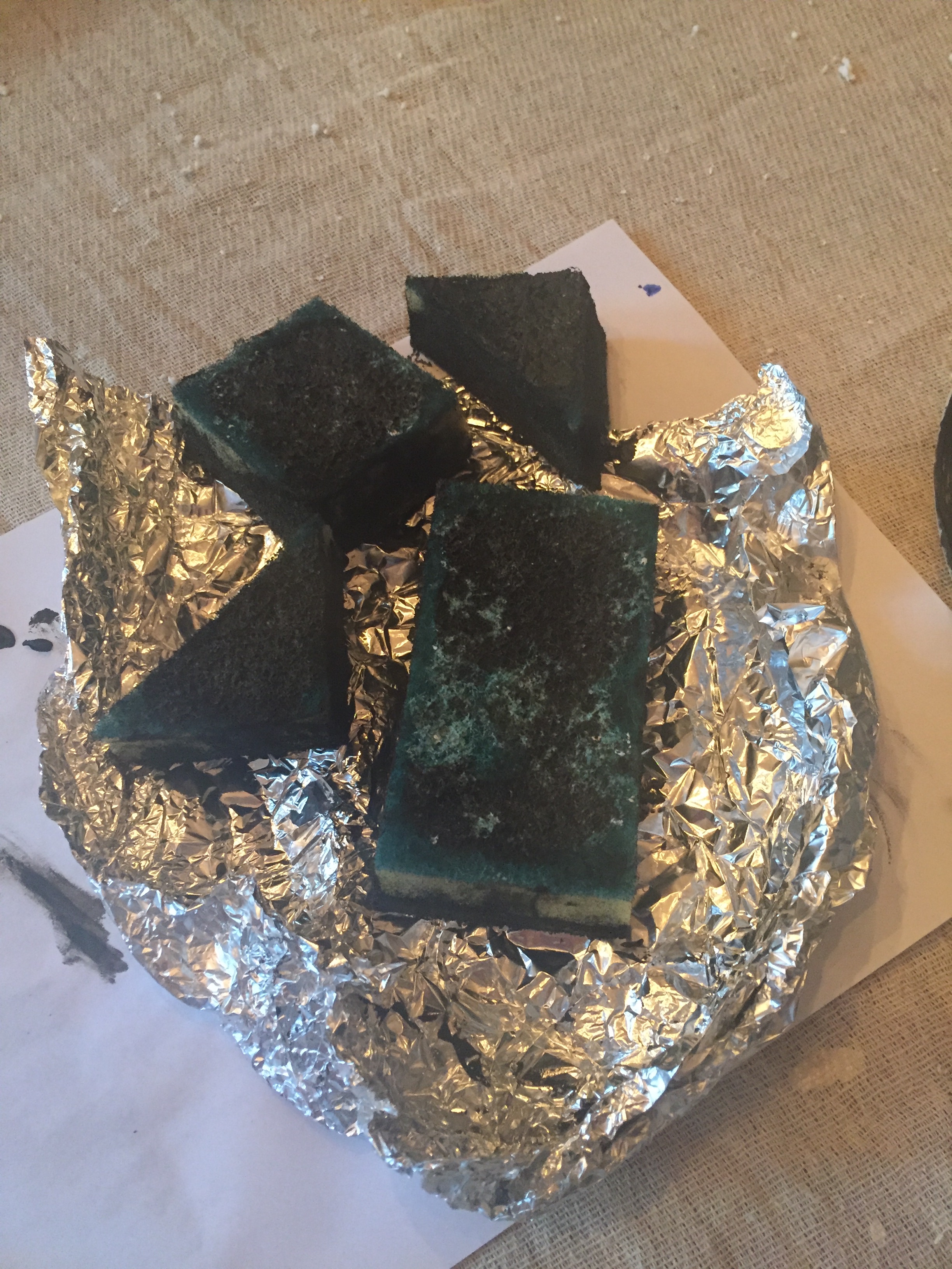
Very simply with Sainsbury’s basic sponges bought for 20p a packet, onto lining paper and using left over paint from the kitchen renovations. Cheap as chips.
This is all part of the great downstairs toilet upgrade project, which after 10 years of abuse is sorely needed.
The idea is to paint the woodwork a mid-grey, homemade wallpaper above the dado (why not?!) and dye the grout (more on that in another post) between the metro tiles a charcoal grey.

(A bit like this)
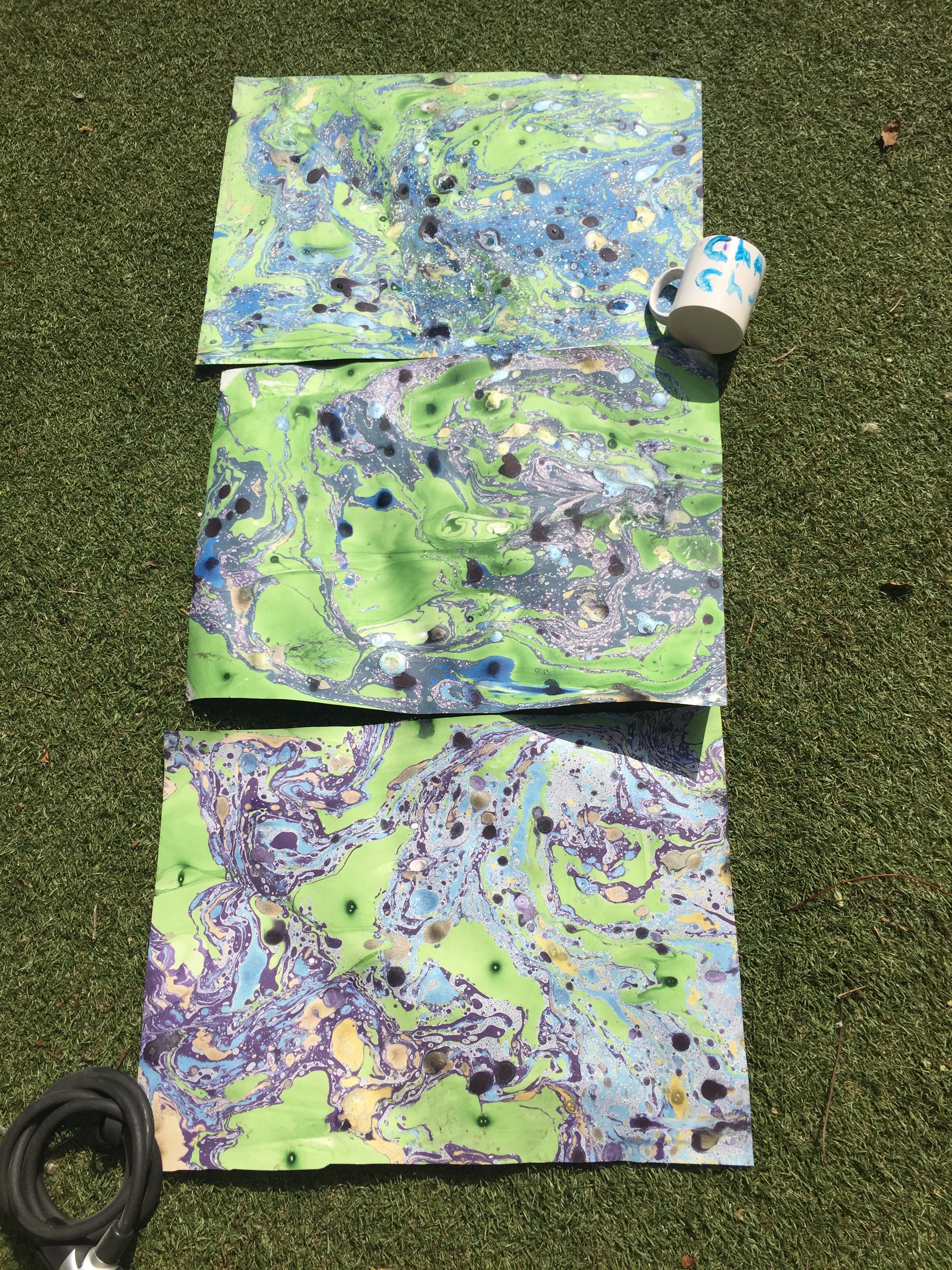
The marbling was part of the experimenting plan for diy wallpaper for the toilet..except the problem was we could only make it in small sizes which gave a patchwork effect. With printing we can make the runs as long as we need. Brucie bonus to control within the chaos.

The inspiration for the print came from the above picture…
And the general sense of informal uniformity from pictures like these.

Embracing the idea that symmetry can just be too damn predictable.

What is working so well is the straight lines versus the diagonal against the curves of fingertips pushing the sponge into the paper. I think I’m in love.
Shame the next few days will be spent doing all the boring bits like filling and sanding.
But watch this space.
Laters, Kate x
