Tagged: retro
Trend 3
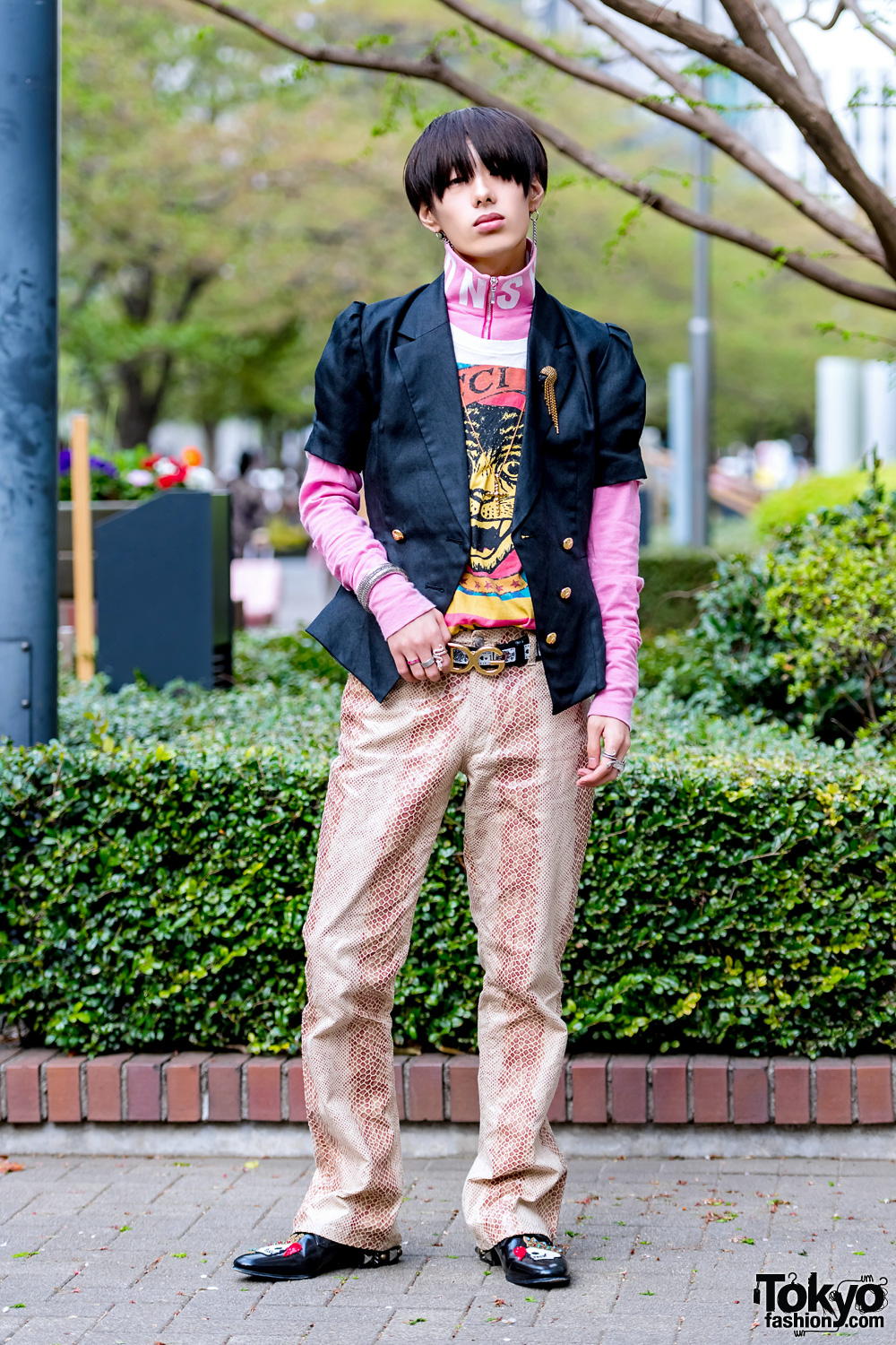
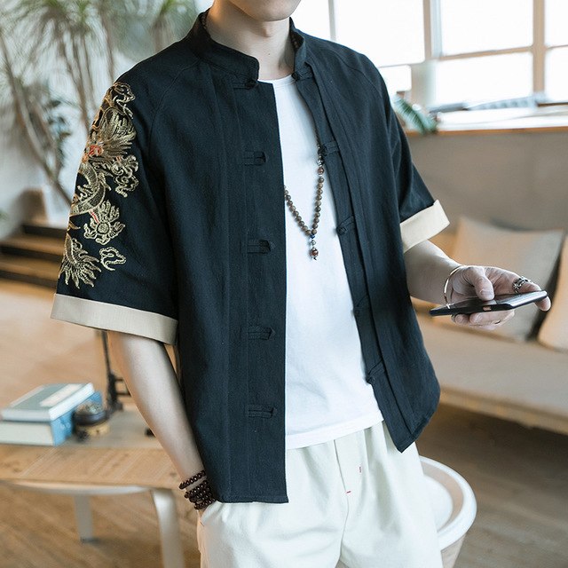
The fickle winds of fashion never stop blowing raspberries; Not long ago I was reading about the terminal death of the short-sleeved jacket and I remember thinking the very act of writing those words was probably like a summoning of the phoenix from the ashes, because the thing about hates is that they have a tendency to come around again….and just a little change can make a radical shift in emphasis.


(All pics Pinterest)
Never say never.
Laters, Kate x
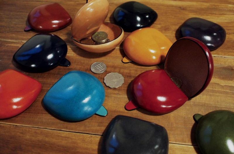
Pot Pickers x
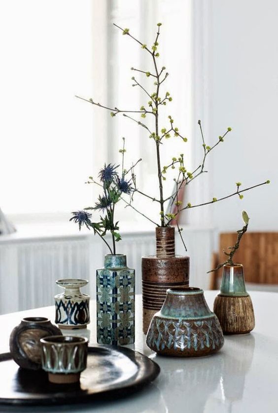
When I was little this was the sort of pottery you’d expect to see in charity shops, the sign of a design aesthetic rejected. How times have changed, the tide, turned. What was generic is now confident, what was old fashioned is nostalgic and what seemed ugly is now defiant and most importantly, appealing.


There’s a company that’s drawing from this feeling and adding their own signature: Kat Huffer and Roger Less, work partners and life partners based in Northeast Los Angeles make up Kat and Roger. Their aim is to combine classic shapes and graphic surface patterns with earthy natural clay textures.

These are mugs you want fill with hot tea and hold between two hands on a freezing winters day.
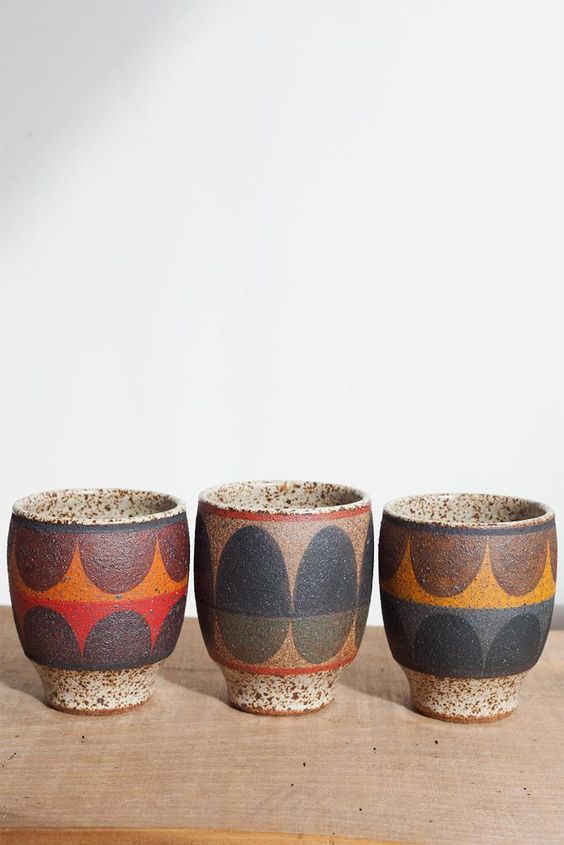


(All pics Kat and Roger and Pinterest, their work can be found in the UK at Alpha Shadows)
These are heart singers and obsession inducers.
Laters, Kate x
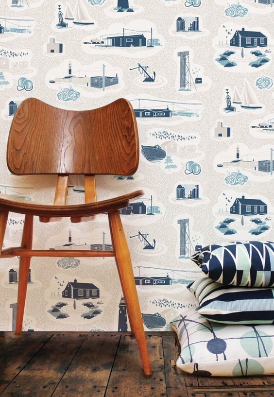
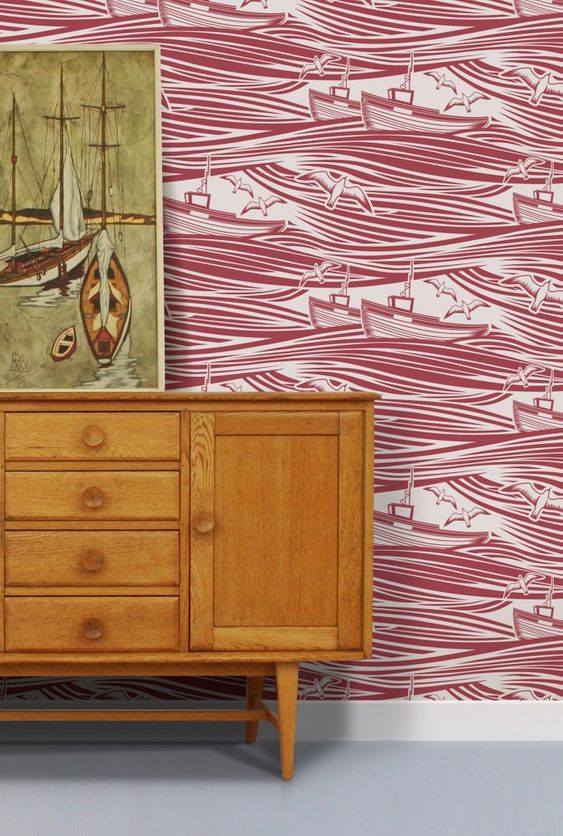
Minimoderns x

The driving force of Minimoderns is pattern with a story: The founders, Keith Stephenson and Mark Hampshire view what they produce as applied pattern across a range of products, including some incredible wallpapers. It adds a pleasant change, a certain flavour. A different slant.
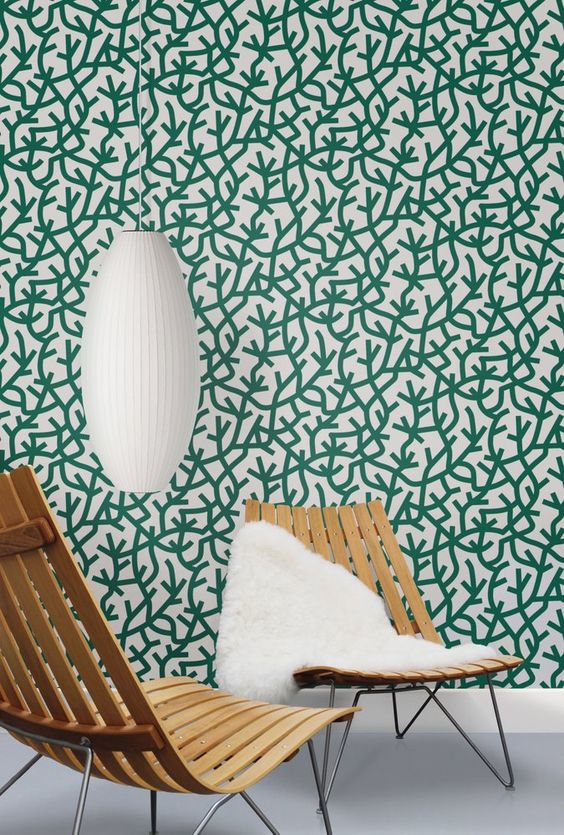

Their design influences range from mid-century British textiles to vintage toys, literature and even childhood memories.

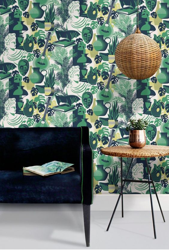
(Love this for a boys room)

It’s the detail..
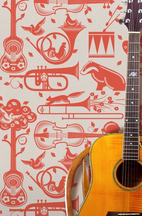
Wallpaper, trombone and badger are three words I never expected to use in a sentence.
If you want retro nostalgia with design integrity and are not afraid of making a statement, look no further.
Laters, Kate x
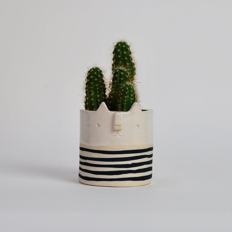
Potty..

Is it a surprise that things are going green? That the tentacles of change are even reaching inside? Plants, once the scurge of the minimalist-matchy-matchy with too much resonance to hippies and patchouli are becoming the statement pieces of choice: Not only are they living pieces of art but they help the living too, cleaning the air and quite frankly, bringing joy.

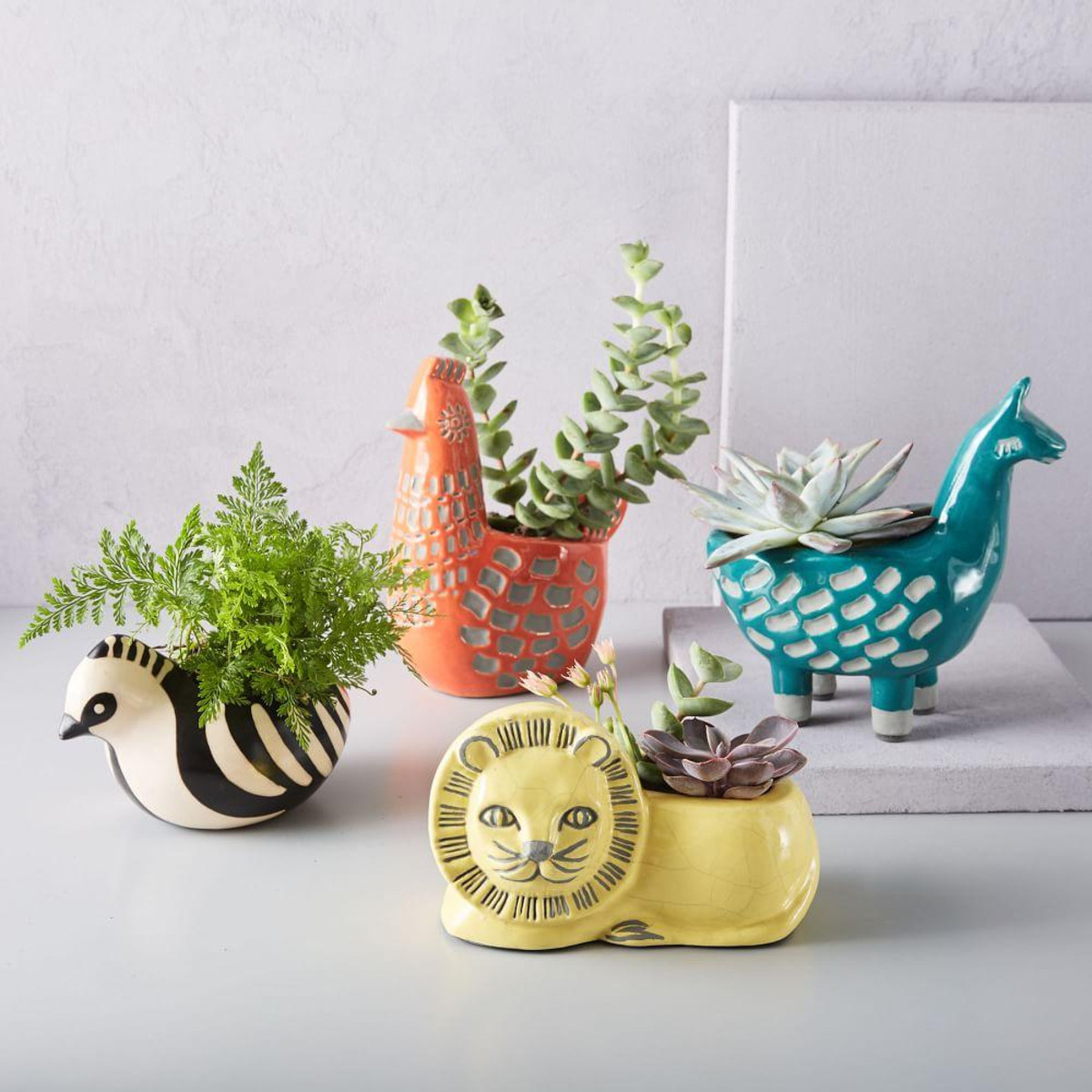

With the advance of plants comes the prospect of their pots and there are some quirky gems out there…All three pics above come from Westelm ..these Llamas are shouting out for a large, multi shouldered cactus..
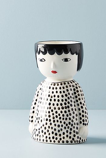

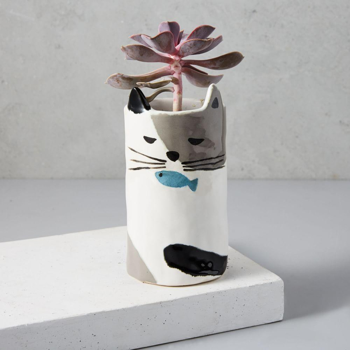
These three delights come from Anthropologie. Their size put them in the perfect Christmas present range. Am I too early??…but when they’re gone, they’re gone.
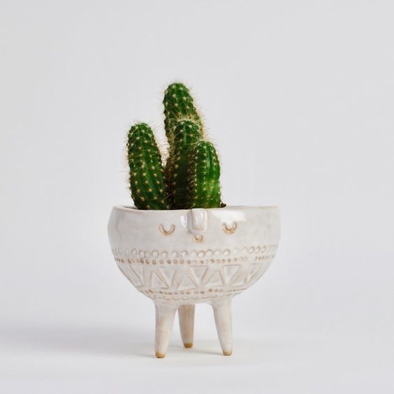
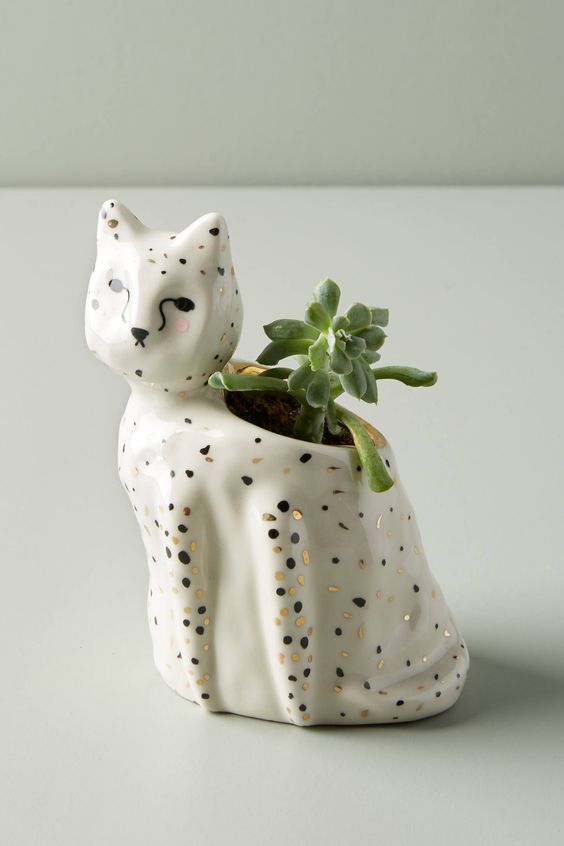
Or there’s the independent handmade option – definitely worth unearthing – these beauties come from Atelier Stella ceramics based in Brighton.

(All pics Pinterest)
Who’s so good, she probably deserves a post all of her own…
Laters, Kate x
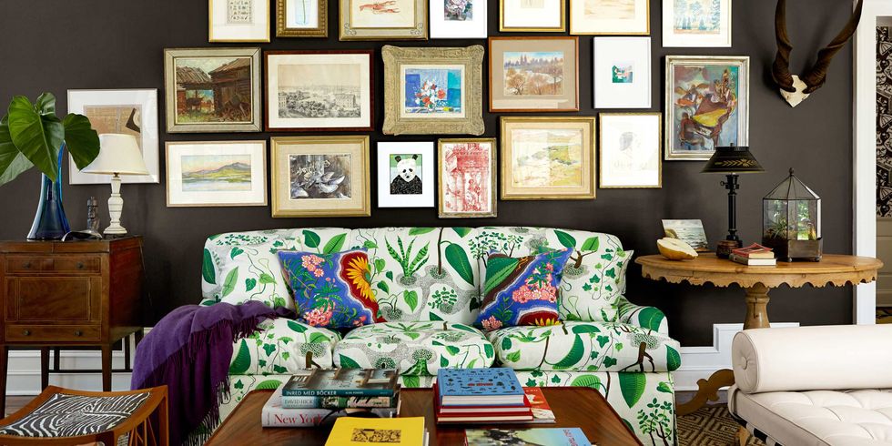
Josef Frank

As winter creeps closer it seems that colour is saturating the eyeballs like a renaissance of the eighties. It’s disappearance happened so gradually, a fading out, a dying down that it’s resurgence feels all the more powerful, poignant even. Not that the cyclical power of trend should come as a surprise – the picture of the wallpaper above was designed by Josef Frank, who emigrated to Sweden in 1933, gaining citizenship in 1939 and became the most prestigious designer in the Stockholm design company Svenskt Tenn. New is never really new..
Whilst his furniture is classic of its time: clean lines, functionality.

It’s his fabrics and textiles that seem so forward thinking, modern and exciting.

(All pics Pinterest)
Maybe you can teach an old dog new tricks..
Laters, Kate x
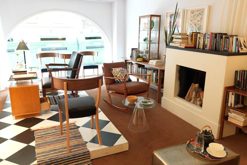
Revamp No.1

Why doesn’t it work? Maybe the photos don’t do it justice, but for a super expensive building this interior comes across as a mash-up between a car sales room and Ikea. The intention seems to have been to create a distinct feeling between what’s inside and what’s outside, but when that subtle line between nature and manufactured isn’t blurred, the furniture responds by looking brash, staged and disconnected.

Which doesn’t mean reflective surfaces as bad – just that age, colour and natural elements need to have a voice.

Even black works when it’s veined marble. The chairs, the nod to modernity with the patina of vintage, the table in the middle inviting the voyeur to sit and drink in, be in the room.

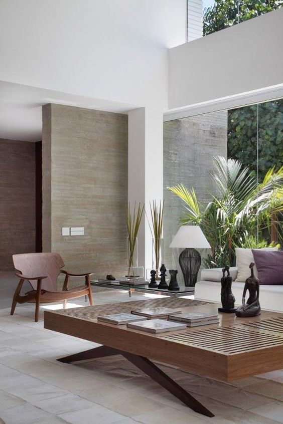
Or change it with the presence of wood, natural, warm, characterful.
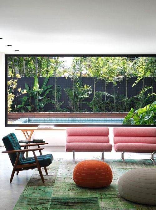
The pink chairs..the colours.

(All pics Pinterest)
The lighting..
Laters, Kate x
Scales x

When’s a tile not a tile?
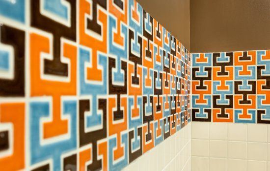
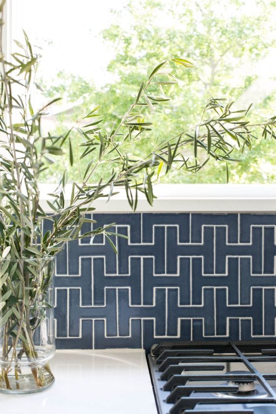


(All pics Fireclay tiles)
When it can think out of the box?
Laters, Kate x
Hattention x


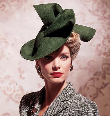
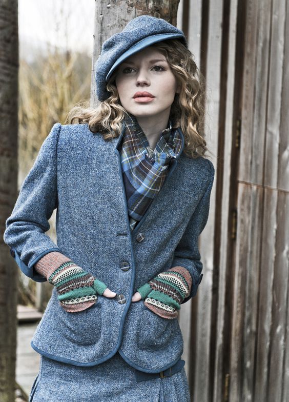
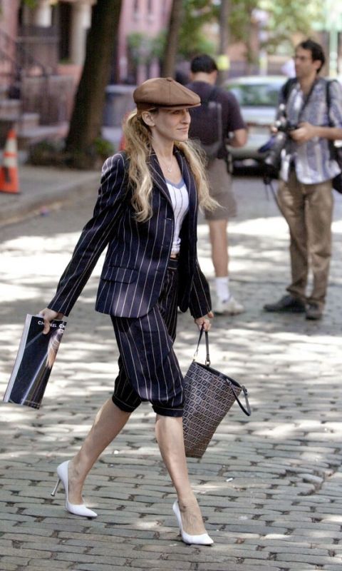


Laters, Kate x
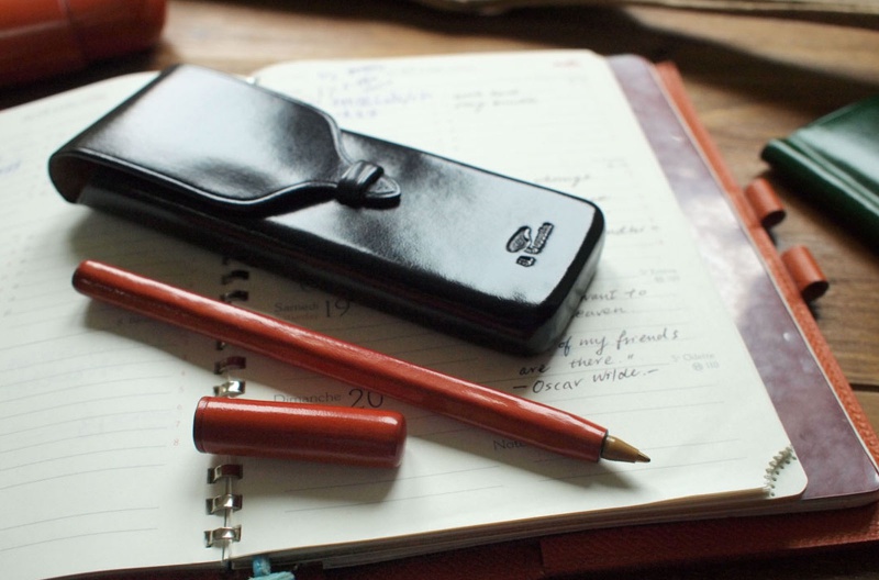
Write out x
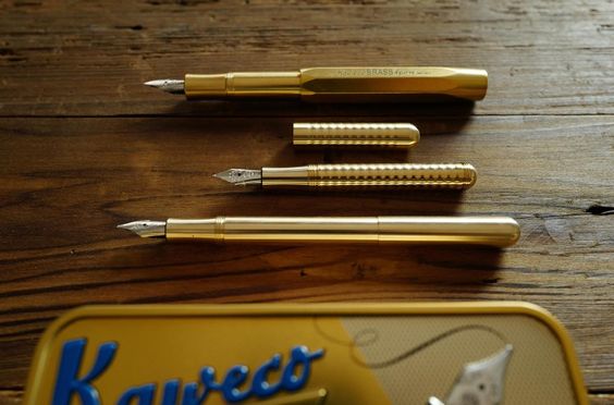
If approaching September means anything it means stocking up on stationary. Which underlines the enigma…why do we need to buy it every September? There’s the normal losses down the back of the sofa, chewed by the children, eaten by the dog. But the real reason is usually simply the lack of quality and that stationary belongs to the class of products blighted by the modern disease of built in obsolescence. They just want you to buy it again. So why not think outside the pencil box?

Tools to Liveby is a dreamy online shop that has done the hardwork upfront, sourcing beautiful stationary products from around the world that have stood the test of time.


The emphasis is on quality and the joy is in the detail, from products like these – brass pencil protectors from Germany.


To memorable packaging.


(All pics Tools to Liveby)
It puts the quality back into quantity.
Laters, Kate x
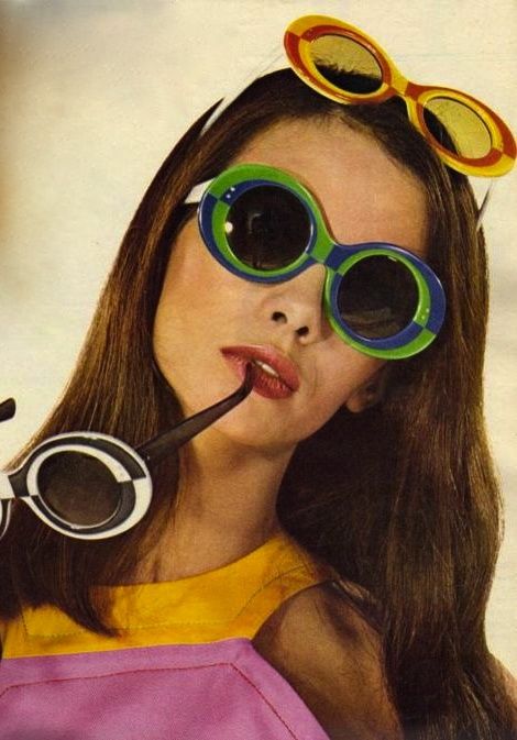
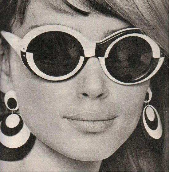
Eye See U x


Laters, Kate x
