Tagged: seventies
Potty..

Is it a surprise that things are going green? That the tentacles of change are even reaching inside? Plants, once the scurge of the minimalist-matchy-matchy with too much resonance to hippies and patchouli are becoming the statement pieces of choice: Not only are they living pieces of art but they help the living too, cleaning the air and quite frankly, bringing joy.

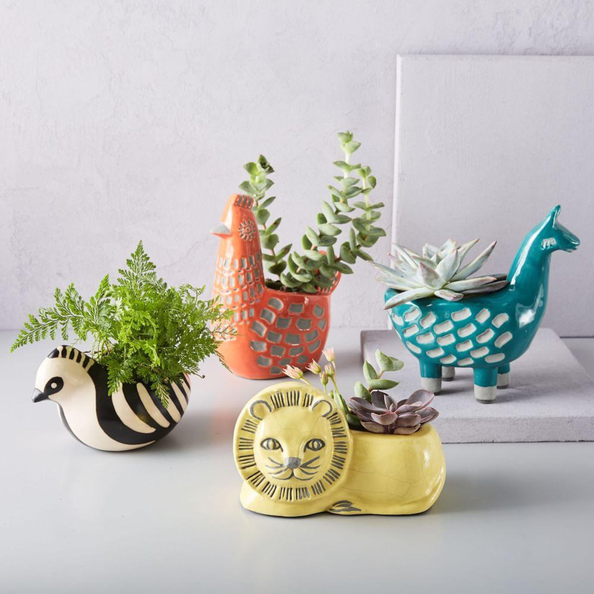

With the advance of plants comes the prospect of their pots and there are some quirky gems out there…All three pics above come from Westelm ..these Llamas are shouting out for a large, multi shouldered cactus..
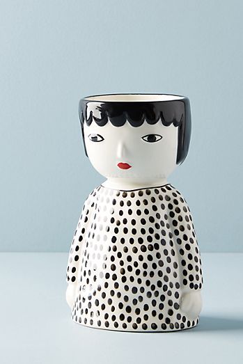

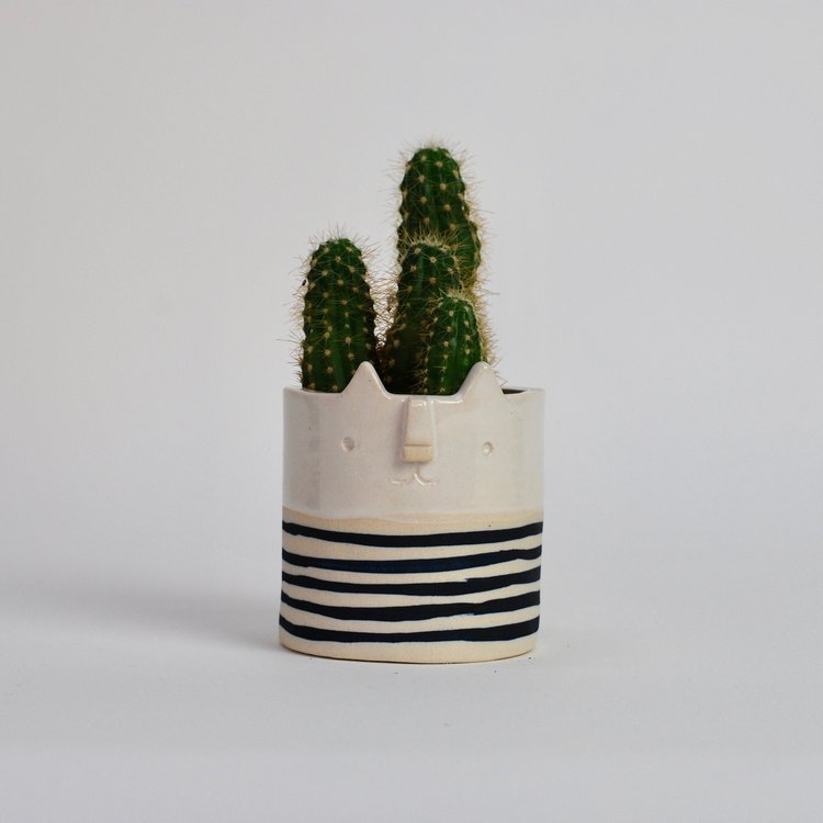
These three delights come from Anthropologie. Their size put them in the perfect Christmas present range. Am I too early??…but when they’re gone, they’re gone.
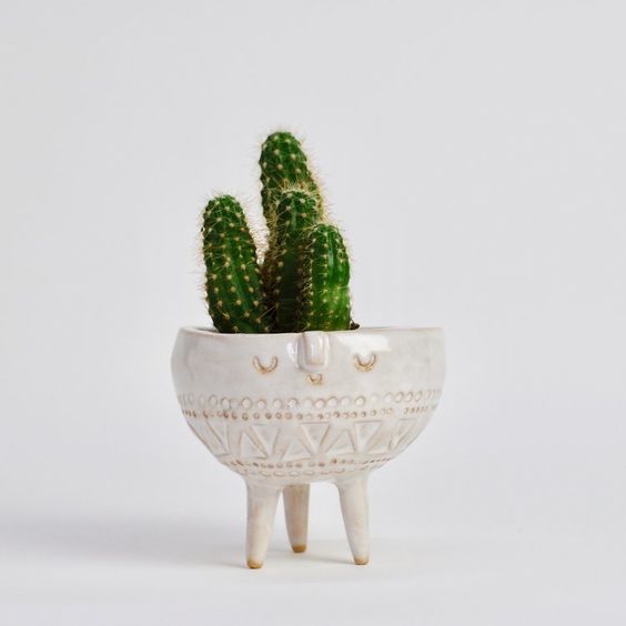
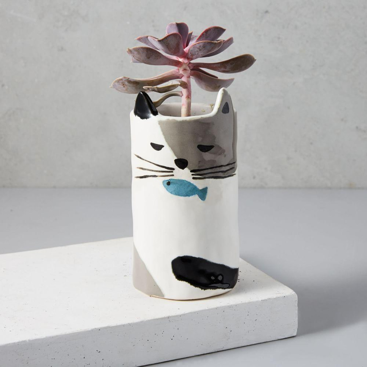
Or there’s the independent handmade option – definitely worth unearthing – these beauties come from Atelier Stella ceramics based in Brighton.

(All pics Pinterest)
Who’s so good, she probably deserves a post all of her own…
Laters, Kate x
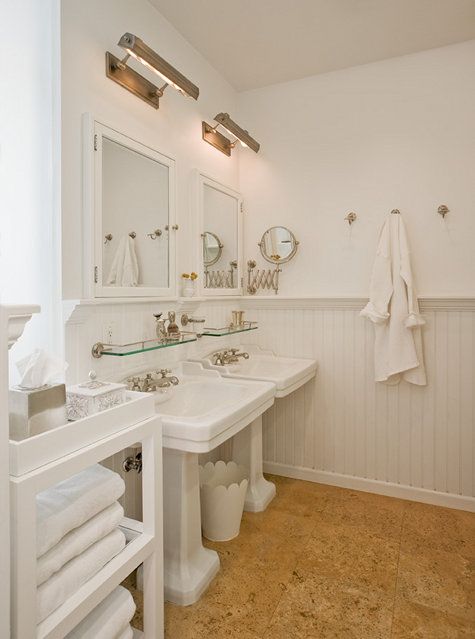
White on..

There are some things that even science still can’t explain..


Past bathroom trends: Curiously overstated, flamboyant, slapstick and in your face.

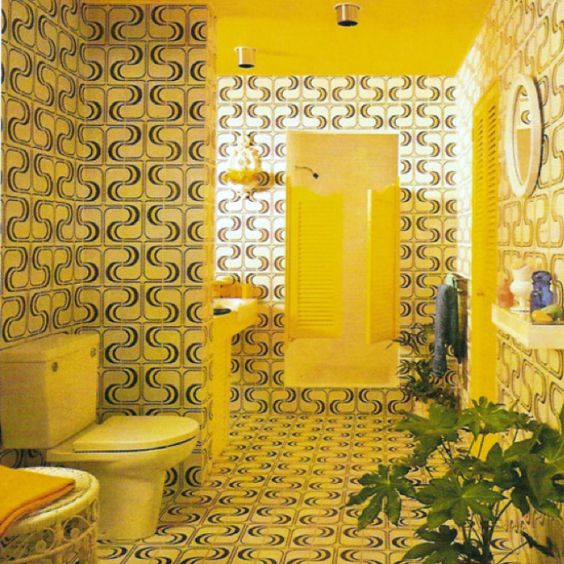
But maybe it wasn’t so bad…maybe we’ve now gone too much the other way – found the plot but lost the fun?
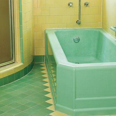
Because yes, there was holy chaos…but take away the shag pile carpets, soften the saturated colour..and the essence of something special is in there..

Hidden in plain view, the traces are lovely…

(All pics Pinterest)
This is the Maida Vale sink by Fired Earth, available in aqua, yellow and navy.
Wide-eyed bewilderment in this goofy praise of avocado? Keep watching – the tide marks are turning…
Laters, Kate x
Floored..

I was clicking through Architectural Digest (as you do) when I alighted on this photo of Jessica Chastain’s New York apartment. It wasn’t so much the design that caught my eye or the pretty cornflower blue – or even the impressive array of copper in the cupboards, but the cork floor tiles.
A fallen high achiever, cork tiles now equate with seventies bad taste and sticky beer after raucous student parties. And yet there’s something about them – a warmth and sense of forgiveness blended with a subtle hint of nostalgia..


This Blogger had a kitchen laid with them last year and she’s written a follow up post on how she’s feels about them a year on. It makes interesting reading.


Maybe, as with all things seventies, it’s time for a revival..
Laters, Kate x
Damn x

The crittall glass people arrived here yesterday and the only glass they left is the sort related to the Emperor’s new clothes: It didn’t fit through the front door…one centimetre out, so it’s been returned to the factory. Apparently the main frame was supposed to be designed in two parts but it wasn’t. Their bad. But it leaves me to explain the situation to Building Control and delay our final sign off again..there’s always something.
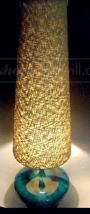
I’m distracting the frustration with a search for the perfect table lamp..something utterly ugly and totally wonderful.
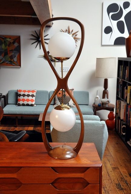
They give such bones to a room..an intriguing combination of height, light and ambience.

It’s a ploy that’s working…
Laters, Kate x
Woolly Palette x

Sheepskin has that rare mix of standout and empathy.

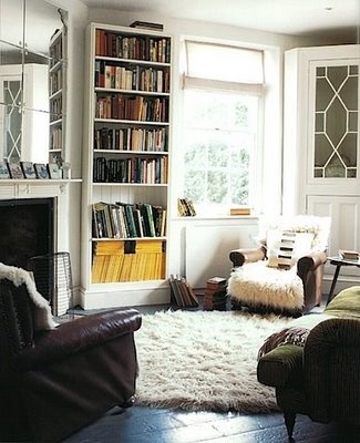
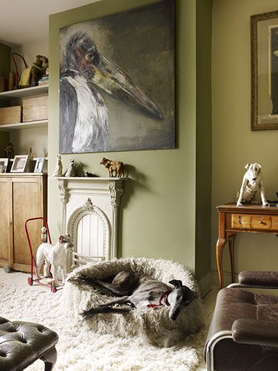
It’s come a long way from the full blown saturation of it’s seventies hey day which resulted in total burn out.

But it’s appeal is sneaking under the radar and gently returning, softening edges and singing of warmth and cosy nights by open fires.
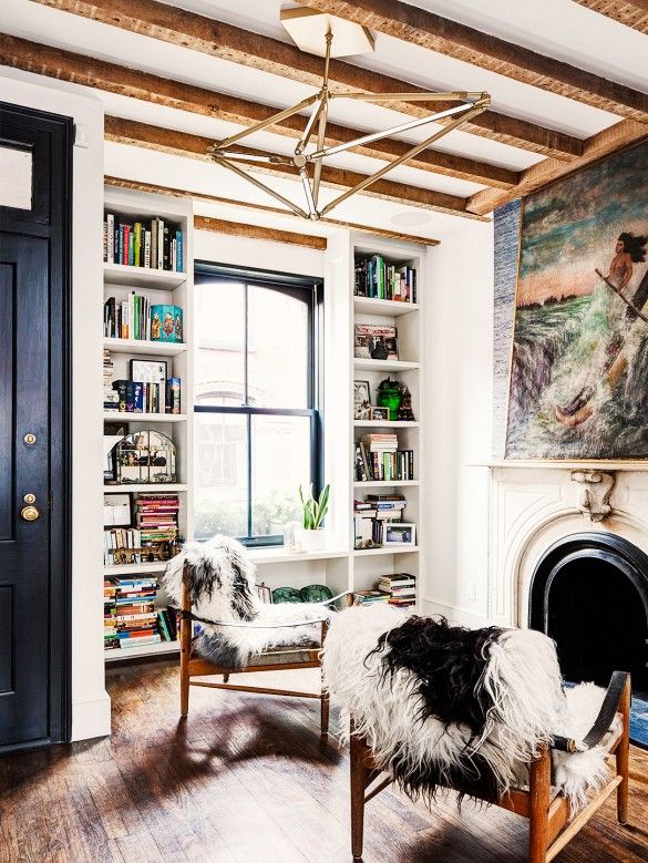

No doubt the flokati rug will soon follow.
Laters, Kate x
AG for Alexa..

Alexa Chung has made her first foray into serious fashion by designing a 20 piece collection for the Californian label AG. It’s a career she’s always dressed for – but is being famous enough?
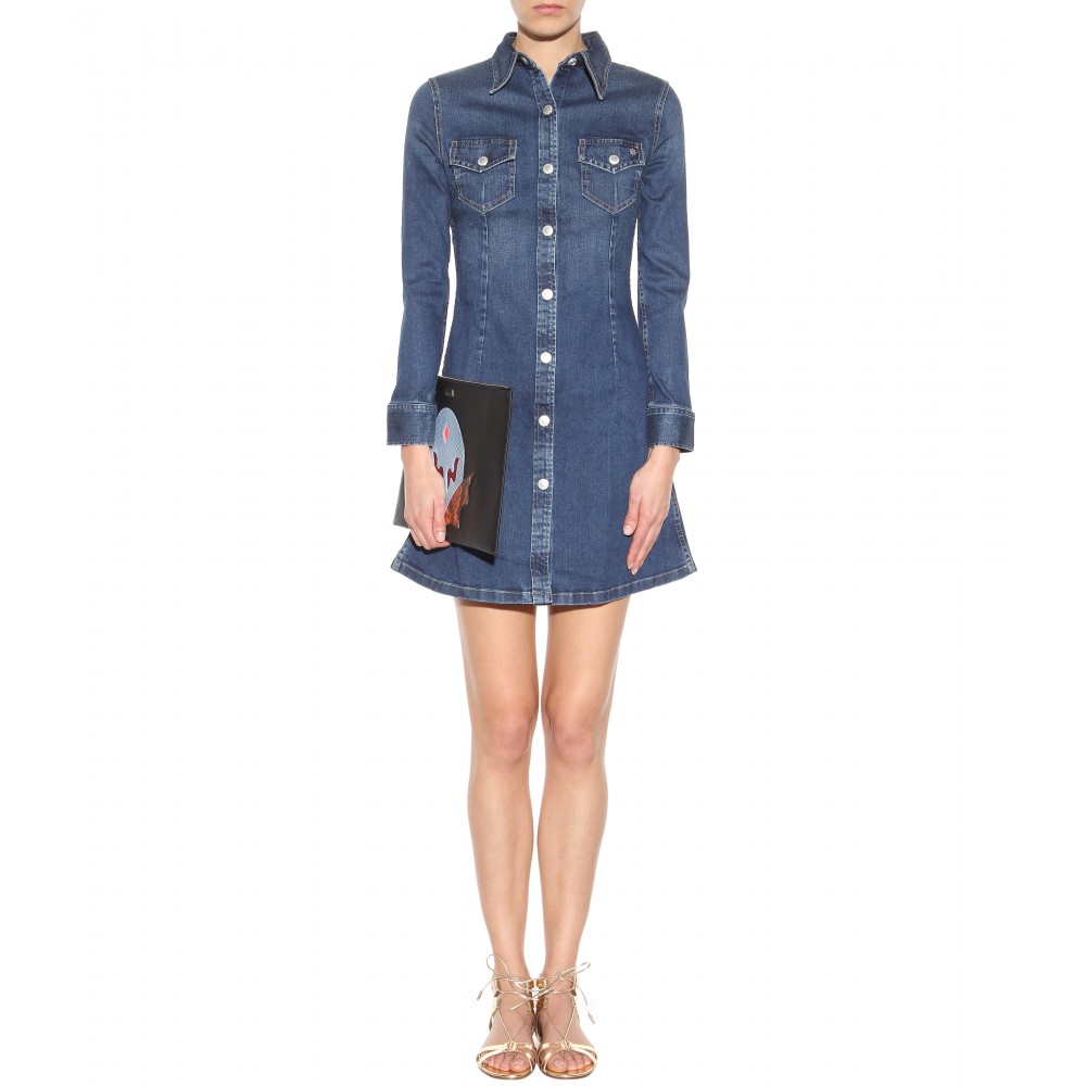
My expectations were high..I wanted frank and forthright with a street awareness…and a determination to do her own thing, all delivered with a kick and a wink..

Well..I like the buttons. But if this really is a throw back collection honouring the late sixties and seventies, I’d have preferred them in brass..
You could say it’s nice and polite..which would be polite..
Or you could say this looks like something you could stumble into on a rack in the deepest, darkest depths of Marks and Sparks..not even Per Una label..
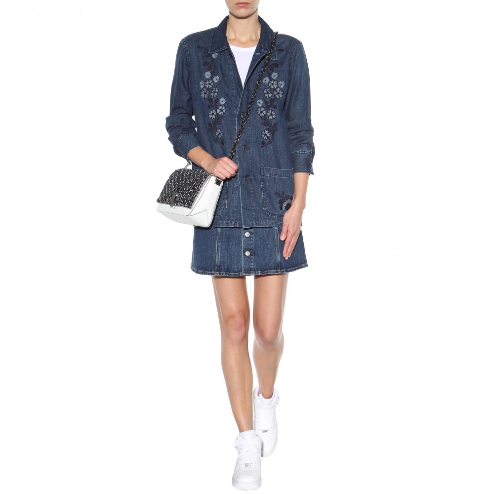

And if you said this was from Gap, I would believe you.
Tame and lacking flair..the collection is like going to taste a beautiful rich merlot..and finding it’s slightly warm water from a plastic cup instead. There’s going to be a lot of seriously good denim this year – Sonya Rykiel and Gucci being just two casing points. In comparison, this collection falls way off the mark. It will sell out..but that says more about our society than good design…
Laters, Kate x
