Category: interiors
The Underworld x
The hunt for the perfect wallpaper goes on. One group of designs that would’ve be way off the radar a few years ago but are ticking the boxes now are the tie-dye patterns.

There’s something about the way they repeat that looks so natural and realistic..as if they’re not repeating at all. Which, let’s face it, has to be a good thing…
Or maybe it’s the memories of a happy summer’s day in the garden.
.

(All pics Pinterest)
They’re probably more suited to a bathroom or bedroom than a cellar…but there’s just something about them..
Laters, Kate x
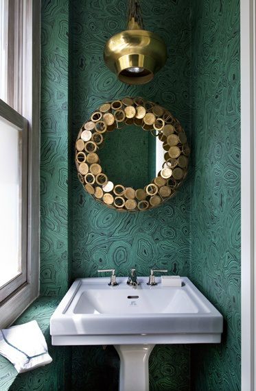
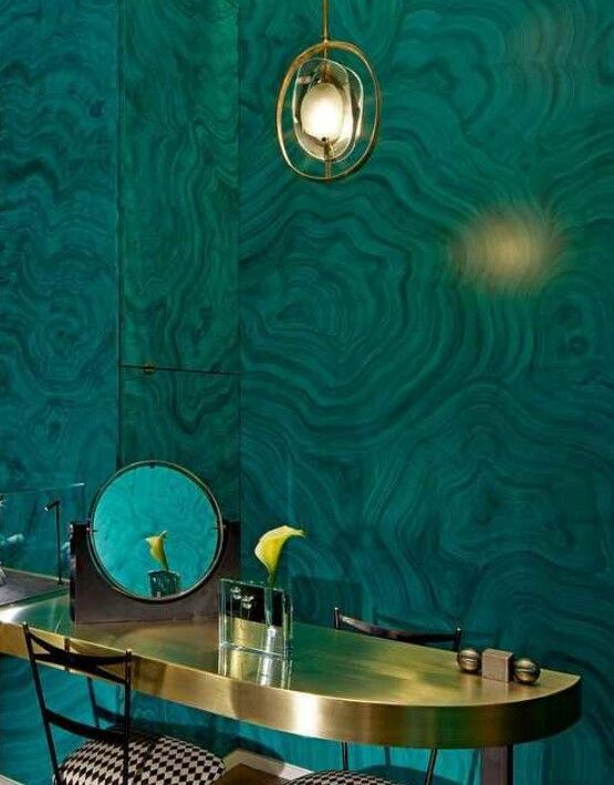
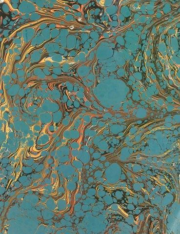
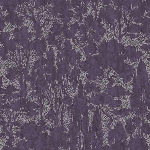
Marbled Marvels..

It’s that time of year: sick children…one coughing her way through the night which is the natural equivalent of chinese water torture, the other with a weeping ear and suspected perforated eardrum. Winter – don’t you love it? At least there’s beautiful wallpaper to keep the blues at bay. The final choice for the cellar (can I really keep calling it that? (but cinema room sounds so pretentious..)(such a first world dilemma)) has yet to be made: There’s three choices and this post represents the first group…a marbled/malachite paper with the hint of unusual mixed with traditional, timeless beauty..


I’m going to trawl the internet to see what I can find that’s UK based…but first we’re off to the quacks…
Laters, Kate x
The Sitting Room x
In the normal run of things, you look at a room, decide it needs a spruce and decorate it knowing the context surrounding it. A renovation is slightly different – you tend to think of each room as individuals and forget how they link together. It’s what’s concerning me about our sitting room.

The original choice was for it to be a green as it leads into the garden, merging them together.

And there are some gorgeous greens out there.
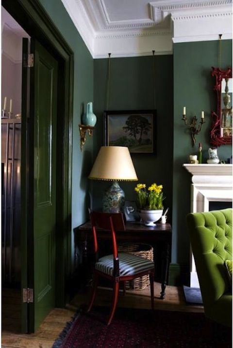
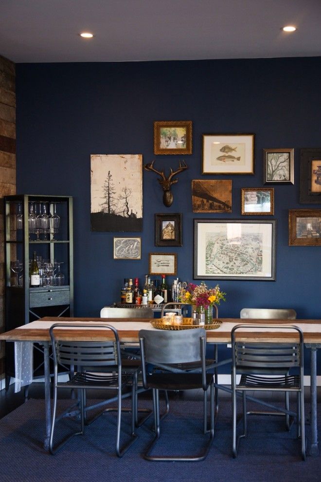
But vaguely rational part of brain said ‘it’s leading from dark grey..’

And then I was drawn to blues, deep, dark, inky blues…resist, I thought – stick to leaves and plants. But the pull was there. And kept coming back. So compromise stepped in – use the midnight blue in the cellar where light doesn’t matter. Which seemed like good thinking.

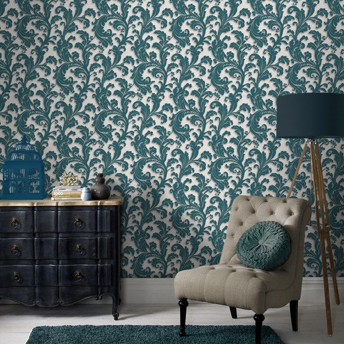
Except I can’t resist the bluey teals that are dominating my Pinterest page.
I laugh that our home might be a cave. But I’m starting to think it really might be…
Laters, Kate x
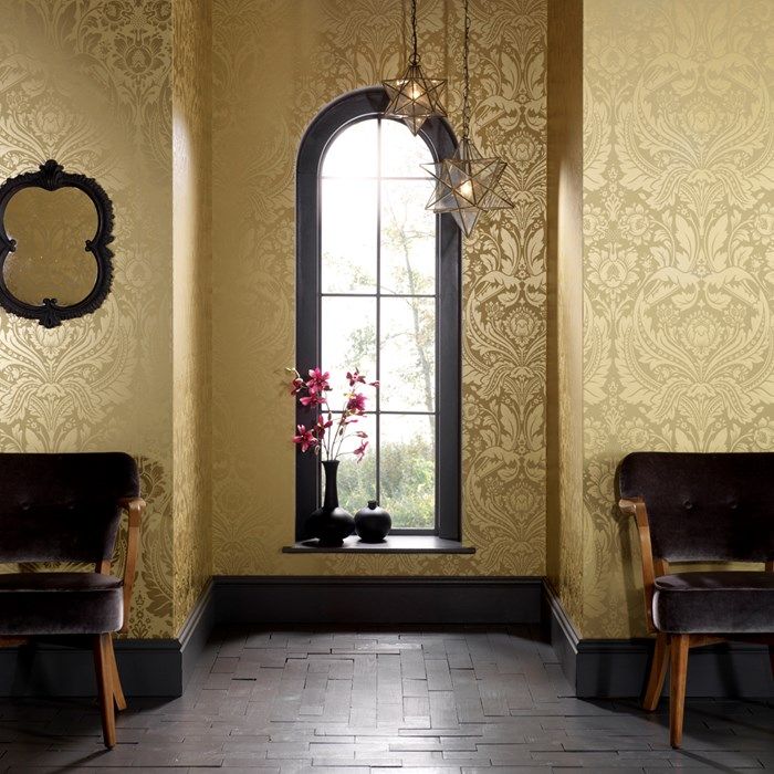
The Hall x

Time to decide which wallpaper makes the cut for the hall which is a bit like going into Willie Wonka’s chocolate factory and just choosing one ickle bickle flavour. How do you pick?
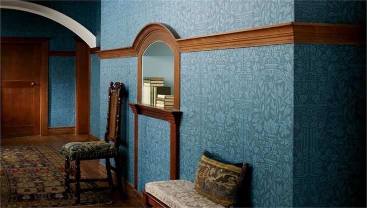
It will be William Morris because he is my interior design hero and God. But that hardly narrows the field down.
I’ve discarded some of the darker patterns, just because I’m going darker…on the dado and skirting boards..and in the kitchen..and sitting room..and cinema room..hey ho – just call my home a cave..


I’m thinking this one – Arbutus – could be it…There’s something about the 3D effect of the leaves and their blue/grey colour..
Decisions, decisions…
Laters, Kate x
Shine & Shade x

Wallpapers: Can you spot the rubies in the dust, the cheerful from the chips, the diamonds in the rough? Scroll through, remember your favourites….then see at the end. So this is number one..
Two.
Three.

Four.
Five.
Six.
Seven.
Eight.

Nine.

Ten.

Eleven.
Twelve.

Thirteen.
Fourteen.
Fifteen.

Sixteen.
Seventeen.

Eighteen.
Nineteen.

Twenty.
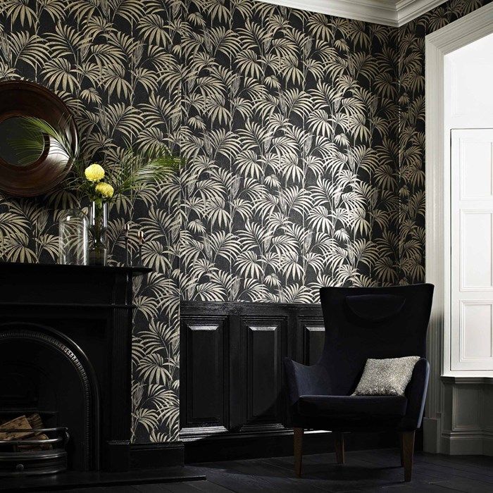
Now for the reveal…..all the wallpapers were from Graham and Brown – not a company featured much in the interior design world glossies. But many of the concepts here are visually similar to their posher counterparts: Honolulu palm versus Palm by Cole and Son, Capulet teal versus Hermes jardin d’osier, tudor houses versus Fornasetti. But their price point? Nothing here was over £20..and some of them were as low as £7.50 per roll…check it out:
One = Honolulu palm green for £20 per roll.
Two = Desire gold for £8.50 (in the sale) or £17 per roll
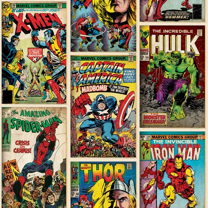
Three = Marvel action hero for £10 per roll
Four = Juan white for £7.50 per roll
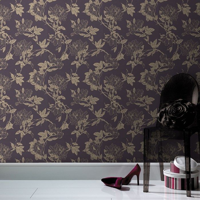
Five = Jiao pruple for £7.50 per roll
Six = Tranquil purple for £7.50 per roll
Seven = Bao white for £7.50 per roll
Eight = Desire damson for £7.50 per roll
Nine = Fresco Mai for £10 per roll
Ten = Olympus black/white for £10 per roll
Eleven = Majestic black for £15 per roll
Twelve = Petit papillon black for £20 per roll
Thirteen = Do the stretch mustard for £20 per roll
Fourteen = Capulet teal for £20 per roll
Fifteen = Botanic charcoal for £20 per roll
Sixteen = Kelly’s Ikat for £20 per roll
Seventeen = Enigma white/prussian blue for £20 per roll
Eighteen = world heritage black/white for £20 per roll
Nineteen = Honolulu black for £20 per roll
Twenty = tudor house for £20 per roll
Makes you think: Where does the beauty lie?
Laters, Kate x
Progress..

The building work is moving up a gear now, particularly in the cellar. The digging is finished, insulation and underfloor heating is laid and it was all screeded and left to dry over the festivities. Now we’re onto the first fix and finalising plans for the second fix.

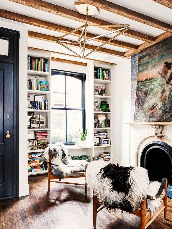
It’s an interesting space in terms of design – it’s predominantly a cinema/games room that needs to swallow a lot of ugly storage. But what doesn’t help is that I have a fundamental problem with the general concept of cinema rooms: It seems that the moment the word ‘technology’ is associated with a space it becomes infused with this need for everything cold, chrome, clean and clinical – like the ‘cutting edge technology’ needs to be supported and highlighted by it’s super-duper space-ship-like surroundings..which will probably be out of date in a year. The truth is I’ve yet to find a cinema room on Pinterest I like or want to lounge, Roman-senator-style in.

So it was back to the drawing board and writing a list from all these pictures of the things that actually make a room cosy: A fire, books, rugs, lamplight, dark colours..fluffy dog.

And that’s when the inspiration struck – why not create a false chimney breast for the TV to go on, with a fireplace where the DVD player/set top box/general crap/ can be hidden in the cleverly made fireplace surround? We can’t have a proper fire..

But there are some amazing electric cast iron stoves around..and in the summer it means you can have the glow without the heat!
It’s a work in progress, but the plan is to have significant 75 cm depth mega cupboards with sliding doors across the back with the boiler and water tank under the stairs. As you come down the stairs, the first cupboard you see will be low level holding games and a vintage dollshouse. Then there will be full height open bookcases either side of the chimney breast and all the way to the end of the wall. The chimney breast will come out 40 cm and hide all the cabling from the TV. The fireplace will be slightly lower than normal to help with eyelines to the screen, and the DVD etc will be housed in the central section of the surround under a fretwork door – which should mean we can use the remote without having to have the door always open (fingers crossed) . The stove will be quietly tucked inside to add ambience, all topped off with a tiled hearth.

May the magic begin!
Laters, Kate x
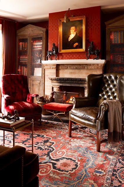
The Cellar x
Sigh. This is part of the inspiration for our cellar renovation..a warm, inviting room from epic the Hotel Provinence in Paris.
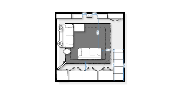
But before we get to the fun bits (we’re still shovelling soil), the room layout has to be nailed (literally). It’s not the easiest room – there’s got to be lots of multi-functionality but I’ve found a brilliant site – The Make Room – which is the easiest, most practical room planner I’ve ever played with.
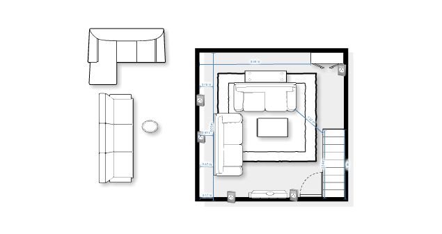
You can pull in furniture..and alter their sizes to represent yours..or what’s on the dream list.

Save different layouts. Add in measurements to ensure there’s enough walk space..(Top tip: As a base line the site uses feet and inches, to change – look to the right and click on ‘add all buttons’ then, look to the left, find ‘view’ click and change to centimetres)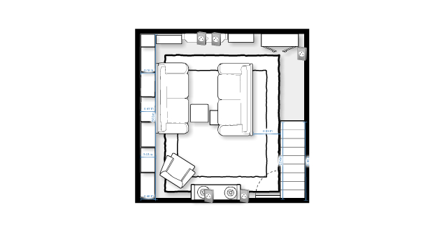
You can choose plugs..lights..even slippers.
At the end – oh the joy! – it gives you a list of the sizes of all the furniture you’ve used..is that not heaven on a page?

Then just print off..and hand to nearest Bank Manager…
Laters, Kate x
Woolly Palette x

Sheepskin has that rare mix of standout and empathy.

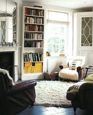
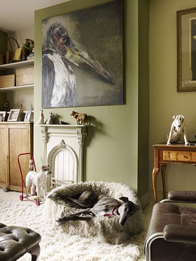
It’s come a long way from the full blown saturation of it’s seventies hey day which resulted in total burn out.

But it’s appeal is sneaking under the radar and gently returning, softening edges and singing of warmth and cosy nights by open fires.

No doubt the flokati rug will soon follow.
Laters, Kate x
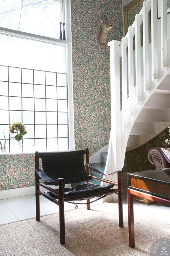
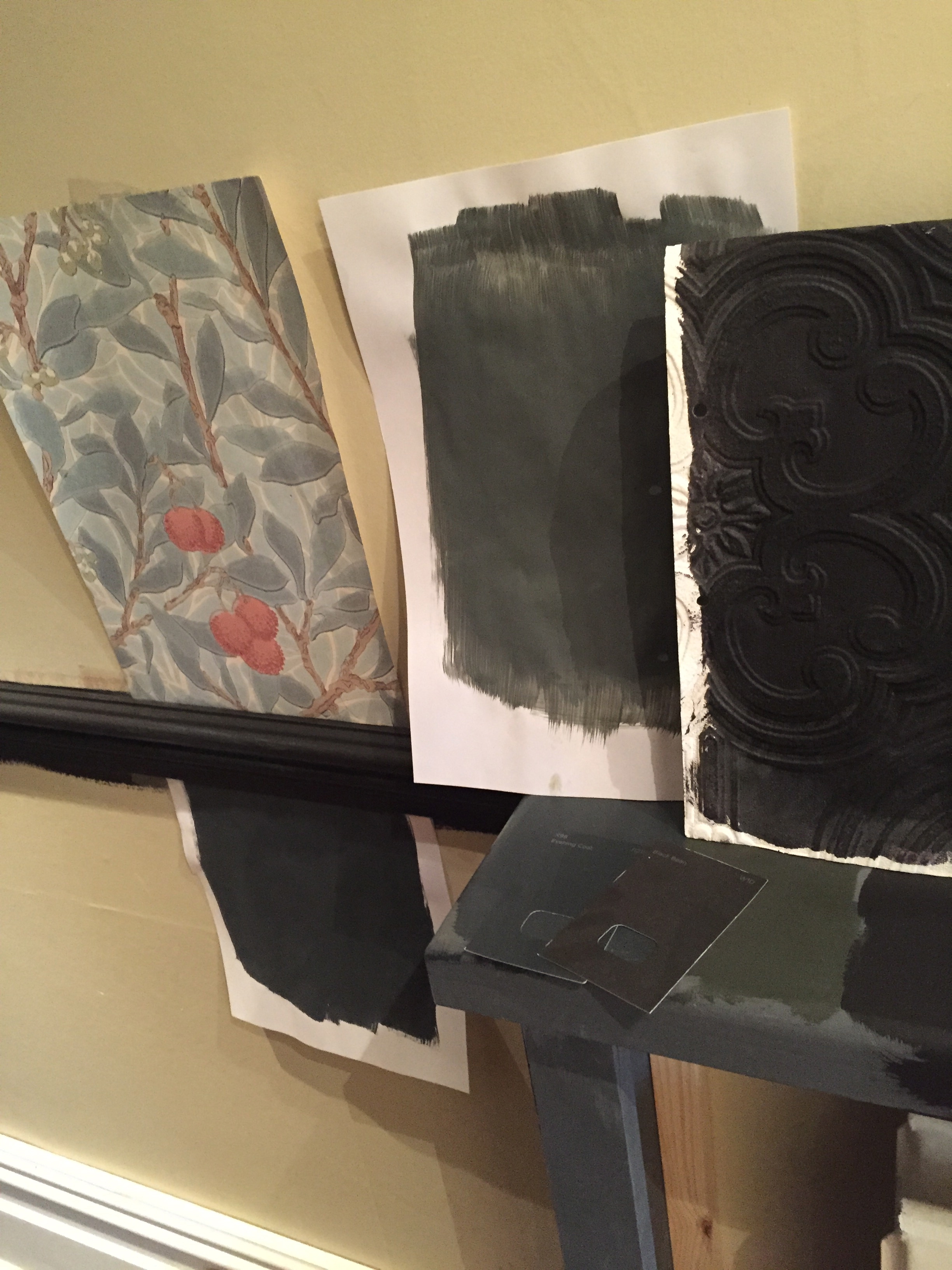
Turning to the Dark side..
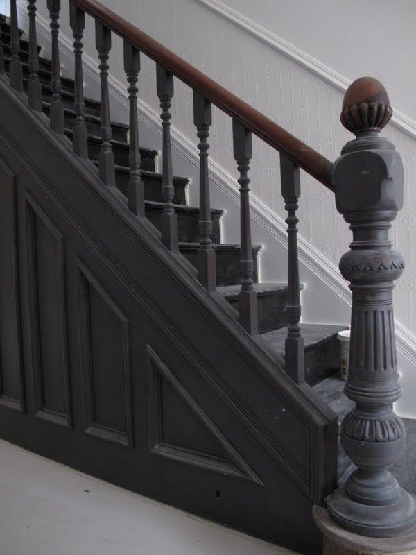
Now to decide on the colourways for the hall. This isn’t my hall, just a picture for inspiration, but I know I want the woodwork to be dark, virtually black, except how far do you go? The newel post in this picture is epic, but I can’t help feel they missed a trick not painting everything that dramatic thundercloud grey up to and including the dado. Does that mean below the dado has to be dark as well? The radiator cabinet? It’s a dilemma..
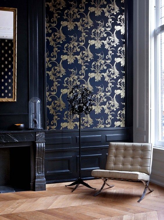
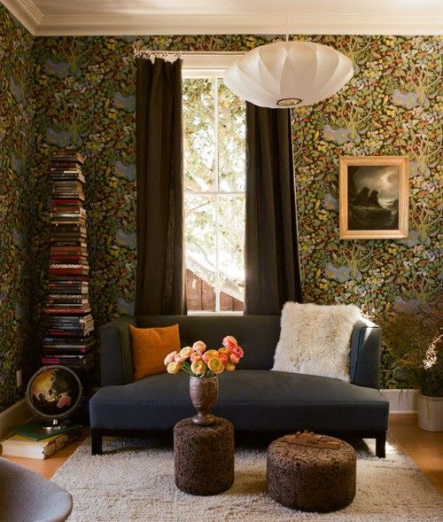
Although having it dark certainly makes wallpaper pop.

And wallpaper is a cert. William Morris if I have my way, but not this one, though the black wood looks magnificent against it.

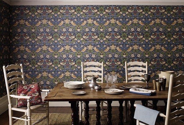
A dark top half which directs the eye beautifully to the bamboo paper at the back. But it’s not what I want.

Dark all the way..tempting, except it’s leading into a dark room..

This is the closest picture to reality…and it’s got to be black all the way, up to and including the dado.
Decision made. Now to choose the wallpaper..
Laters, Kate x
Skirts and Trims x

The latest obsessions on our renovation are skirting and architrave…and the difference it can make to the personality of a room.
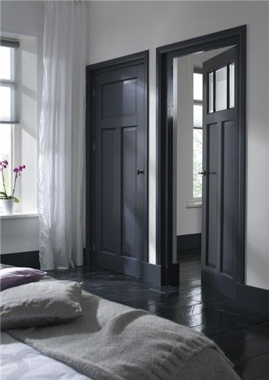
Particularly if it’s picked out in a darker colour.

Oh! The height! The scale!


And ours is going on! Only the top layer mind, as the floor has yet to go down..but it’s a bright, burning light at the end of a long dark tunnel.
Laters, Kate x
