Category: interiors
They’re Here!

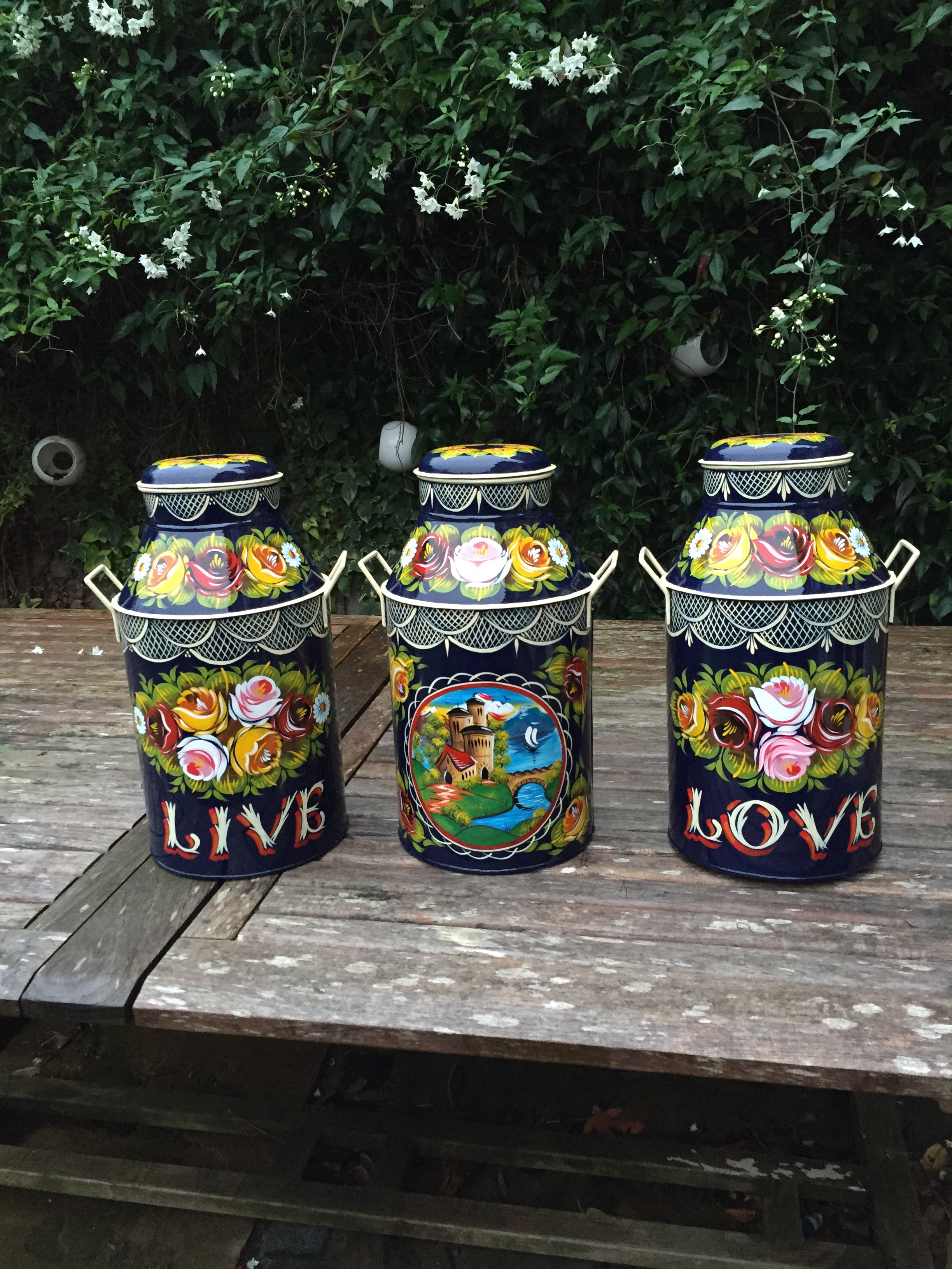
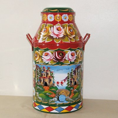
The kitchen lights in all their milk churn glory have arrived! Including their beautiful wording…

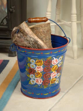
On the flip side are painted typical canal art scenes of castles and mountains.
I’m suspecting they’ll be hung in a row like this..so the cook on the far side has the last laugh..
My cup, it floweth over…
Laters, Kate x
Fur coat..
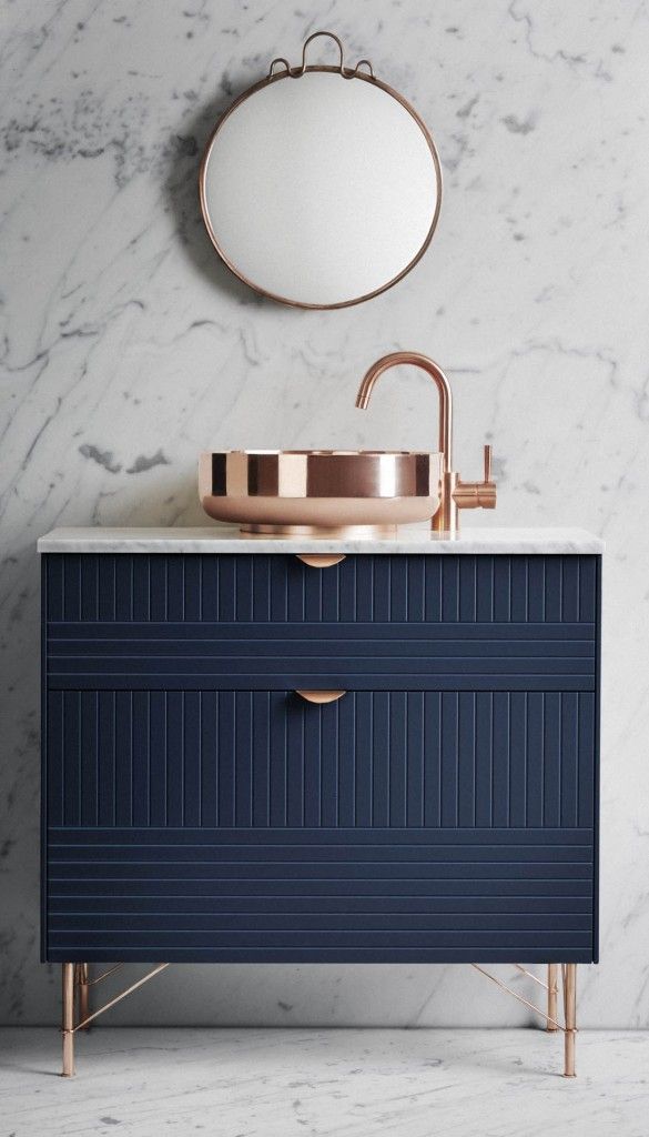
There comes a point in every house renovation when Ikea becomes a must not a want. It’s that line in the concrete dust between Pinterest dreams and harsh reality. Not that there’s anything inherently wrong with Ikea – a huge percentage of what they do verges on the genius. It’s just that, chances are, everything you like will be replicated a hundred times over in millions of homes around the globe, even in your next door neighbours, which as an individual, never sits comfortably. But that’s where Ikea hacks kick in – the idea of taking the basic Ikea form and transforming it into something with Icarus-like wings. A concept the company Superfront has taken a whole leap further..
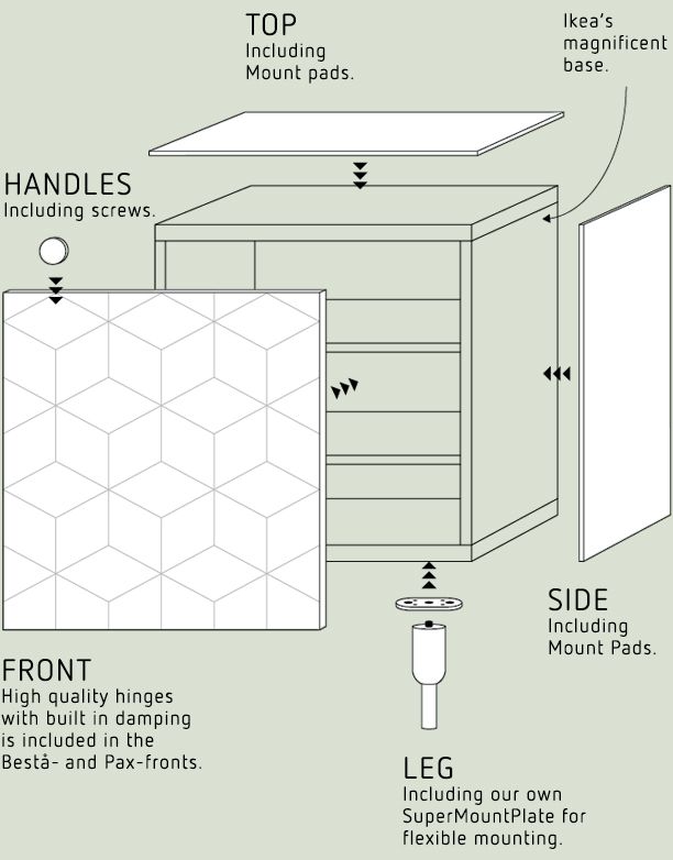
They design and manufacture fronts, handles, legs, sides and tops that fit Ikea’s most common cabinets.
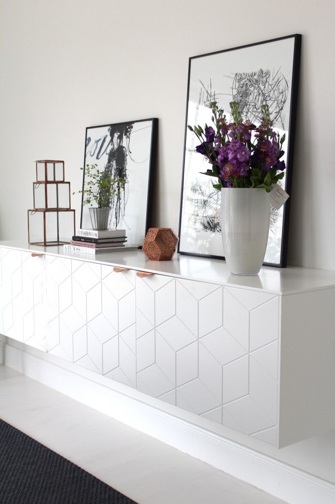
And they do it with style and panache.
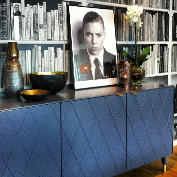
What’s not to love?
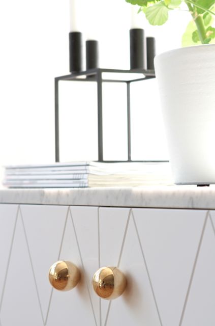
Except there’s a mental leap to get over..you’re buying Ikea because it’s cheap..and then you’re going to spend lots of money on it to make it special? Why not cut the middle man out and buy something expensive in the first place?

Or let these designs stand on their own two feet and cut out the Ikea bit? Except then they’d be unhitching from the global gravy train…

Hey ho. At least what they do opens up the opportunity to follow suit and nick pay homage to all their ideas too..and so the dog eat dog world of design continues…
Laters, Kate x
Kitchen heaven!
The kitchen light’s are coming! The kitchen light’s are coming!…and I have no real idea what they will look like or whether they will actually work, except that in my head they are totally brilliant.
I needed three pendants to hang over the new island unit but didn’t want to go down the industrial look, not because I don’t like it..I just wanted something very different.
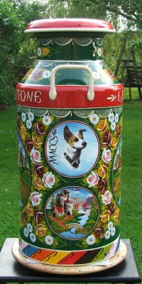
Also, I’ve realised over the years that I have a passion for folk art..an art form we don’t take seriously enough here in the UK. All the images here are typical examples of British canal art – the traditional means of decorating canal boats and barges. I think it is stunning, ingenious and totally covetable.

So I’ve commissioned three milk churns to be painted just for me by my favourite canal art painter…and they’re finished!!
Seriously. Can’t. Wait. More details when they’re here.
Laters, Kate x
Crystal Balls….

There’s a change in the wind..can you smell it? It’s something I didn’t think I’d sense again, but it’s there and getting stronger. Like the White Witch of Narnia, the power of the White-Company-scandi-minimalist-Christmas is finally waning and being replaced with bright, retro, seventies glam. This year on my tables, all the candles will be warm…and red…

Fairy lights will be multicoloured and loud.
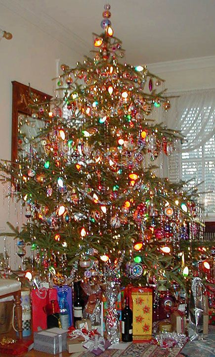
And the tree will be smothered in tinsel and those funny silver threads once again.
It’s time to embrace the kitsch and the vulgar..

Out with the bland and in with the true!
Laters, Kate x
Back-splash x
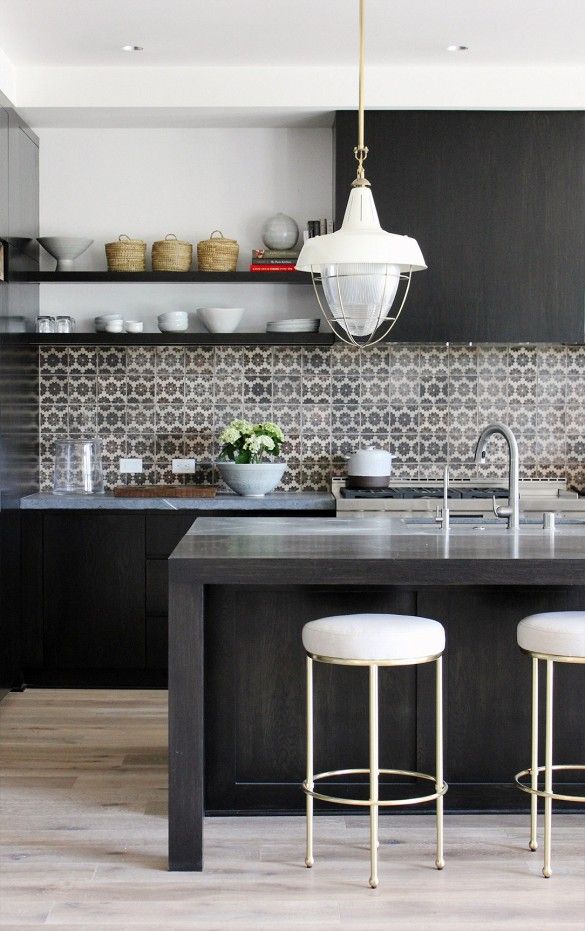 There’s still a long way to go, but I’ve learnt in this house renovation game to always be ahead of the curve in the decision making – there’s nothing worse than the pressure of time forcing a choice, so the current obsession is kitchen splashbacks.


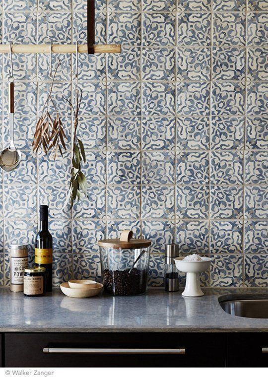

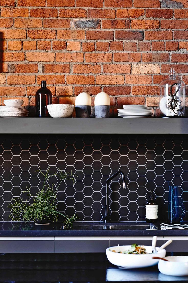
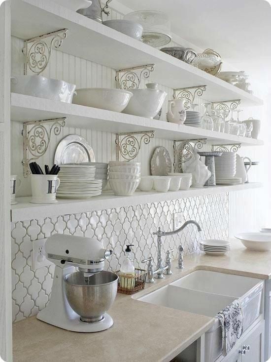

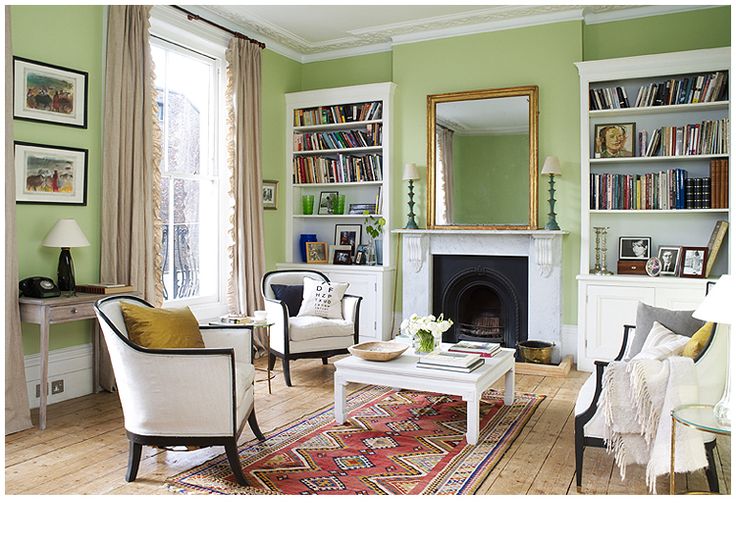
Question: Did you choose your favourite based on the actual splashback…or which kitchen you preferred? (casing point, the pic above..nice tiles, shame about the curtains…)
Laters, Kate x
Light up my Life x
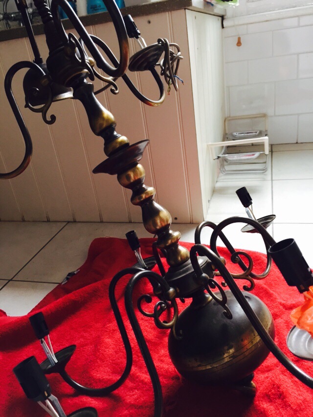
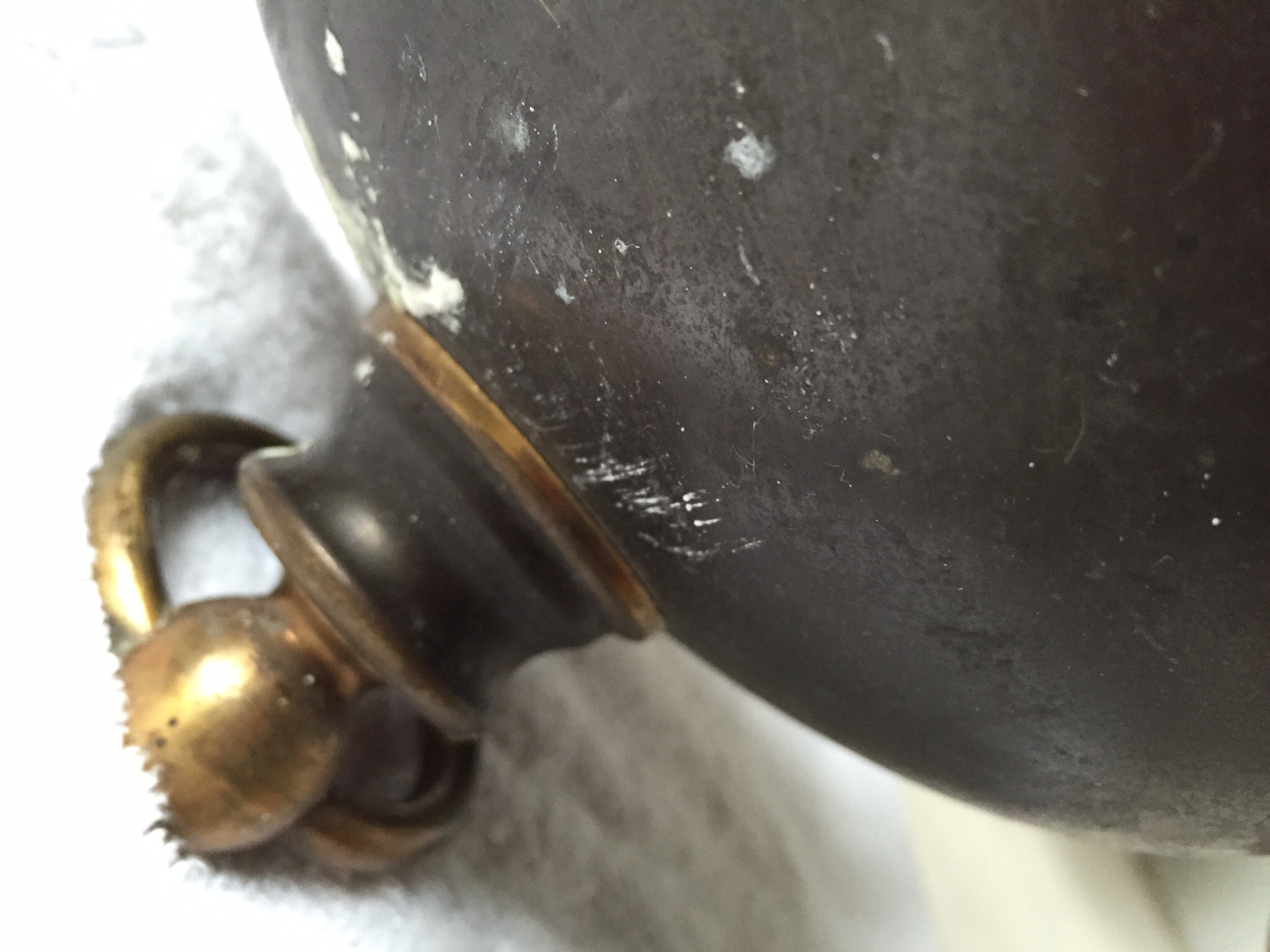
Ah! The potent joys of a holiday to Kent, where each time we visit I think I’ve cracked the lack of internet, only to fail miserably again and again..until the only option is to (with natural great regret) down tools entirely and embrace the holiday spirit and a world without computers. Needless to say, it was a walk along the path to bliss! But more on Kent another day..both pre and post trip I’ve been obsessed with the light for our new dining room. Much to my own surprise, having looked at various 1950’s and 70’s lights with their cool drama, I went for this classic flemish brass number. It was the cost shape that made it stand out..over a metre tall and two tiered, like a Christmas tree (imagine decorating with ivy, fir and baubles. Sigh) but it was in a pretty sorry state and covered in a dark varnish much loved in the 1940’s that now just detracted, like a bad fitting nun’s habit from it’s simple lines and austerity appeal.
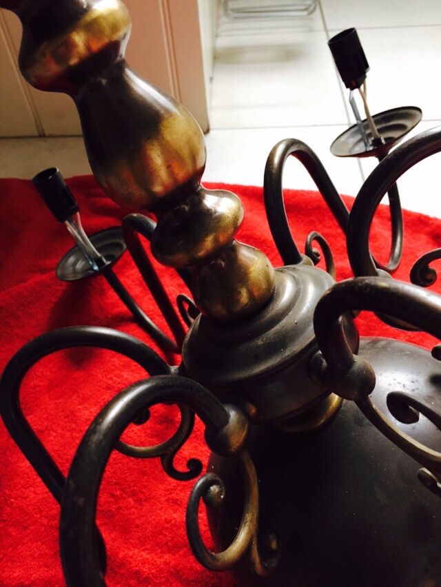
But how to clean it? Pinterest proved to be a wealth of info and basically there were two options – making a paste with vinegar and baking powder or soaking it in nail varnish remover. Not being sure how much nail varnish remover would be required to fill the bath and dubious about the effect of remover on electric wiring, I opted for the first choice.

The vinegar and baking soda bubbled up beautifully when mixed together and had the additional benefit of the evocative scent of a down town chippie.

It was slathered on and left to simmer gently.
The result? A huge, stinking, smelly mess…and no noticeable change.

Undeterred, Plan B went into action: Cotton wool pads soaked in nail varnish remover and wrapped around the light like a mummy.

It definitely made a difference, but didn’t shift the deeper stains which even elbow grease couldn’t budge.

Returned to instructions…and to give them their due, they did say to use very fine steel wool with the nail varnish remover.

And when I finally got hold of some (slack..always make sure you have required tools before you start) it was like magic..the black literally evaporated away. From this..
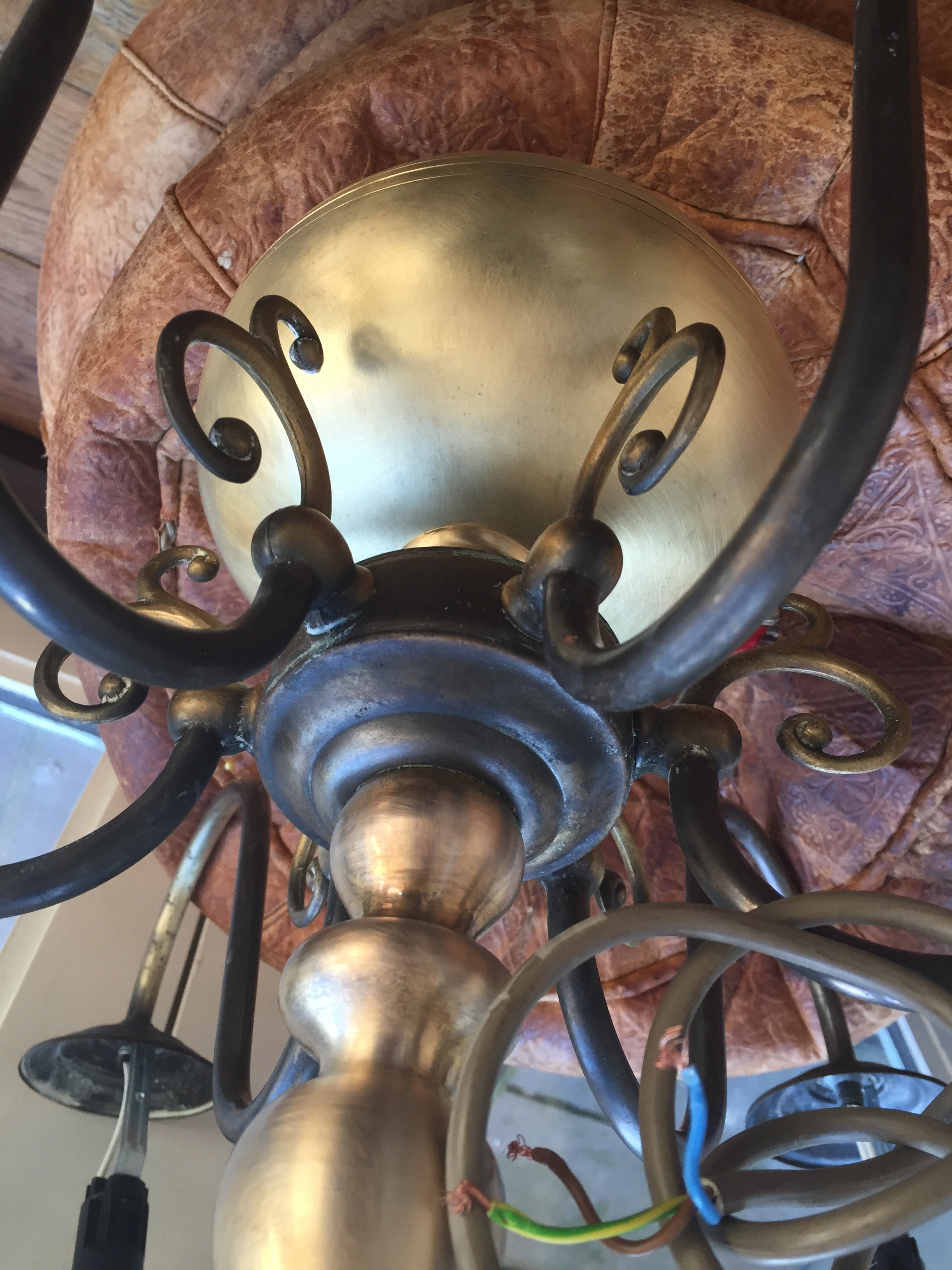
To this.

Like Cinders from the ashes, she’s turned into a real beaut! Now I just need to source some of those vintage, edison-like-filament bulbs that have been popping up everywhere..pray they do them in this size…but knowing my luck…they’ll cost more than the light!
Laters, Kate x
Stockwell Green No.203

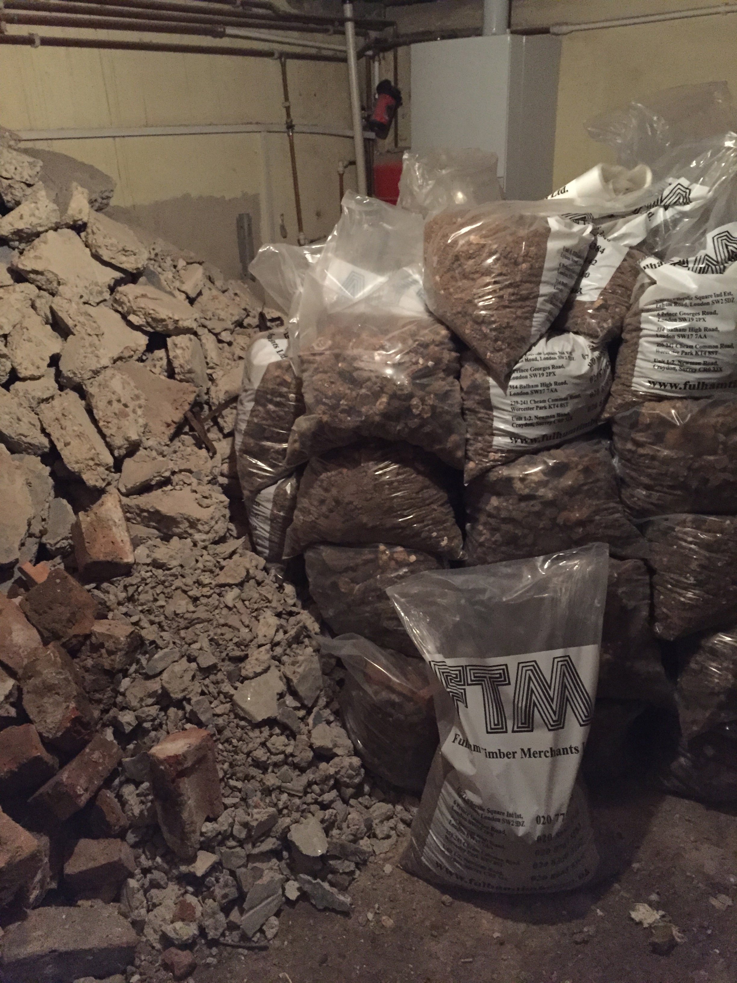
The building works are coming on, although there’s still a great deal to go (she says as she looses electricity and internet again), but we’re far enough down the line I’ve started to allow myself the infinite pleasure of looking at paint charts and buying sample pots, because paint has that magical ability to turn an ordinary room into the stuff of dreams.

And there are some interesting brands to choose from – take Mylands – the oldest British paint manufacturers still owned (four generations and counting) and managed by it’s founding family who remain the only paint manufacturer still producing paint in London.

The joy of their colours comes from their attached history, and the fact that unlike many other manufacturers, they still use earth pigments in their paints.

Recognise this place? It’s the kitchen from Downton Abbey..with a paint colour I’ve lusted over many a Sunday night.

Empire grey and Amber grey by Mylands no less.
Well, if it’s good enough for Mrs Patmore…
Laters, Kate x
Wednesday..

Happiness..a very dear friend has stepped off the red-eye from the States this morn and is coming to stay! Oh joy!
Sadness..my house is not at it’s best.

Happiness..it’s not raining!

Sadness..I have no kitchen

Happiness..wine doesn’t need cooking!
Laters, Kate x
Wallpaper x
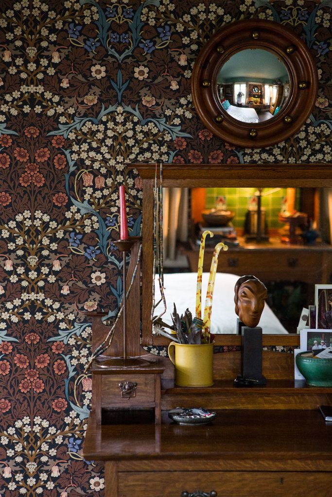
I did a Swedish embroidery class with a friend last week – everything was bright, breezy and scandi. It’s summer..everything is still bright and breezy..so why am I drawn to the dark side?
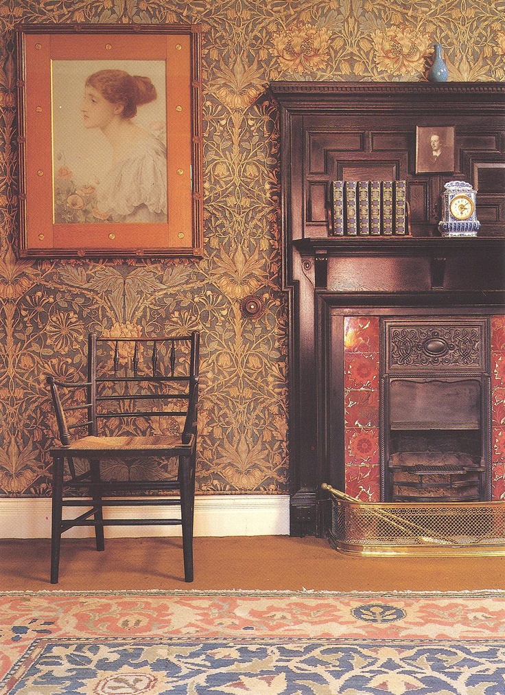
I imagine what it’s like to look at bright, green leaves through black window frames, the light pulling you out, the garden dancing.

Or a hall, where mysterious corridors can lead anywhere, the walls glowing with a real log fire.

(All pictures Pinterest)
There’s a substance, a peace, a sense of history..and I want it.
Laters, Kate x
Brass…
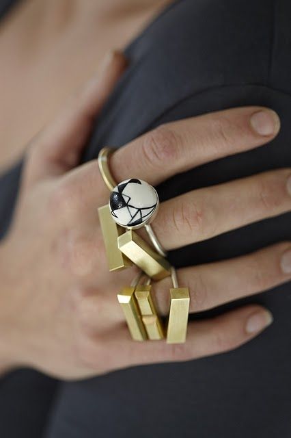
Today is our fifteenth wedding anniversary…..15 years!…I wanted to upload a picture from the holiday, but the IPad is failing me, instead it’s pictures of all things brass and delicious saved into the library before we left, but they’re a surprisingly good representation of a golden time and a very wonderful man….

 Brass..


Laters, Kate x
