Tagged: exteriors
Swimming pools

so here’s the thing…I was meant to be in the UK this week, travelling out to Greece on Friday, but in one of those schisms of life I flew out a week early, even missing the England match, but not missing the London heat.


These were a selection of mouthwatering photos designed to pre-empt the summer dream…simple, elegant beauty that looks so edible it transcends man made and manufactured…….except now I just happen to be living the reality…
Laters, Kate
Project concrete x

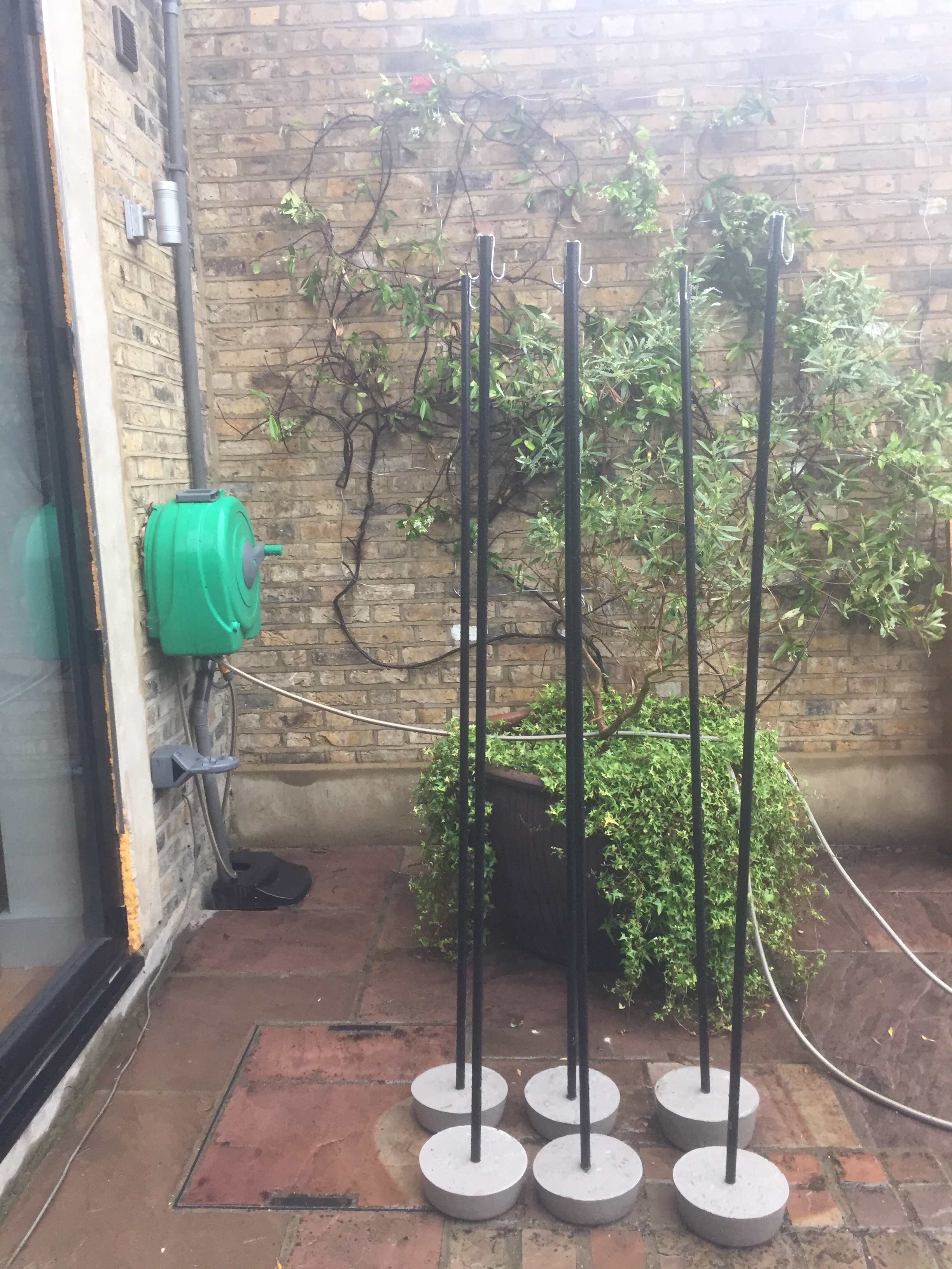
There was a project this half term – to make fairy light stands for the garden, just like these ones.

The aim was to have pure concrete at the bottom rather than a container of any sort. I found these 7 litre tubs in the pound shop and hoped the flex on the sides would mean the hardened concrete would pull out easily. The easiest way to mix the concrete was separately, in each tub. Tip of the day: mix it in layers rather than all at once – put a bit in, add water, mix…add a bit more, otherwise it hard work..and there’s always a bit you’ve missed..otherwise, I didn’t know how easy concrete playing was. Like play doh for grown ups..

The concrete was nothing posh. Bog standard from DIY store.

I had six foot metal poles from homebase (£4.75 each) to go in the middle, held in place with duct tape till they were hardened.

It was surprisingly easy to pull the finished bases out. Ta-dah!
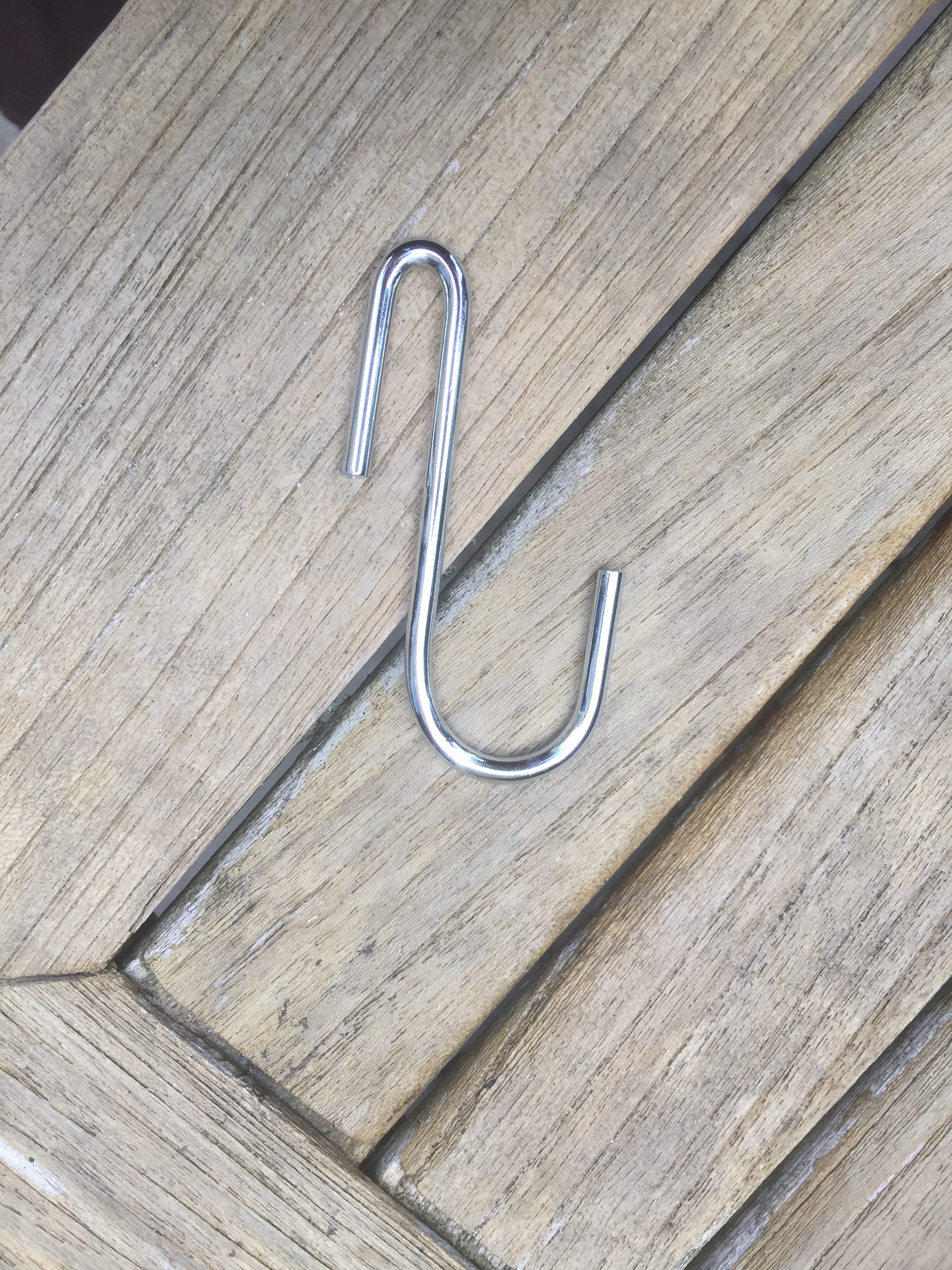
I bought s-hooks from Amazon. The shape of this particular hook was appealing with it’s straight side to fit in the pole and the curvy end to hold the lights.

In position..pic taken today as the rain streams down…the hooks are held in position with window putty. Simple.
The final thing will be to paint them all black – when the weather improves. And then photograph them with their lights. Maybe then I’ll do a post on finished projects because the mirror has finally gone up in the downstairs toilet too….
Laters, Kate x
Brickwork x

So I’ve found this App called ‘Paint my place’ – it’s not the most intuitive app and there’s no point in going for the free version, it’s £2.99 or nothing. But it has allowed me to take a picture of the front of our house and play around with different colours on the brick work.

This is off-black from Farrow and Ball. Probably a bit too gothic..

Pic no.2 – I was curious to see what a really dark blue would look like as an exterior paint. Not my favourite. What I learnt is not to go for the colours you know, but choose via the sample square on the app, that way you can see if you like the potential colour rather than the specific colour.

The version using Farrow and Ball downpipe. The softer dark is better.

Neutrals – this is Skimming Stone by Farrow and Ball – which probably proves the point of colour distortion: Don’t rely on what it says if you’re going to buy paint based on this app.

And finally – Elephant’s breath, Farrow and Ball.
It’s been interesting and fun to to have a genuine chance to experiment. I think it has proved previous posts conclusions: Downpipe is an easy choice because it will work. To find the right neutral will be much harder, but I’m surprised how much I like the neutrals.
My admiration for Hockney and his skill with ipad art has now shot sky high.
Laters, Kate x
Outside Story x
This summer it will be fourteen years since the outside of house was painted. I know the date exactly because it was the year we got Molly the dog. Which means everythings getting a bit old. But at least the outside can be re-painted..although I’d prefer not to paint it white..at one point I thought a beige putty colour would be the way to go..but finding the right putty colour has proved very hard as so many have too much green in their base. Now I’m thinking it’s the chance of a lifetime to go rad, be bad..and go dark..
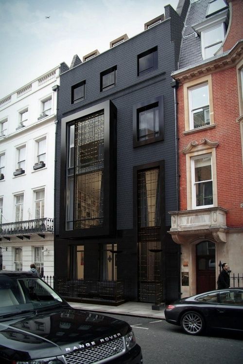
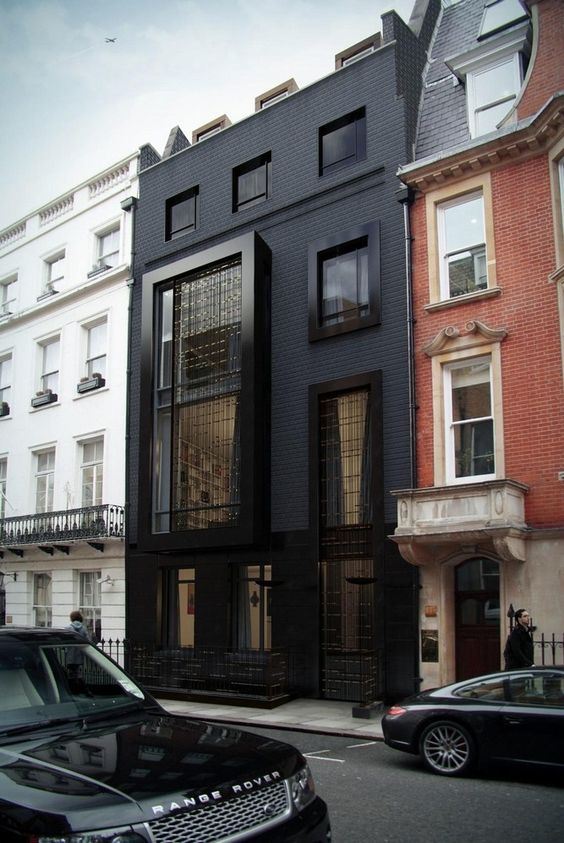
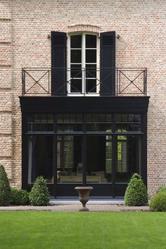
Particularly when you see photos like this: It’s hard to standout against such beautiful period houses but this modern number effortlessly makes its mark.

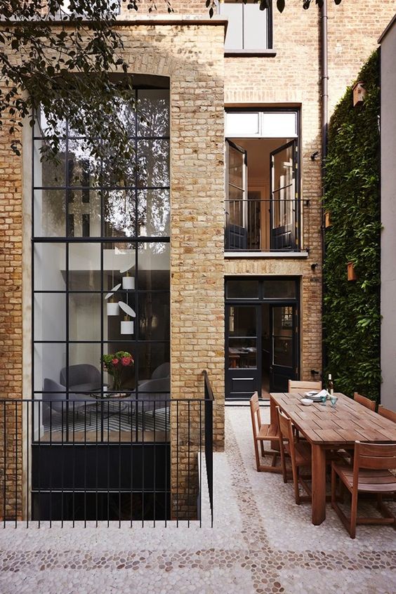
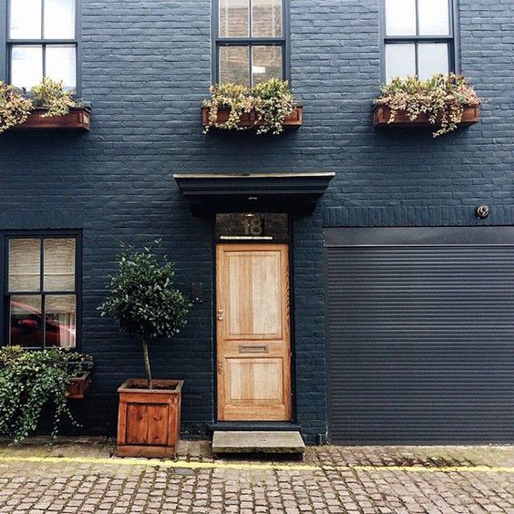
Ours is a Victorian redbrick house not dissimilar to this one. Whilst the colours compliment, on a personal level I think an off-black would work better…

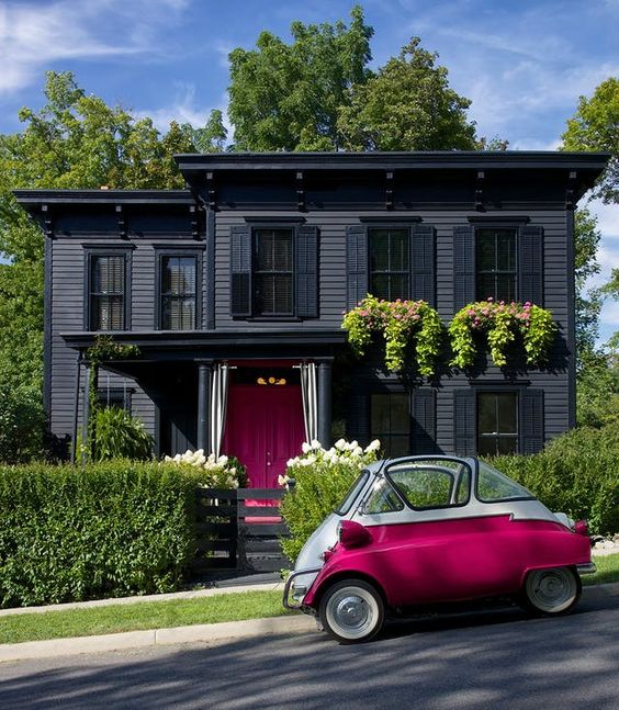
Maybe more like this. But is that just opting out??


I think I might takes some pictures of our facade and start colouring in…there must be some technology out there now to help make the decision? Watch this space.
Laters, Kate x
Exteriors..

As the internal painting on the house starts coming to an end (just the downstairs toilet and some radiator cabinets to go) all thoughts are turning to the outside. It’s a big decision and needs time to mull.
There’s so many options..dramatic and black?
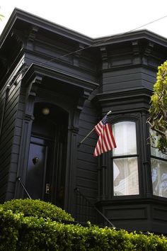

I like it..but I think it might be better on the back of the house…(I just love the way it contrasts with green..)
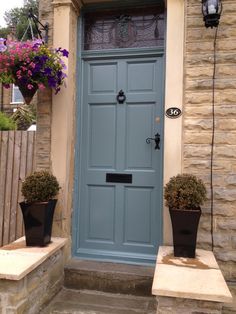
So at the front..I’m thinking putty coloured windows and woodwork..but the front door? A darker putty shade? or that classic pale blue…
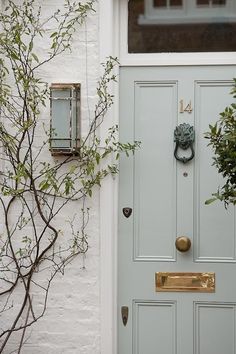
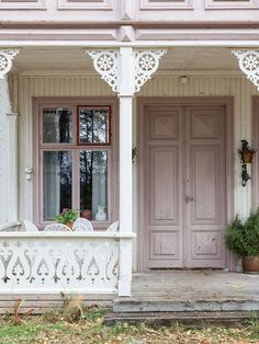
Or even a mallow pink?

Hmmmmmm. There’s no rush – we like the front looking crap as a burglar deterrent over the summer…but the picture needs to come into focus..
Laters, Kate x
