Brickwork x

So I’ve found this App called ‘Paint my place’ – it’s not the most intuitive app and there’s no point in going for the free version, it’s £2.99 or nothing. But it has allowed me to take a picture of the front of our house and play around with different colours on the brick work.

This is off-black from Farrow and Ball. Probably a bit too gothic..
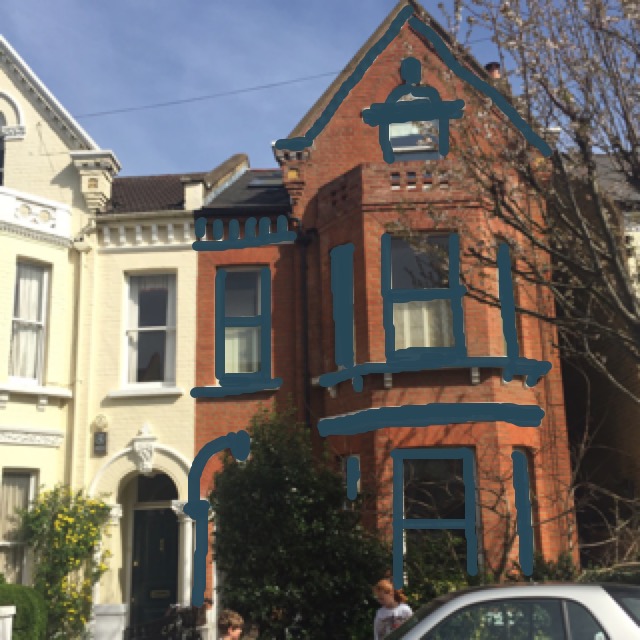
Pic no.2 – I was curious to see what a really dark blue would look like as an exterior paint. Not my favourite. What I learnt is not to go for the colours you know, but choose via the sample square on the app, that way you can see if you like the potential colour rather than the specific colour.
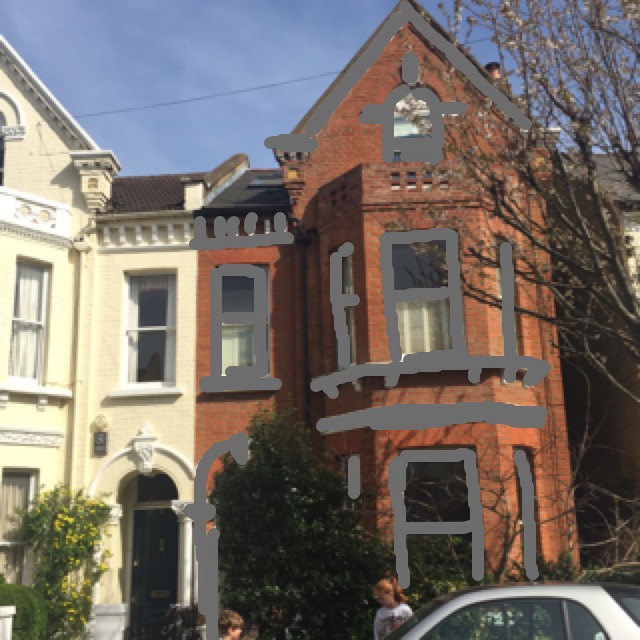
The version using Farrow and Ball downpipe. The softer dark is better.

Neutrals – this is Skimming Stone by Farrow and Ball – which probably proves the point of colour distortion: Don’t rely on what it says if you’re going to buy paint based on this app.

And finally – Elephant’s breath, Farrow and Ball.
It’s been interesting and fun to to have a genuine chance to experiment. I think it has proved previous posts conclusions: Downpipe is an easy choice because it will work. To find the right neutral will be much harder, but I’m surprised how much I like the neutrals.
My admiration for Hockney and his skill with ipad art has now shot sky high.
Laters, Kate x

Good info! 👍