Tagged: experimenting
What did you do at the weekend? x
It’s been a while coming, but I’ve finally hit the time when I am (virtually) redundant from hand to hand trench child care. Quite a revelation. Suddenly free time is mine again – like really mine. And weekends seem to be the place where the change is most obvious – one day is spent going for long cycle rides (to keep up with husband, a self-confessed mamil, I have an electric bike – like shut the door fabulous) and the other? Well, inspired by Sewing Bee – I’m sewing. This is the pattern I’m currently working on. In this print:
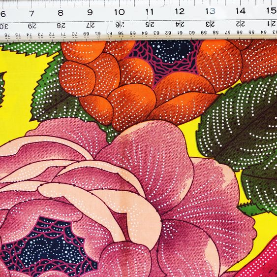
Because it was cheap to make mistakes on and the print made me smile. But if it works, I’m upgrading to this:
Bright canary yellow! And the main print is like 83 cm large! Watch this space…
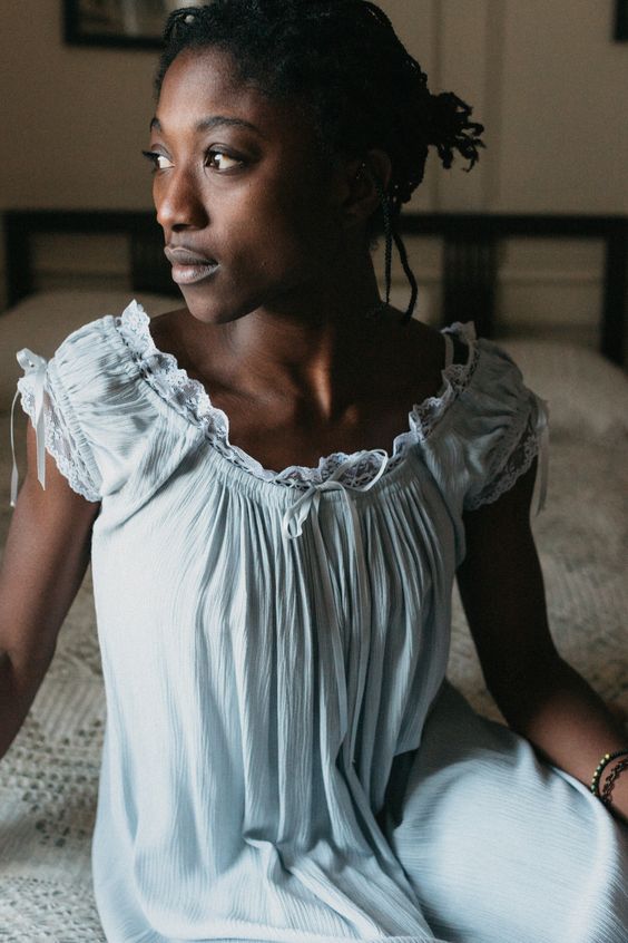
My new porn is searching for future patterns and ideas – which leads me to what was going to be the main thrust of this post – Folkwear patterns – based in the US, but a treasure trove of historical and international patterns from a Hungarian Szur worn by Magyar herdsman as far back as the middle ages to a ladies chemise from the mid to late 1800s.
(All pics Folkwear. com – and if you want to check out my collection of sewing thoughts and ideas check out Material on Pinterest)
I’m in heaven!
Laters, Kate x
Brickwork x
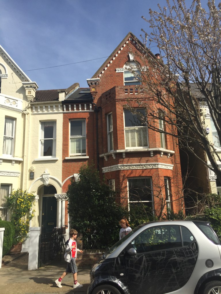
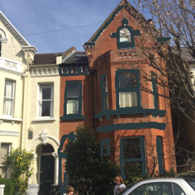
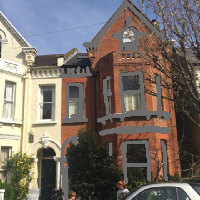
So I’ve found this App called ‘Paint my place’ – it’s not the most intuitive app and there’s no point in going for the free version, it’s £2.99 or nothing. But it has allowed me to take a picture of the front of our house and play around with different colours on the brick work.
This is off-black from Farrow and Ball. Probably a bit too gothic..
Pic no.2 – I was curious to see what a really dark blue would look like as an exterior paint. Not my favourite. What I learnt is not to go for the colours you know, but choose via the sample square on the app, that way you can see if you like the potential colour rather than the specific colour.
The version using Farrow and Ball downpipe. The softer dark is better.
Neutrals – this is Skimming Stone by Farrow and Ball – which probably proves the point of colour distortion: Don’t rely on what it says if you’re going to buy paint based on this app.
And finally – Elephant’s breath, Farrow and Ball.
It’s been interesting and fun to to have a genuine chance to experiment. I think it has proved previous posts conclusions: Downpipe is an easy choice because it will work. To find the right neutral will be much harder, but I’m surprised how much I like the neutrals.
My admiration for Hockney and his skill with ipad art has now shot sky high.
Laters, Kate x


