Tagged: Choices
Favourites x
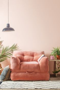
I am an avid Pinterest poster. Driven by all things visual, I find it a place I can nail down fleeting thoughts and find substance to inspiration. It’s the workings of my inner mind, but held in aspic so it doesn’t fly away again. It’s also my way to test longevity – a day, a week, a month later, is there still the same reaction? Sometimes things are pinned for the wrong reasons – on one level it’s a sofa, but the real magpie glint is the inspiring colour of the wall. Sometimes there’s a purpose, often there’s not, the intent just to trail a hand in the flow of colour and movement, pick up the scent of future trends. But this post is about what has caught other people’s eyes, what has unexpectedly cut the mustard in the big, wide world? Like this chair, from Ian Snow, has a remarkable 1.6k impressions. Is it the velvet? the flexibility? the squish? Or all three?
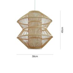
It’s summer, the 70’s are becoming a thing. No surprise then that all things rattan are having a moment. Like this light from Etsy, 123 impressions and counting.

This one, again from Etsy. A bargain at £32.53 plus shipping. 104 impressions and rising.
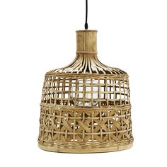
This light is ranking third – from Design Vintage at £110 has 94 impressions.
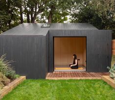
At 110 impressions, this modern garden pod has caught the imagination. It comes from a photo I took from the Home section of The Times. No details unfortunately.

Is it the bench? Or the cushion? The link was for the cushion – £45 from Dibor – 915 for impressions.

(All picks Pinterest)
The cushion on its own….444 impressions.
It’s a strange old world.
Laters, Kate x
Illusions x

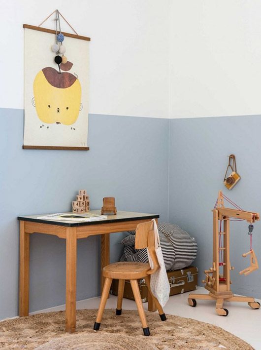
It’s a mad old time at the moment – both kids starting new schools, husband working away from home during the week, scaffolding up, decorators in both inside and out. It does mean Bella’s room is finally being decorated – more on that later. But making the final decisions in consultation with her has meant much pinning on Pinterest. First there’s been finding the line between what she wants now versus what I believe would stand the test of time and take her through her teenage years…an interesting discussion. But there’s also been a feeling of walking between a real world and an imaginary one and reaching a point where the two seem to collide into a strange reality. As we’ve both been pinning and sharing inspiration it’s become more and more obvious that what looks good isn’t always practical, and if it isn’t practical, does it deserve it’s title of good? Take the kids room above, an eclectic vision of white pepped with colour and texture. But the ladder..why?
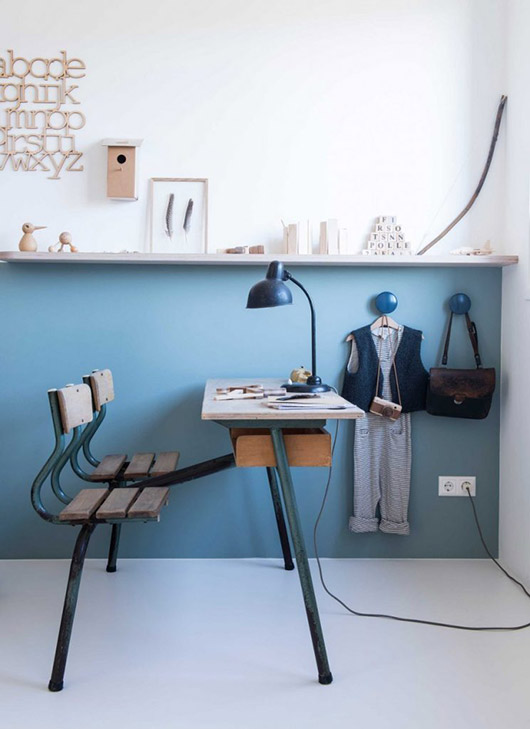
At first glance this is a minimalists wet dream with toys framed beautifully to catch the eye like tempting abstract art. Except how can a child reach them? Stand on the rocking chair? Maybe borrow the ladder from the picture above?

Same problem here. Except don’t you look at all of these and feel sorry for the kids? The toys are so carefully chosen and exceptionally curated, not because they’re fun to play with but because they’ll photograph well, give the right image..this is a sickness that is contagious..

Or else you’ll get the room where there aren’t any toys at all. Because..well..playing is just so overrated isn’t it? Far better for kids to just to suck it up that they’re going adults and get used to it, perception over substance, pretence over truth, the new modern dream…maybe I need to go and live with the Amish..or not! But embracing what is beautiful and what is practical seems a basic, honest step…
Laters, Kate x
Outside x

Small, brave signs of spring are appearing: delicate snowdrops, sturdy crocuses and longer days. Which is maybe why thoughts are turning to the outside and in particular window boxes: Such a simple way to mix lush colour with urban grime.

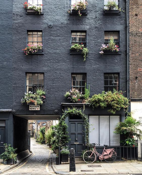
The decision of which colour to paint the exterior woodwork of the house is also edging ever closer: Soon the weather won’t be an excuse. Go dark?

Or go neutral?


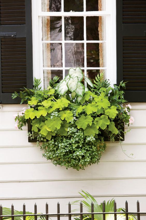

Put the two decisions together and it’s an interesting conundrum: Which combination looks better zinc, black or terracotta for the window box against the neutral?


Or the grey?
Why is it so hard? Damn.
Laters, Kate x
One, two, three, floor..

The study is need of a serious makeover and has been for some time – it’s been a kitchen, a nursery and now a dumping room, though not in the Australian sense. But there’s only a limited budget in the pot, which challenges the learnt mantra of do it once, do it well.
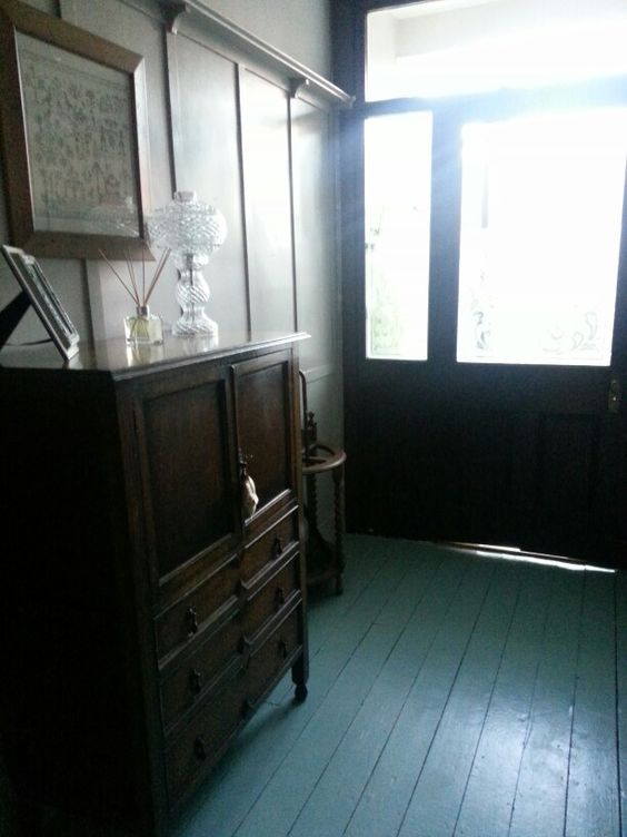
But it’s an interesting dilemma – does cheap cheapen? Or does it actually require greater planning, imagination and inventiveness? I would plump for the latter everytime.
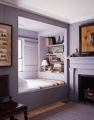

Except the carpet in the room desperately needs replacing. Natural sissal would my covering of choice, topped with a vintage rug like in the first picture. Sigh. Just not possible.

So it has to be painted floorboards – black? white? or maybe like this – painted the same colour as the walls..


(All pics Pinterest)
As for the rug…the one at present is a rather sad generic black and white number from Ikea. But what if one could dye it? Now that could be fun…watch this space…
Laters, Kate x
