Taka Naka x
 Taka Naka like to play with the eye and revel in experimenting with the unexpected. Basking in rich sources of inspiration subtle it’s not, capturing shifts in every mood..at the same time and layering them up like a rich mouth watering pavlova.
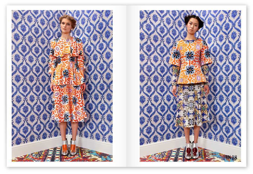
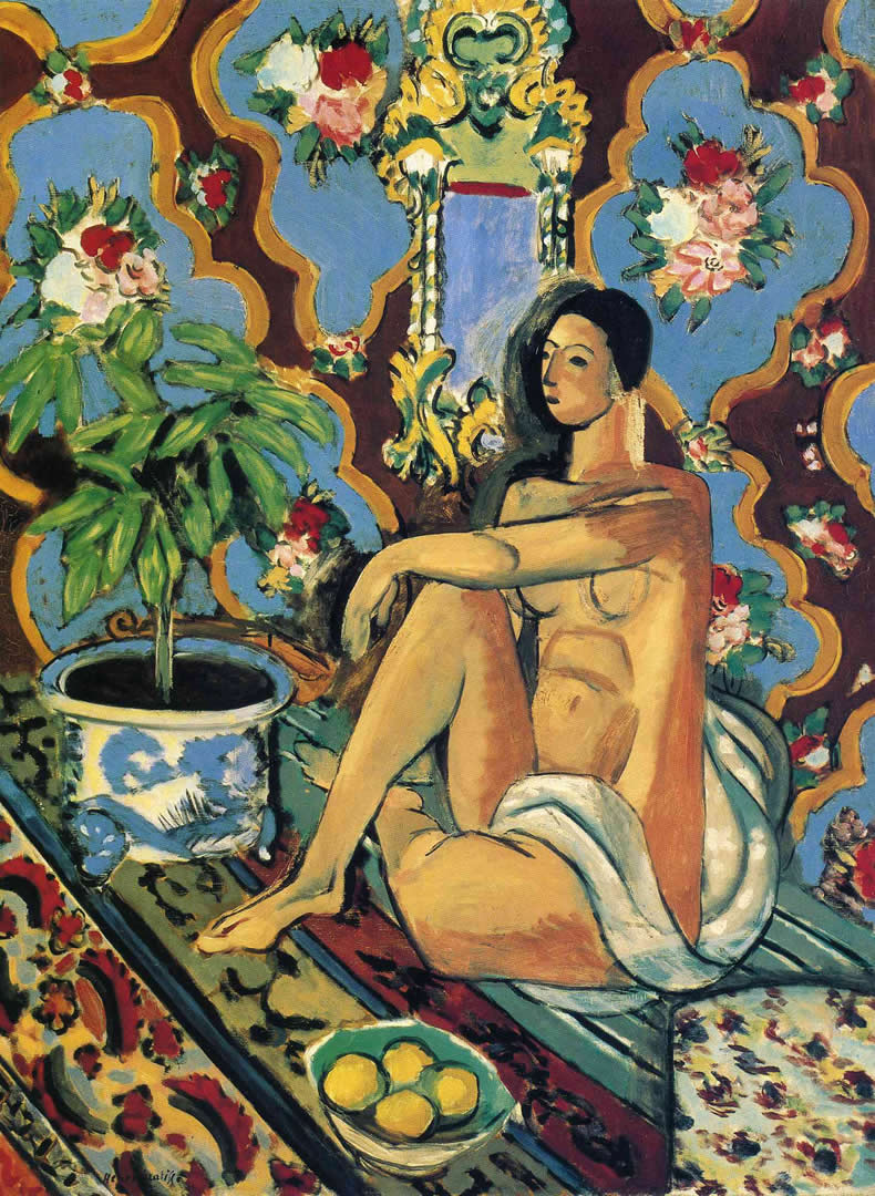
 Their signature are impressive in-house prints based on paintings or photography. For AW14 they’ve taken it a step further taking the world of interiors: prints from Carpets, wallpaper, tiles and porcelain as their point of inspiration. As well as – and appropriately given the exhibition going on in London at the moment – the wonderful work of Matisse.
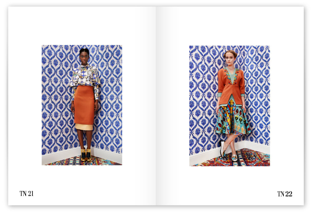
The aim is an exotic clashing effect, beautifully constructed with print on print.
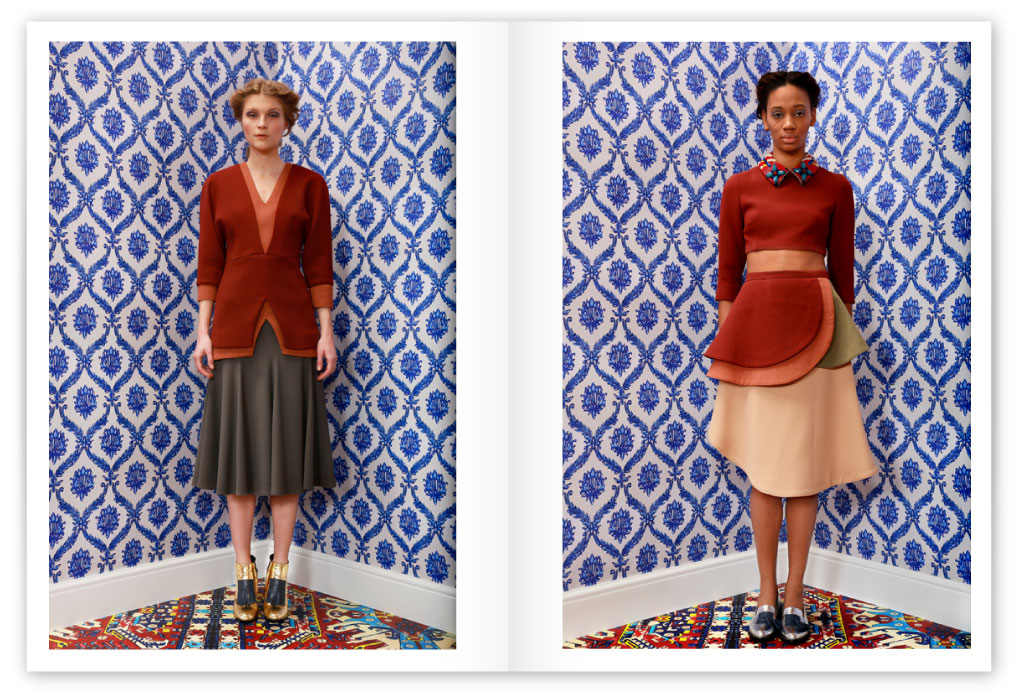 There’s a true fascination about how it all weaves together..helped by the incredible sets of these photos..
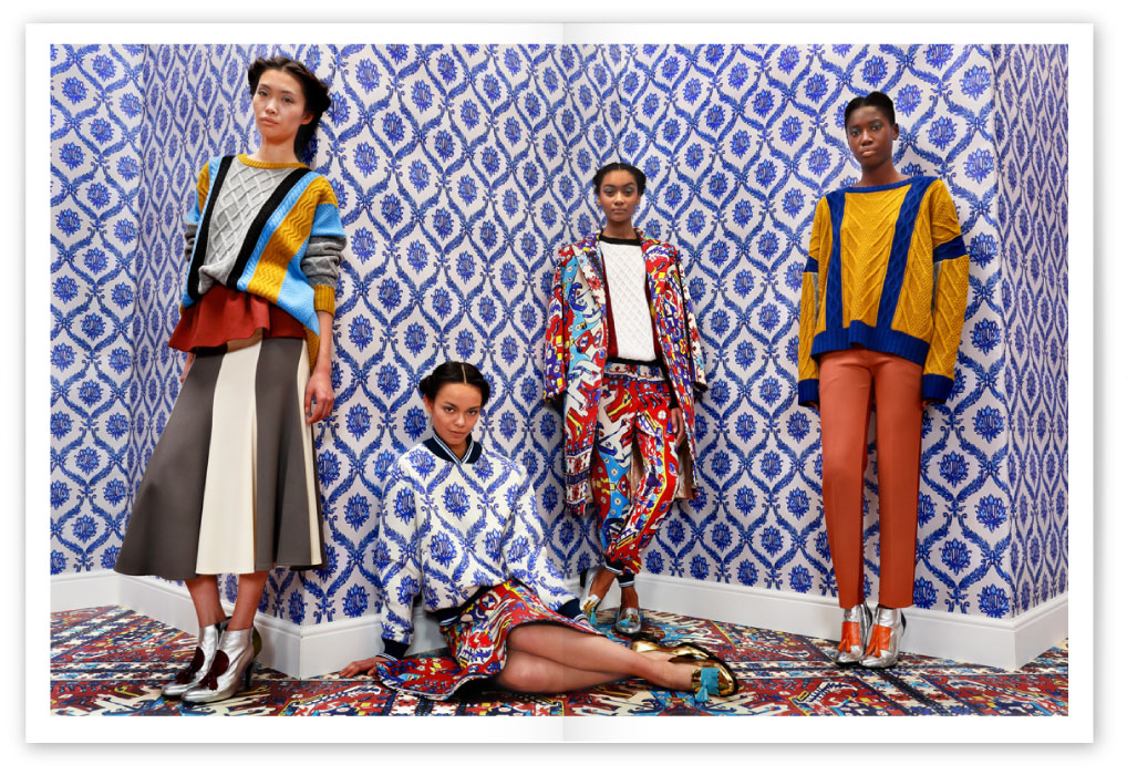 The Designers, identical twins Tamara and Natash Surguladze, say that by working together their designs reflect their contrasts..and yet still reveal the dual nature of the brand.
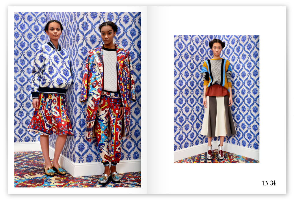

That print on the bomber jacket..so evocative..
So Matisse..

The Collection is a new twist on relaxed dressing within luxurious symbols.


Instead of searching for a point of rest, like a Bird of Paradise, the Collection sings it’s shimmering little heart out in perfect harmony..
Laters, Kate x

Reblogged this on S T A N Z I N O.
Thank you! xxx
We love promoting your stuff:)
I don´t have words. Would not even in Spanish. Where do you find these treasures, dear Kate? Deeply inside, I am number 22 and what would be number 23 (right after 22). I just wish I´d dare.
I seek them out!! They make it look so easy…I can’t decide..the first two? But then 34..and the bomber..I’m in heaven xxx
Joy overflowing…..colour print,colour print,repeat…..xxx
Clash, humour, joy, fun, pushing boundaries, incredible prints..it’s like falling into a pot of melted chocolate.. xxx
love all dresses…beautiful colors and print
I love the fact it’s not just the prints but the cuts of the clothes and dresses as well..gorgeous xxx
Love the pattern
Such a joy to see..just oozes confidence.. xxx
love the pattern on pattern!
It’s mad, bad and dangerous to know! xxx
TN21 and TN34 are mine… just sayin’… LOVE THIS!!! A real feast for the eye and big statements everywhere. Gorgeous! Now to go rob a bank…
Fight you for 34! xxx
Such gorgeousness – like adorning yourself in joy! xxx
I’m with you all the way! xxx
This is one of the most interesting collections I’ve seen in a very long time. Beautiful, flamboyant but also timeless and practical. Fantastic!
Standout, exciting..and utterly wearable..it is wonderful! xxx
It’s amazing how all these colors and prints look so harmonic and nice together!
And they’re standing on an outrageous carpet..and they still look awesome! xxx
TN 51 and TN 19 for me, please! 🙂
Elegance with the 51, colour with 19..I see how your mind works! xxx
OMG, I want them all, the prints are extraordinary and the colours. I love the one where the model blends in the wallpaper!!
There are some great minds at work…That carpet! xxx
Like Taka Naka’s stunningly inspiring collection, your post is an artistic masterpiece ! xxxxx
Come here for that hug! xxx
ooooo those prints are divine!! =)
A treat for the eyes…maybe not for the wallet! xxx
I love when the dress blends with the wallpaper, all the designs are so full of color and life. Just beautiful!
How clever is that? You know just how much thought and effort has gone into this collection.. xxx
The moment I clicked and your page opened, I went… whououp… sat straight and instinctively put a larger distance between my eyes and my screen! And I’m still absorbing everything! Wow!
It is very in-your-face..but I find it quite refreshing..I could wear everything.. xxx
Well, predictably, I like the solid color outfits the best but there’s great deal of joy in all of them. I love the humor, too, of the clothes matching wallpaper, etc.
It is impressive the amount of harmony that can be created where it shouldn’t..the wallpaper is genius! xxx
These are all such perfect gems! Wallpaper: the newest accessory
High five to that! xxx
AMAZING!! Love it.
I’m thinking its the white in the pattern that draws everything together.. xxx
Glorious! I have a friend who worked with them in their early days and it was apparently chaos inside. It’s nice to see they are still going and so strong! And maybe the chaos inspires those clashing colorful prints . Whatever gets their juices flowing! xox
Very interesting. There’s obviously been a huge gear change since their SS13 Collection..I wonder if they’ve been spotted and supported..I hope so xxx
Gorgeous. Love them all.
The orange, blue and white is such an unexpected but glorious combination.. xxx
J’adore and thank you so much for sharing all these glorious Taka Naka gems…
totally struck by the photographer’s keen eye for mixing pattern and colour…
as well as that of the designers–fabulous collection and shoot!! ~xo
It’s all just come together..made to look utterly effortless! xxx
Love the dresses, but the photography just blows me away! Very Matisse 🙂
It’s certainly one of the best look books sets i’ve seen in a long, long while.. xxx